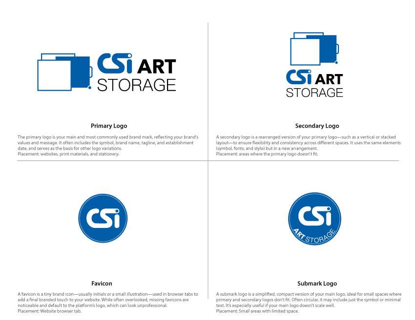
I was brought on to lead the rebranding initiative for CSI, repositioning the company as CSI Art Storage in alignment with their strategic shift to focus exclusively on high-end art storage solutions. The goal was to retain brand recognition while clearly communicating the new direction.
To achieve this, I preserved the iconic “CSI” lettering from the original identity—leveraging its existing equity—but modernized the typography and visual style to convey a more sophisticated, design-forward aesthetic. The updated brand integrates “Art Storage” in a way that’s clean, legible, and immediately clarifies the company’s niche.
An essential part of the visual identity is a custom-designed icon that reflects CSI’s flagship product—an innovative art storage system that will be central to their future offerings. This icon serves as both a branding element and a functional visual cue that aligns with the brand’s purpose and product design.
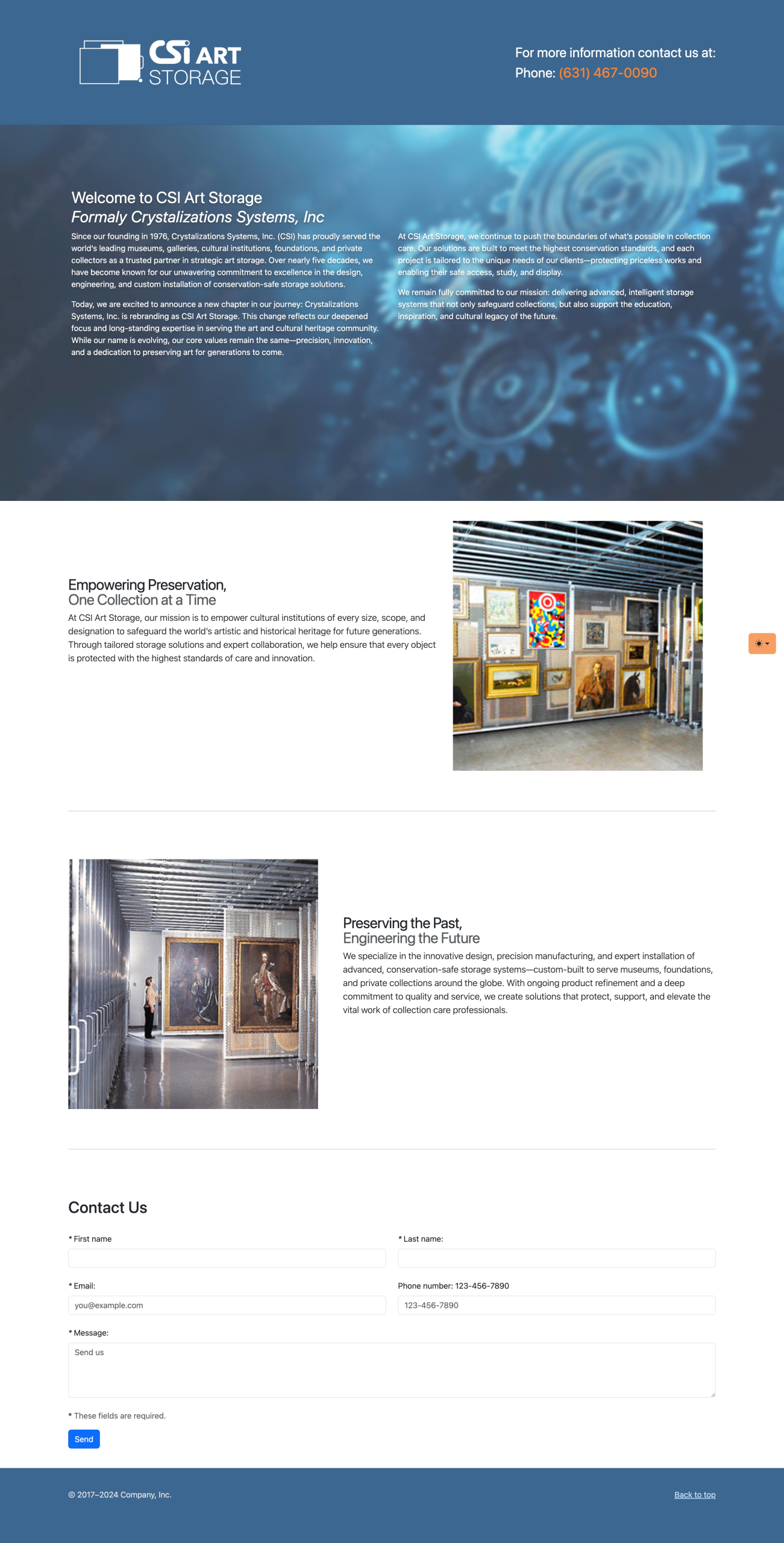
In parallel with the brand refresh, I designed and developed a temporary landing page to establish a digital presence during the content transition phase. Prioritizing usability and responsiveness, the layout is minimal yet informative, with flexible space reserved for future photo and video content. We’re currently in the process of producing original media and sourcing high-quality stock images, so the site remains in a soft-launch/testing phase. Once the final assets are ready, the page will be updated to fully reflect the new brand’s visual storytelling.

