Design
Med-High Fidelity Wireframes
CAD Update
The CAD application was a comprehensive tool enabling mass transit companies to perform a multitude of tasks for their fleets.
Its complexity and scale were significant; a complete redesign would have required over two years. To manage this, we divided the project into manageable sections, beginning with the map view.
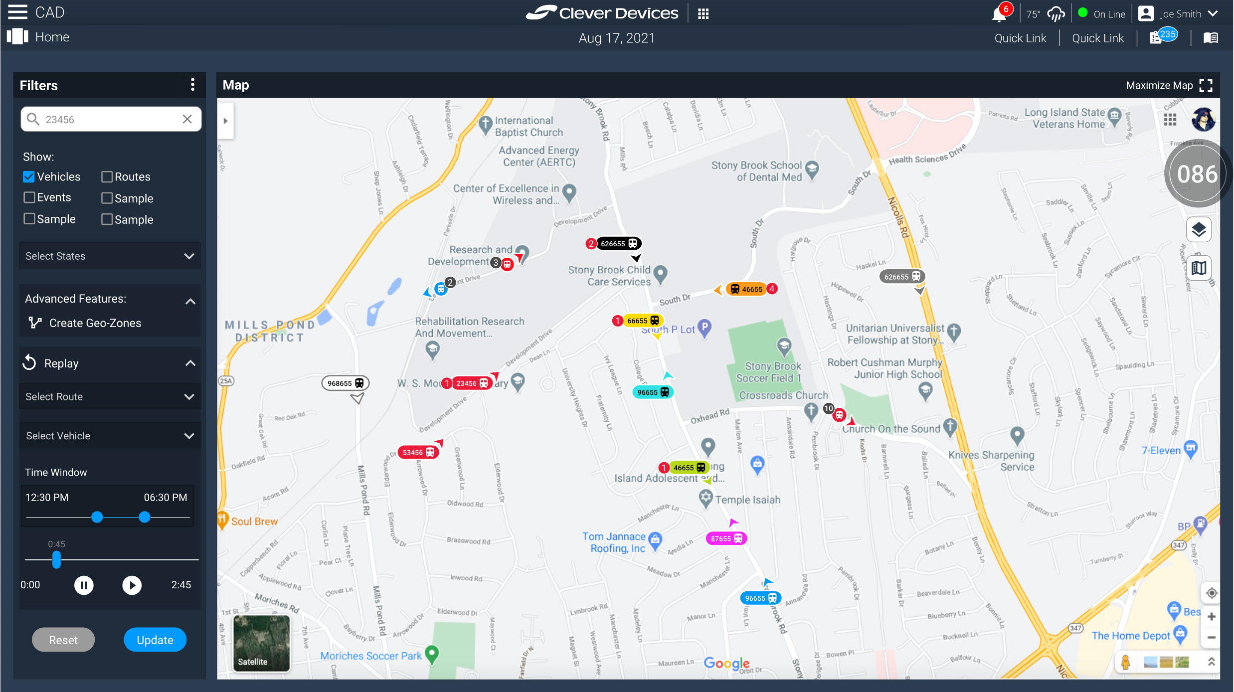
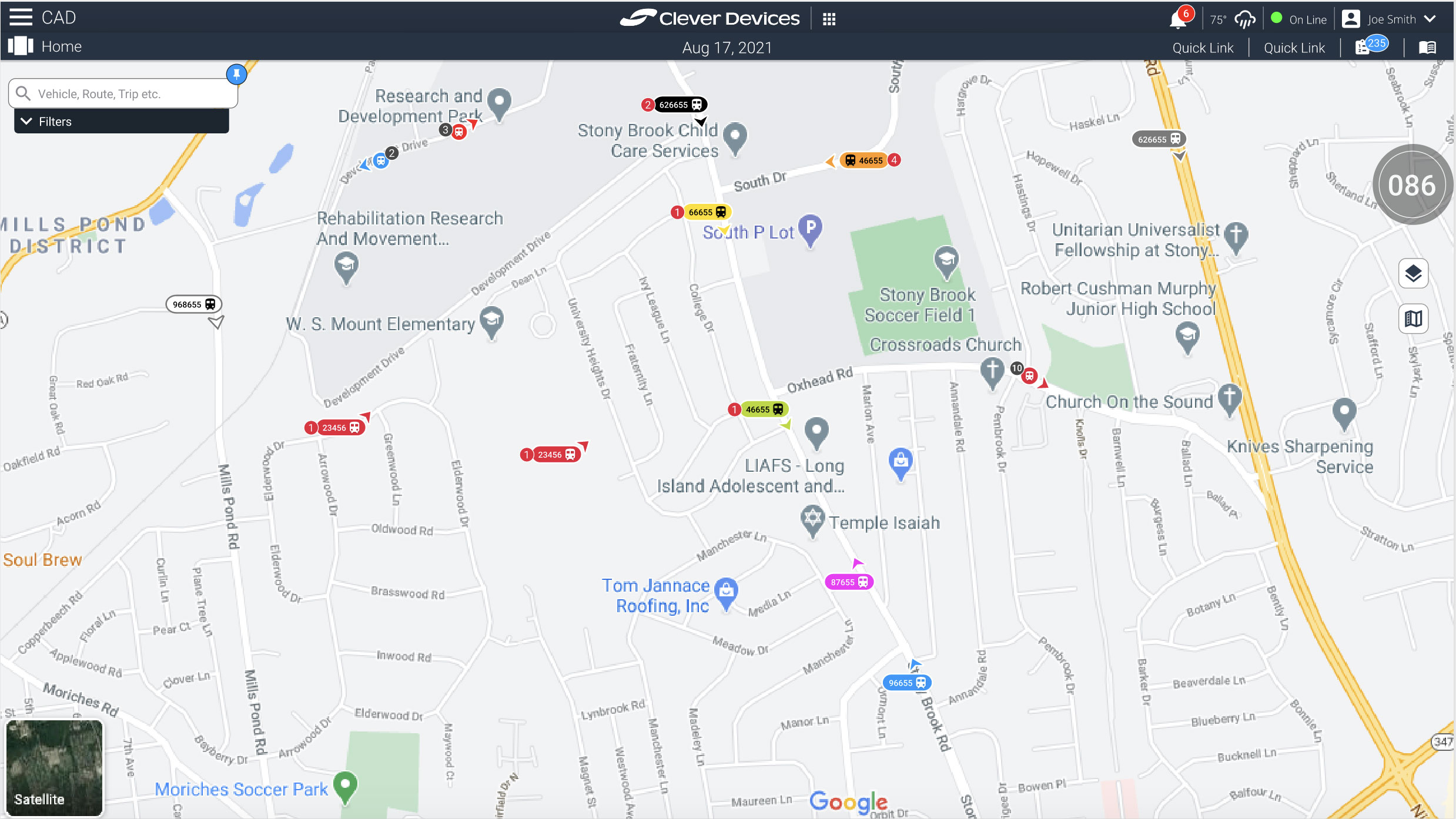
Initially, the maps in the application were outdated, user-unfriendly, and challenging to decipher. We commenced the project by addressing the smallest component: the vehicle icons.
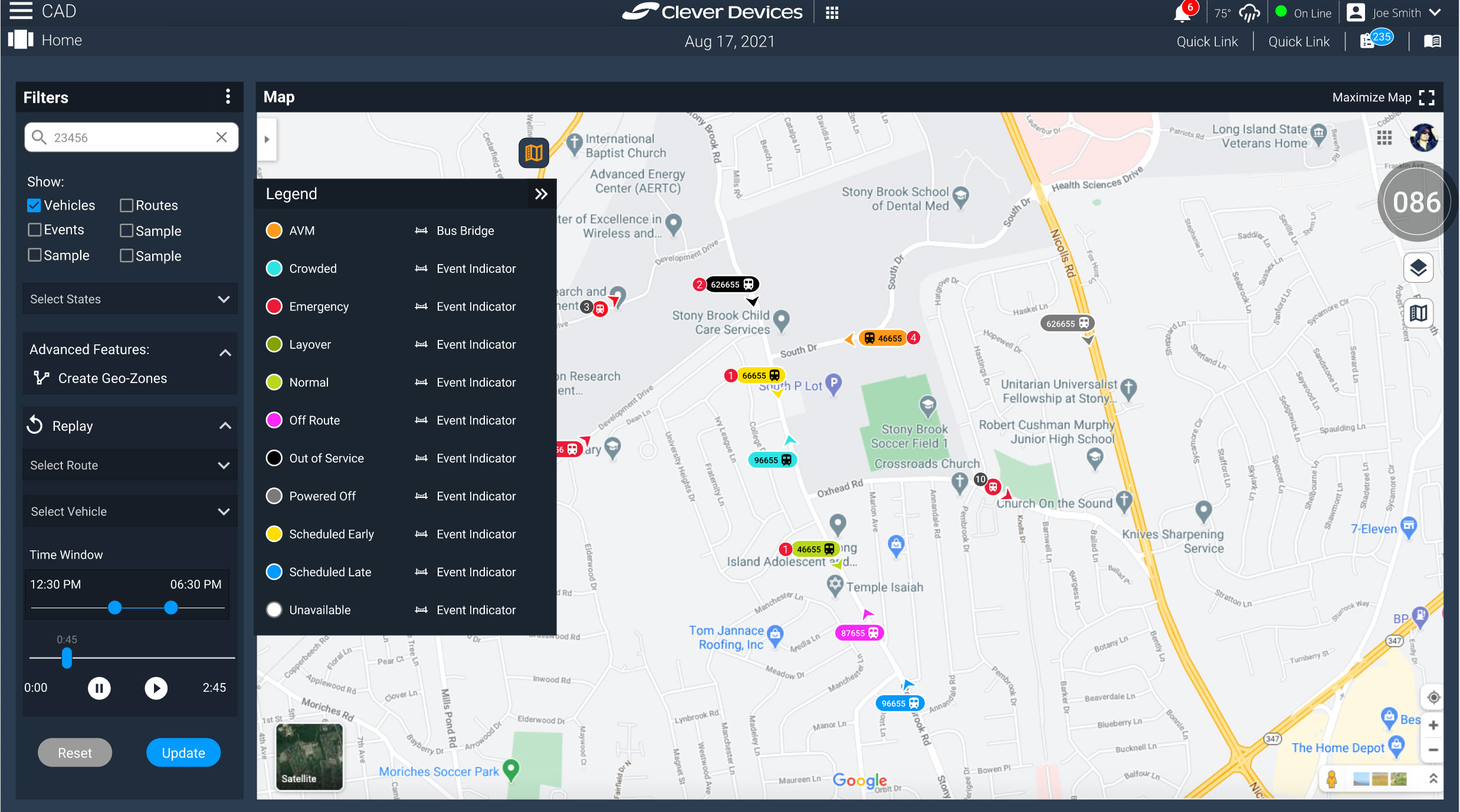
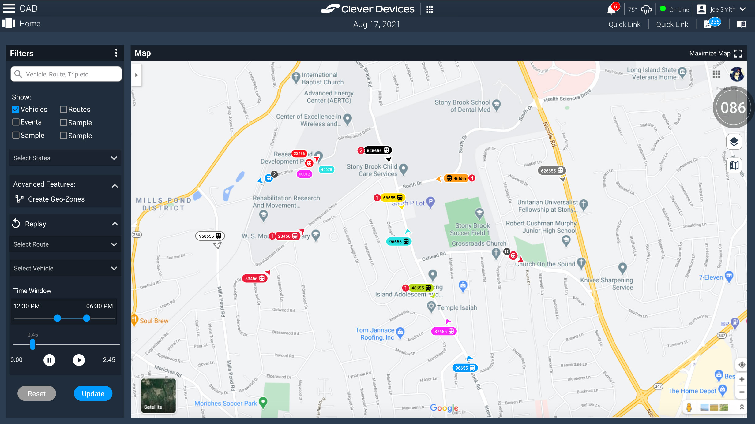
The primary challenge with these icons was to convey a wealth of information at a glance, while also accommodating potentially hundreds of vehicles on screen. This included displaying vehicle status (color-coded), vehicle type (e.g., bus icon), vehicle ID (up to nine digits), event type (icon representation), and crucially, the vehicle’s direction.
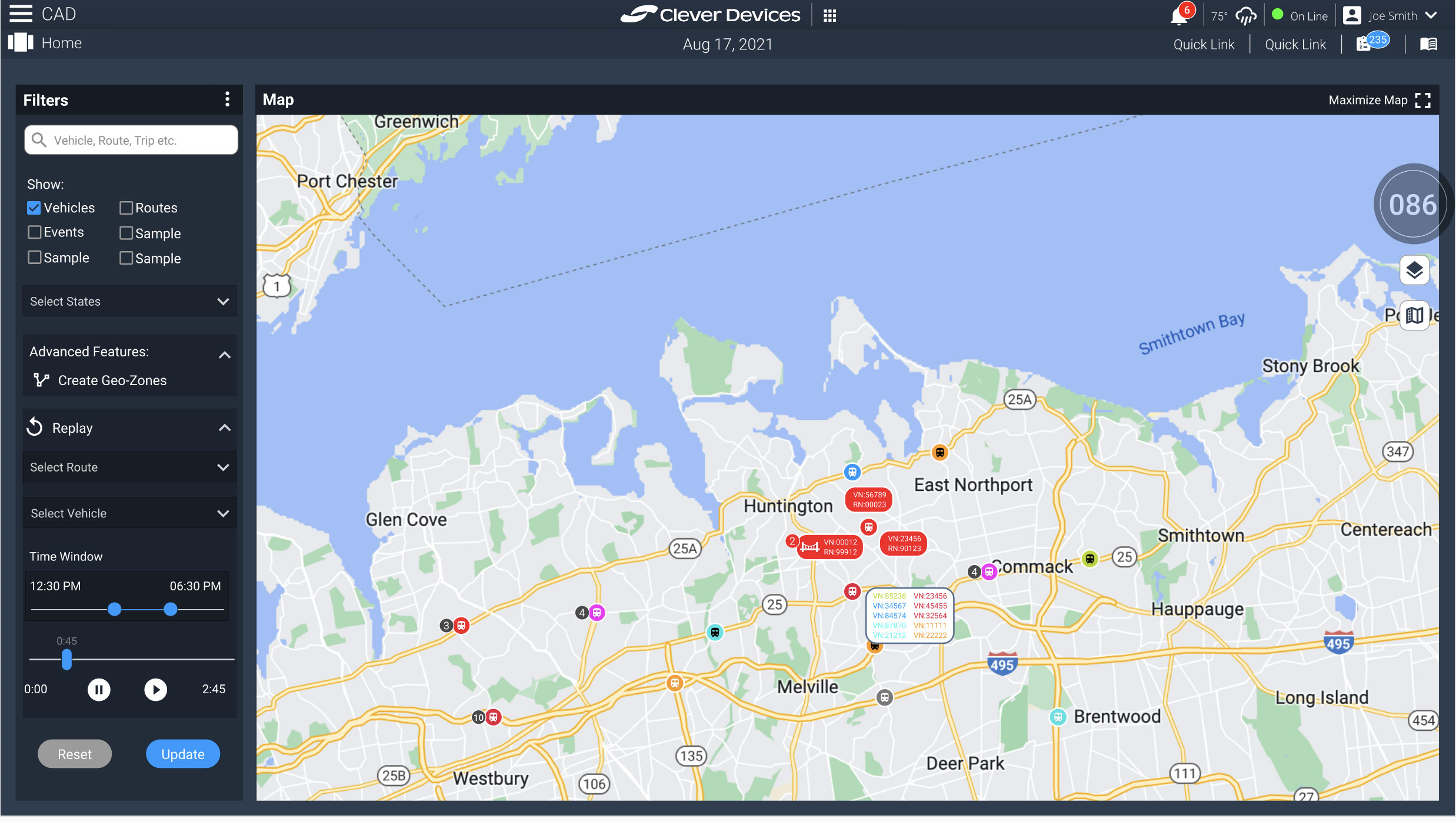
Another issue I identified and resolved was the problem of vehicle bunching, where icons would overlap depending on the map’s zoom level. I found the approach of suggesting continuous zooming to isolate specific vehicles impractical. Instead, I devised a solution to improve both the appearance and functionality of the icons when bunching occurred. Simplified icons would display the number of vehicles, and upon clicking, would expand to reveal all vehicles with their respective information, allowing users to drill down for further details and actions. If a vehicle had a Vehicle Identification Number (VIN), the number would display events associated with it. In the absence of a VIN, a trailing number would indicate the number of bunched vehicles.
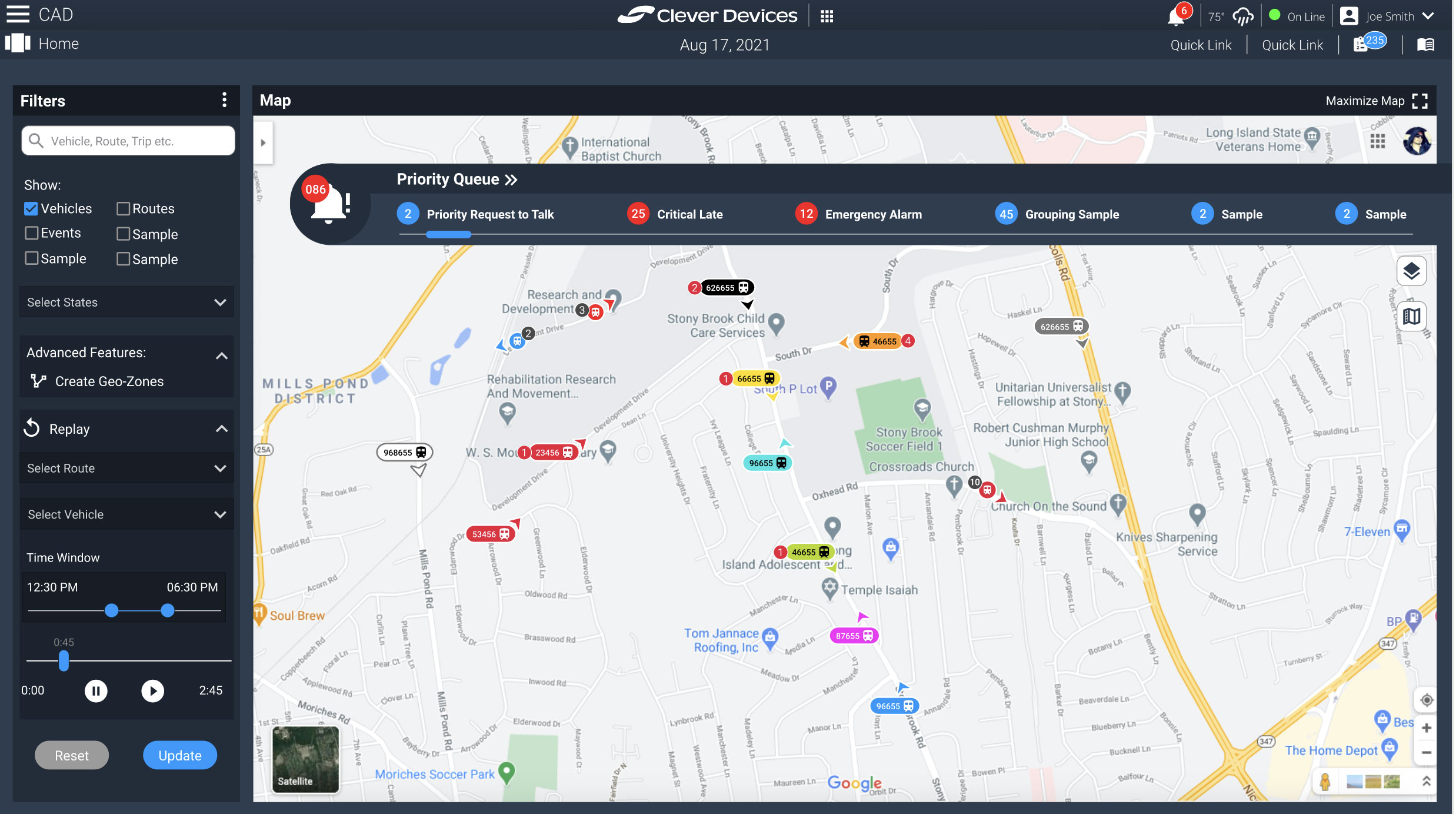
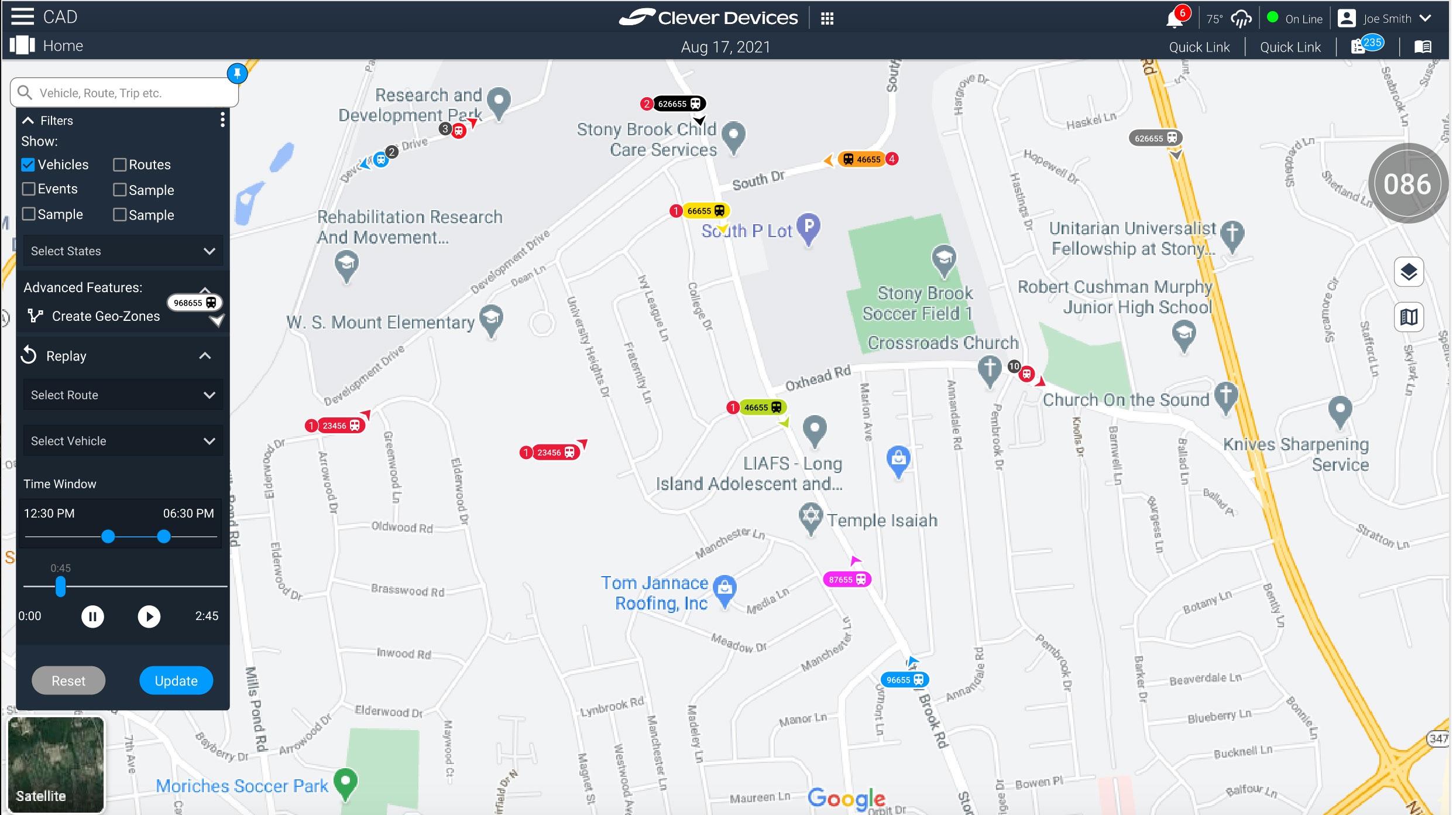
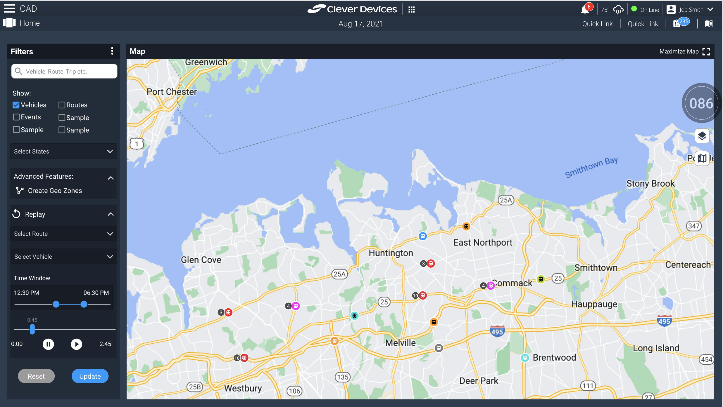
In addition to refining the vehicle icons, I also contributed to enhancing the user interface (UI) for the map itself and expanding its functionalities.
The following gallery showcases some of the ideas we presented to product managers to see if we had their buy in to continue on the current path.
Leave a Response