Digital Experiences
« BackCAD Application Map & Vehicle Interface Redesign
Company: CleverDevices
Role: UX Design • UI Design • Interaction Design • Information Architecture
Tools: Figma • Adobe XD • Wireframing
April 4, 2024 at 8:23 pm
CAD Application Map & Vehicle Interface Redesign
Company: CleverDevices
Role: UX Design • UI Design • Interaction Design • Information Architecture
Tools: Figma • Adobe XD • Wireframing
April 4, 2024 at 8:23 pm
The Challenge
The CAD application was a large-scale operational platform used by mass transit agencies to manage fleet activity, vehicle status, and real-time operational workflows. Due to the complexity and size of the system, a full redesign would have taken years to complete, requiring the project to be approached incrementally.
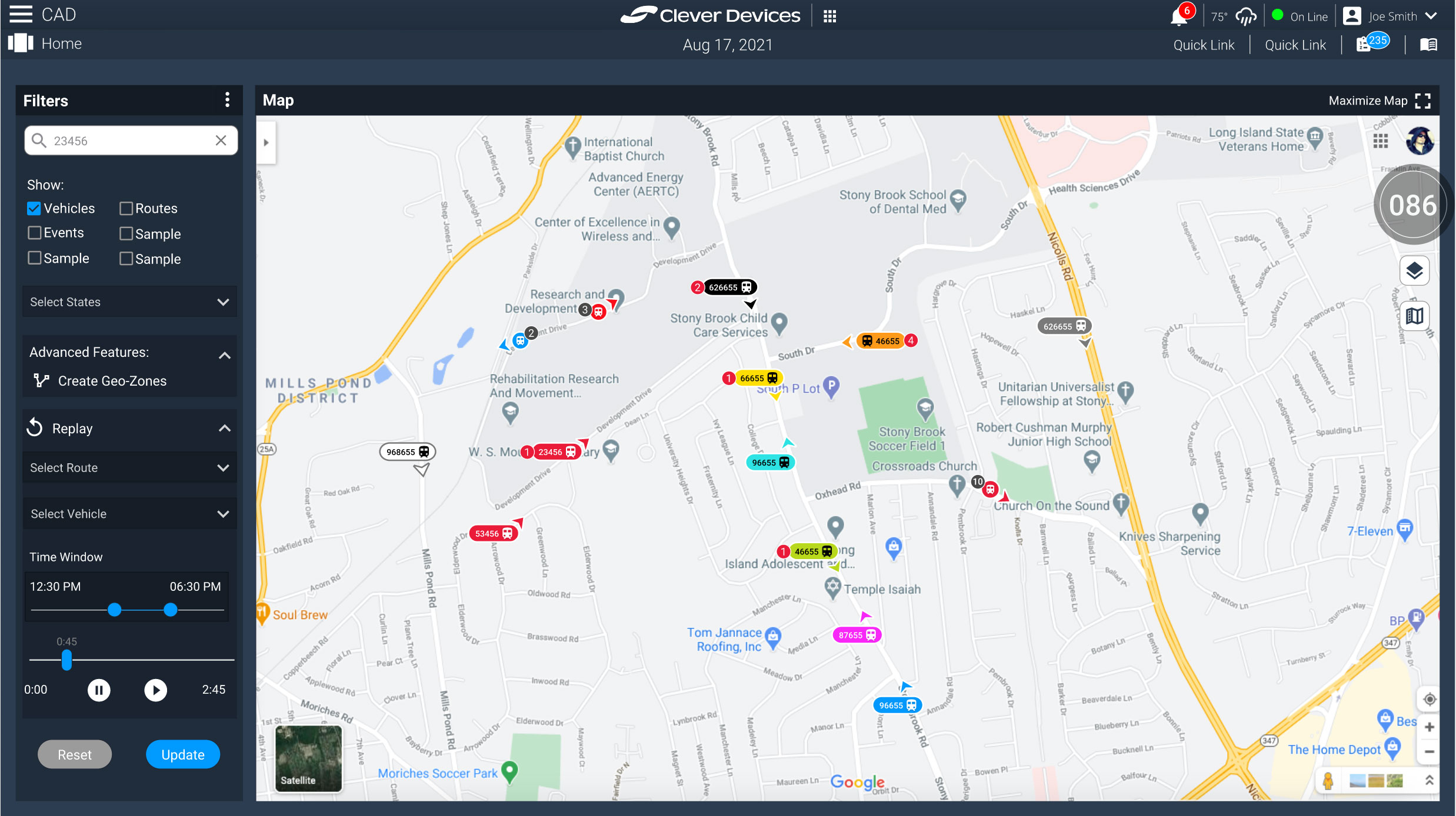
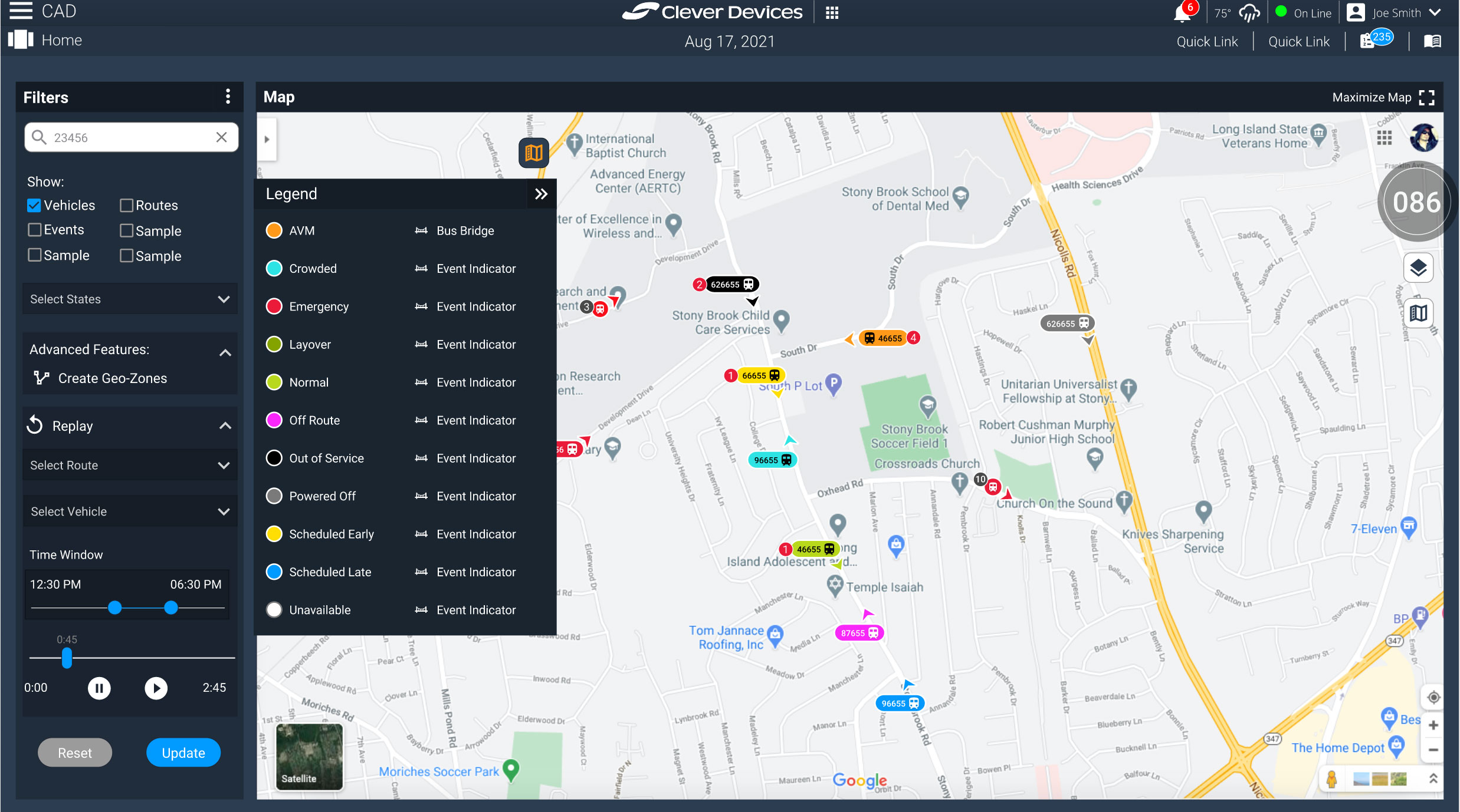
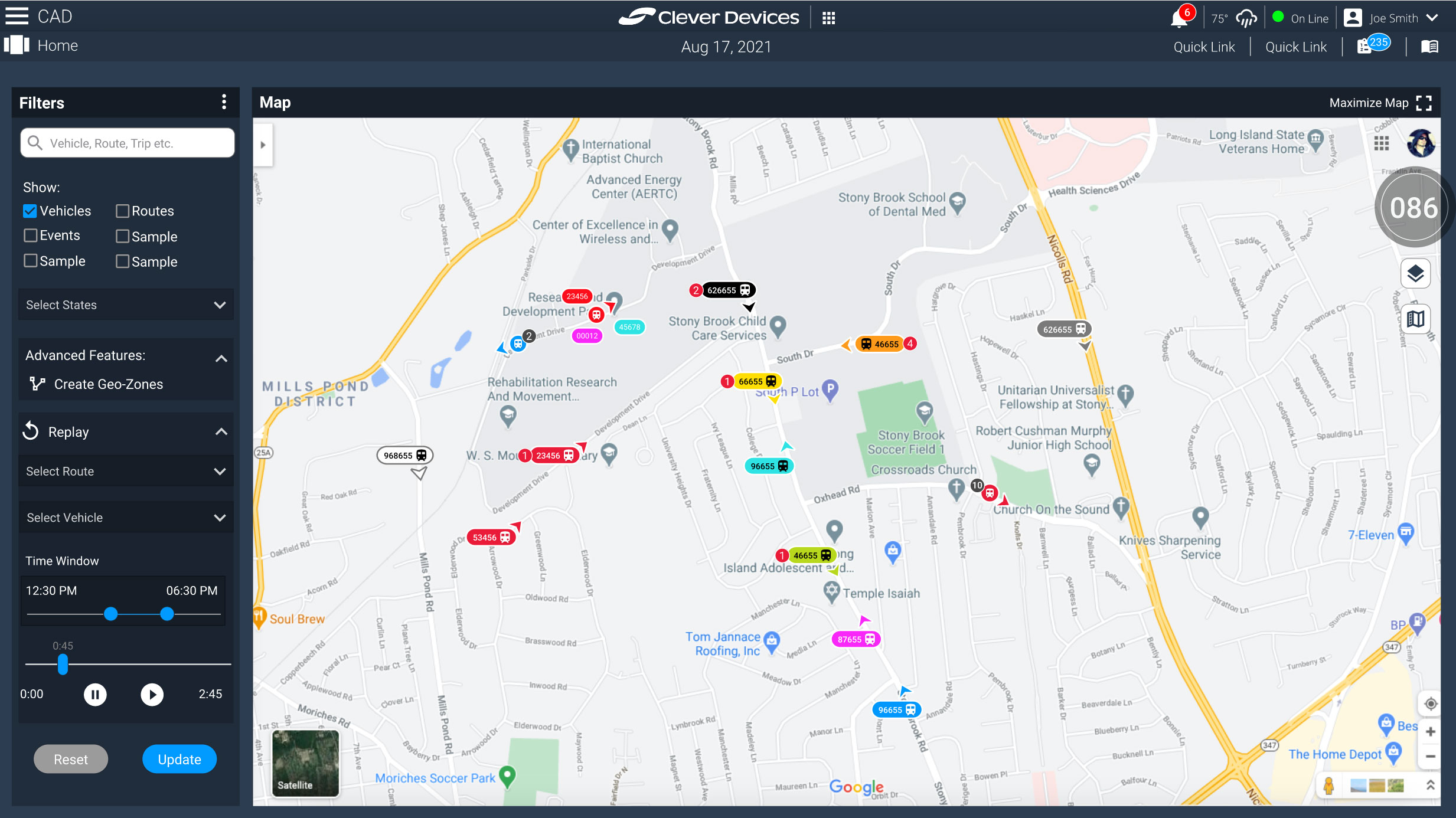
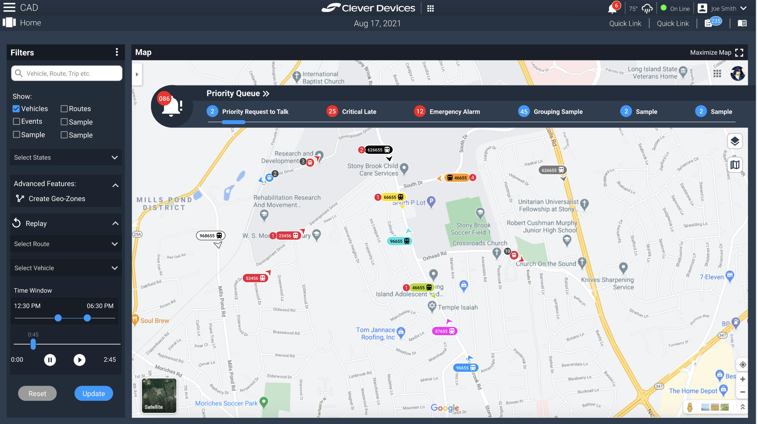
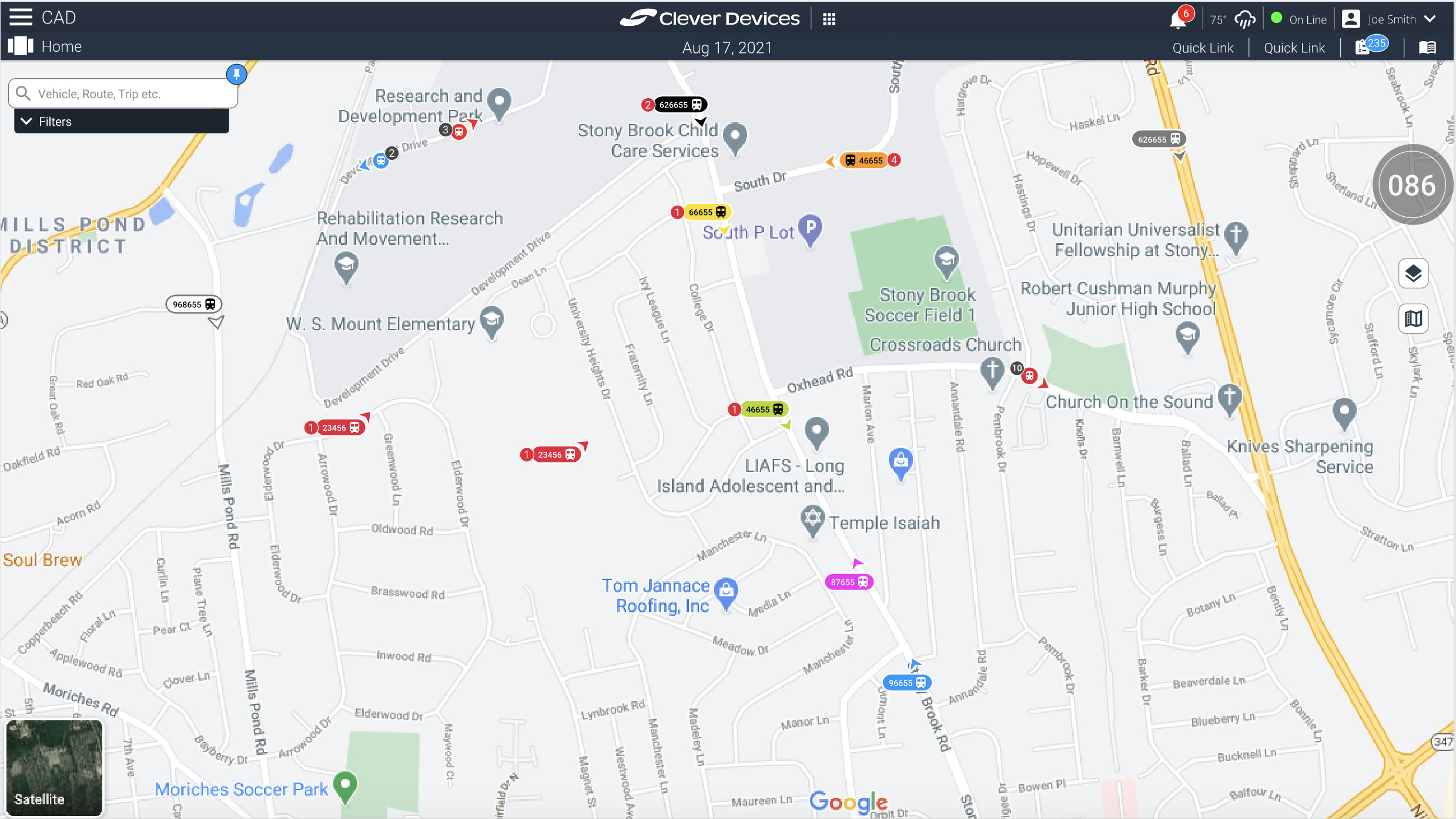
The map interface was identified as a critical starting point because the existing experience was visually outdated, difficult to navigate, and overloaded with information. One of the most significant usability challenges involved the vehicle icons themselves, which needed to communicate multiple layers of operational data while remaining readable at scale across dense transit environments.
Operators needed to quickly identify vehicle type, status, direction, event indicators, and IDs—often while viewing hundreds of active vehicles simultaneously on the map.
The Approach
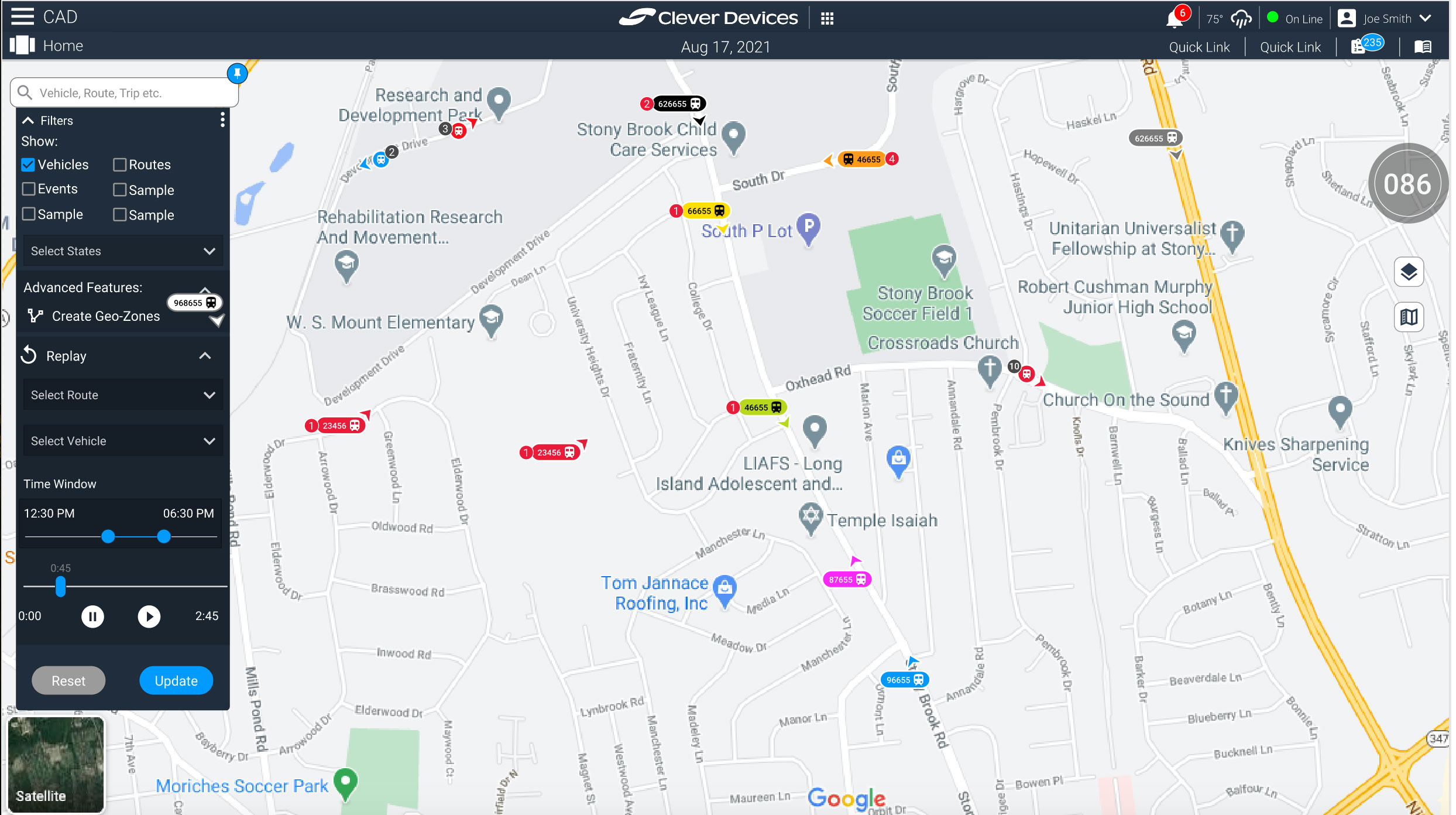
The redesign process began by focusing on the smallest but most frequently interacted-with component: the vehicle icon system. The goal was to simplify information density without sacrificing critical operational visibility.
I explored ways to create a scalable visual hierarchy that allowed users to quickly interpret vehicle states through color coding, iconography, directional indicators, and contextual event markers. Particular attention was given to readability and interaction behavior across different zoom levels and operational conditions.
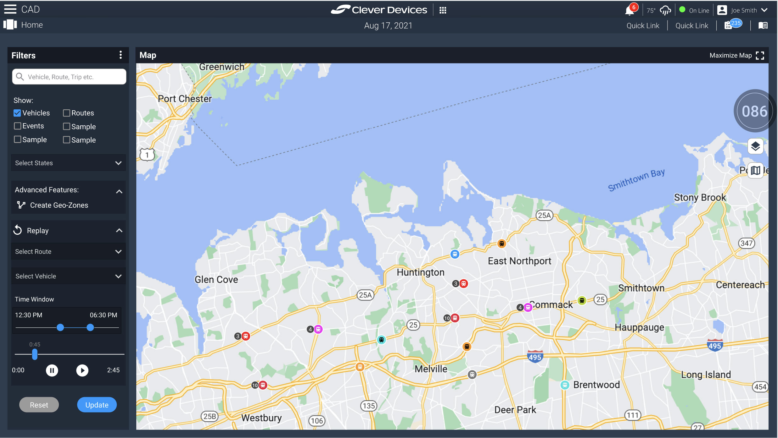
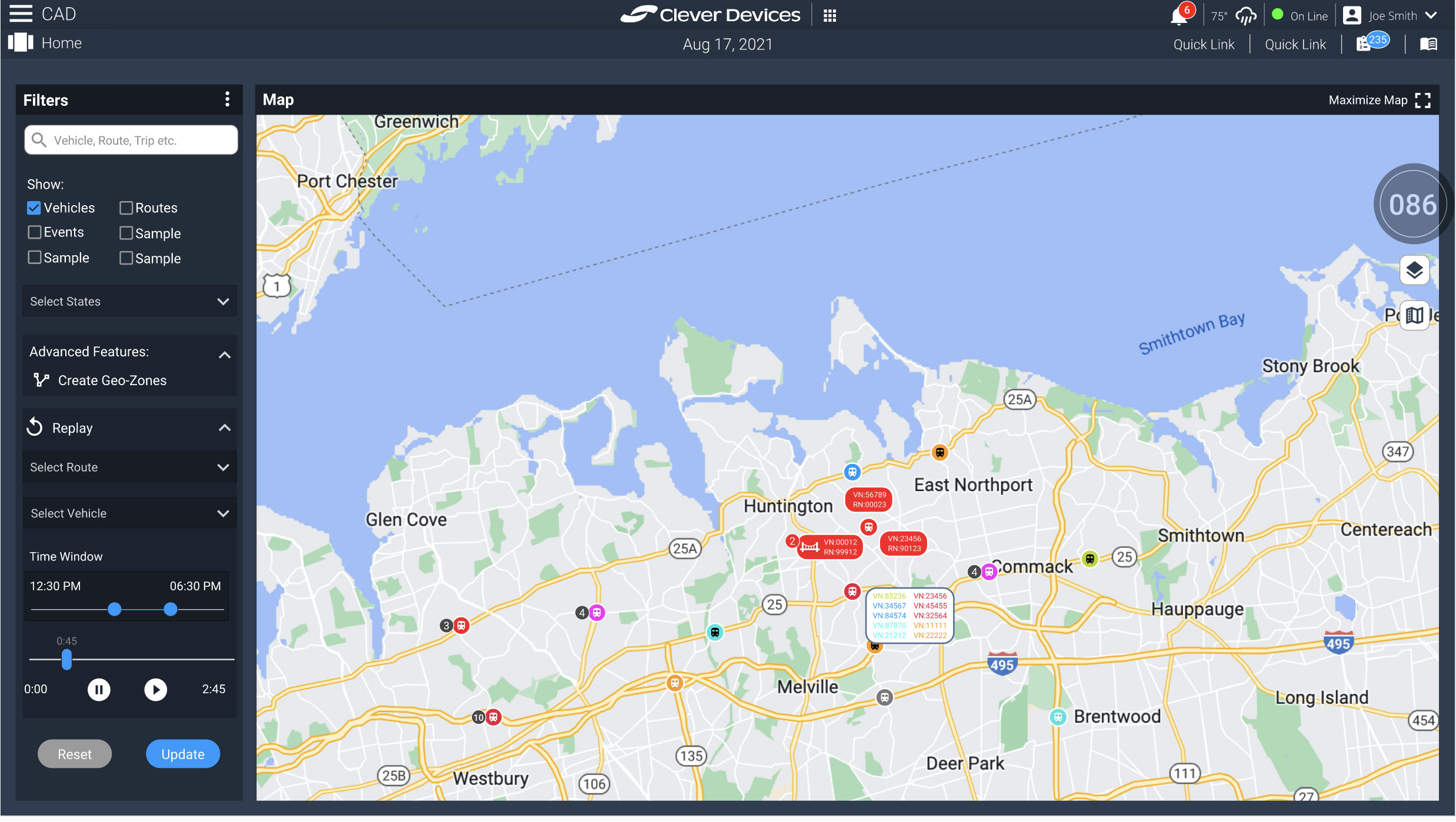
One of the major UX problems I identified was vehicle bunching, where overlapping icons made map interaction difficult and reduced situational awareness. Rather than relying on users to continuously zoom in and out to isolate vehicles, I proposed a more scalable interaction model.
The solution introduced grouped vehicle indicators that condensed overlapping vehicles into simplified cluster icons displaying vehicle counts. Selecting a cluster would progressively expand and reveal individual vehicles and associated operational details, allowing users to drill into specific events and actions without overwhelming the interface.
In parallel with the icon redesign work, I also contributed to broader UI enhancements and interaction improvements across the map experience to modernize usability and support more efficient operational workflows.
The Outcome
The redesign concepts introduced a more scalable and user-centered approach to handling complex fleet visualization within the CAD system. By simplifying dense operational data into clearer interaction patterns and progressive disclosure workflows, the proposed solutions improved readability, reduced visual clutter, and enhanced situational awareness for operators.
The concepts presented to product managers generated strong interest and helped establish a clearer direction for modernizing the platform’s mapping and operational experience while maintaining the depth of functionality required by transit agencies.