Digital Experiences
Full Brand & Website Launch
Company: Lucky Star Entertainment
Role: Brand Strategy • UX Design • UI Design • Front-End Development
Tools: Figma • Adobe XD • Bootstrap • HTML • CSS • JavaScript
Full Brand & Website Launch
Company: Lucky Star Entertainment
Role: Brand Strategy • UX Design • UI Design • Front-End Development
Tools: Figma • Adobe XD • Bootstrap • HTML • CSS • JavaScript
The Challenge
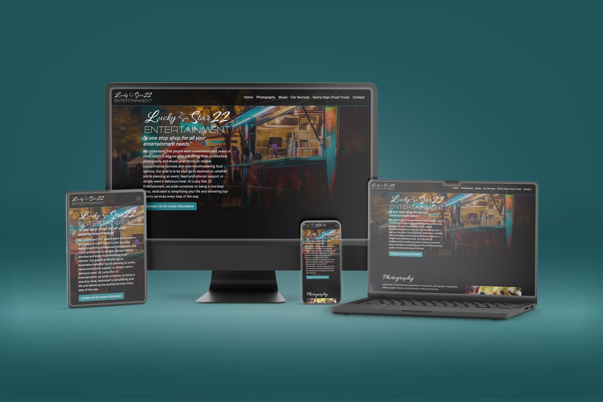
The client needed a professional digital presence to help secure funding and establish credibility for a new business, but lacked both a defined brand identity and an existing website. The challenge was not only to design and develop a responsive website, but to first create a cohesive visual foundation that could guide the company’s positioning, messaging, and future growth.
The Approach
Rather than approaching the project as only a website build, I proposed a full brand-to-digital solution that connected identity, user experience, and development into a unified process.
The project began with brand exploration and logo development to establish the company’s visual direction and overall tone. While the branding approvals were in progress, I simultaneously began building the foundational Bootstrap framework that would support the responsive website experience.
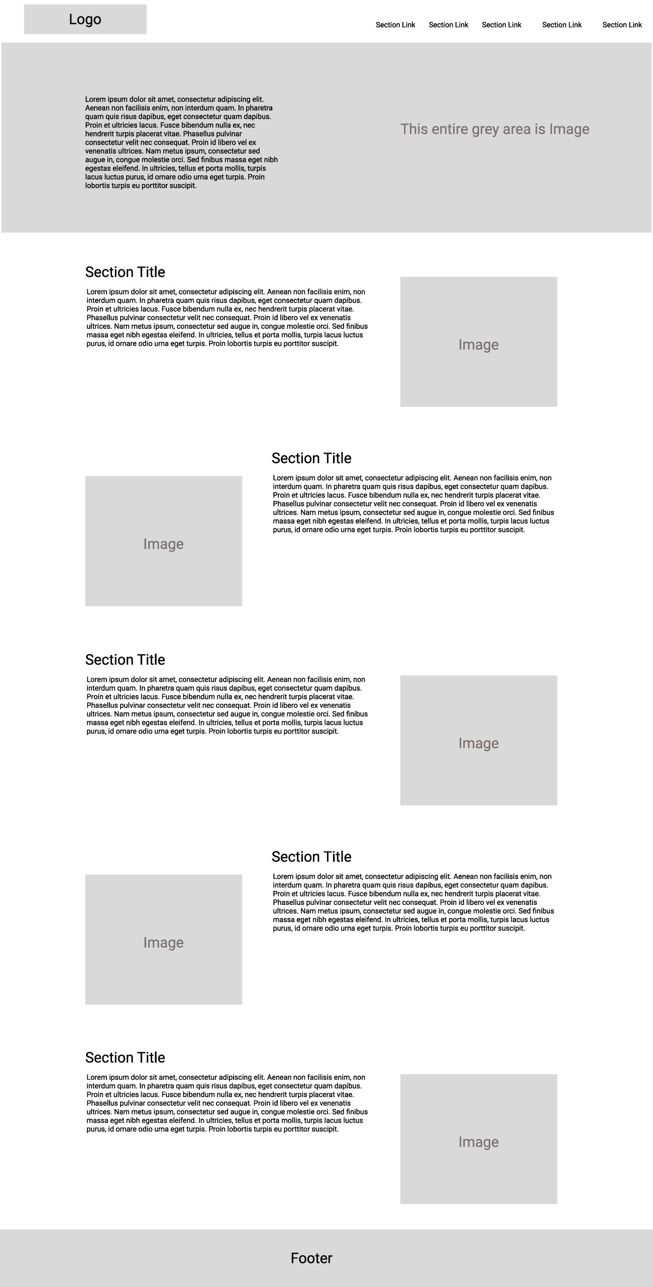
Once the visual identity was approved, I moved into UX planning, wireframing, and site architecture to define the structure, user flow, and content hierarchy. High-fidelity interface designs were then created to refine the visual experience before transitioning into front-end development and implementation.
By handling both the design and development process, the final product maintained consistency from concept through execution while streamlining communication and iteration throughout the project lifecycle.
The Outcome
The project resulted in a cohesive brand identity and fully responsive digital experience that provided the client with a professional foundation to launch and grow their business. By aligning branding, UX strategy, and development under a unified creative direction, the final website delivered a polished experience designed to build trust, communicate credibility, and support future scalability.
Tablet Application Redesign
Company: CleverDevices
Role: UX Design • UI Design • Interaction Design • Product Design
Tools: Figma • Adobe XD • User Flow Mapping • Wireframing • Prototyping
Tablet Application Redesign
Company: CleverDevices
Role: UX Design • UI Design • Interaction Design • Product Design
Tools: Figma • Adobe XD • User Flow Mapping • Wireframing • Prototyping
The Challenge
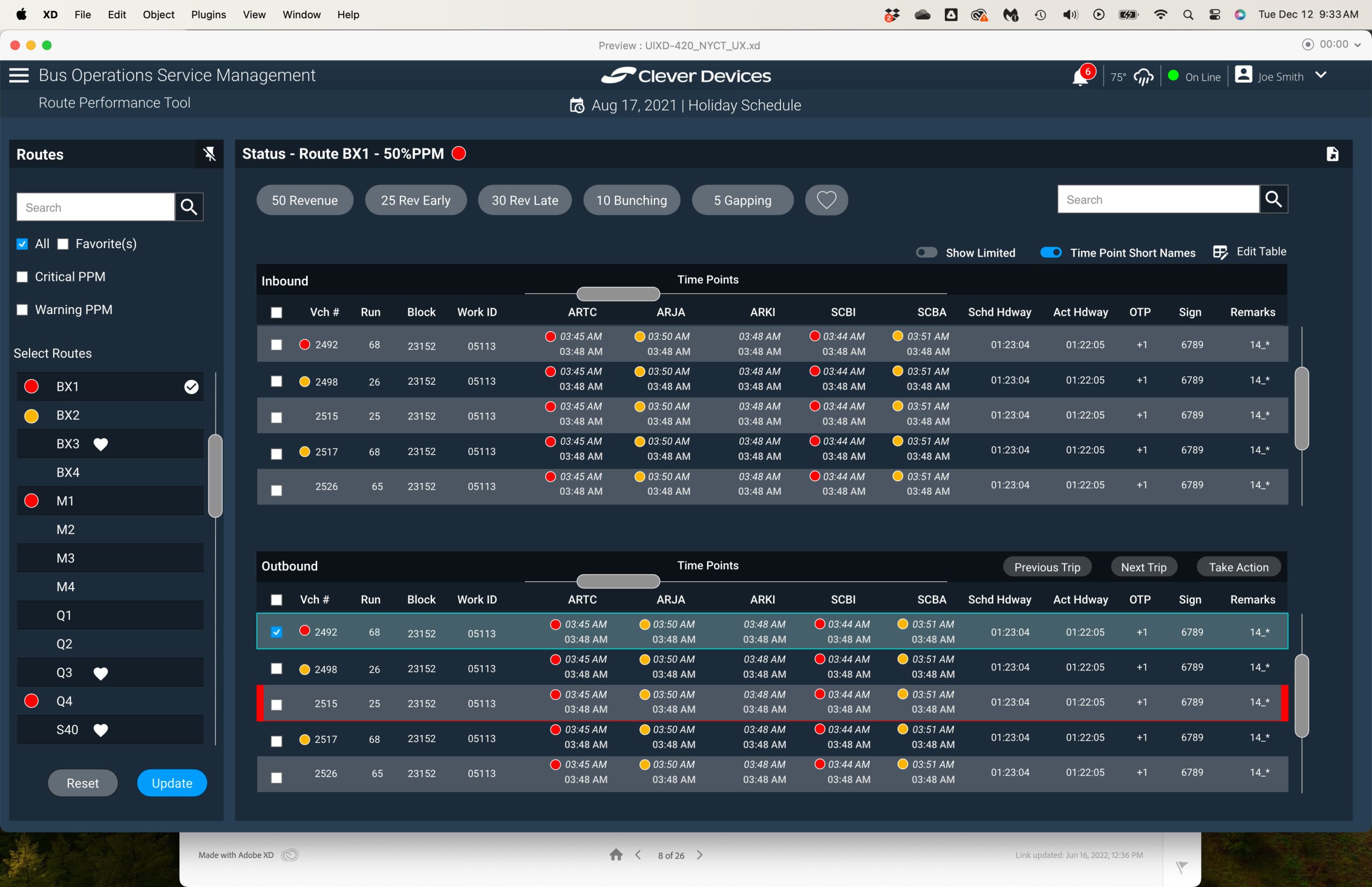
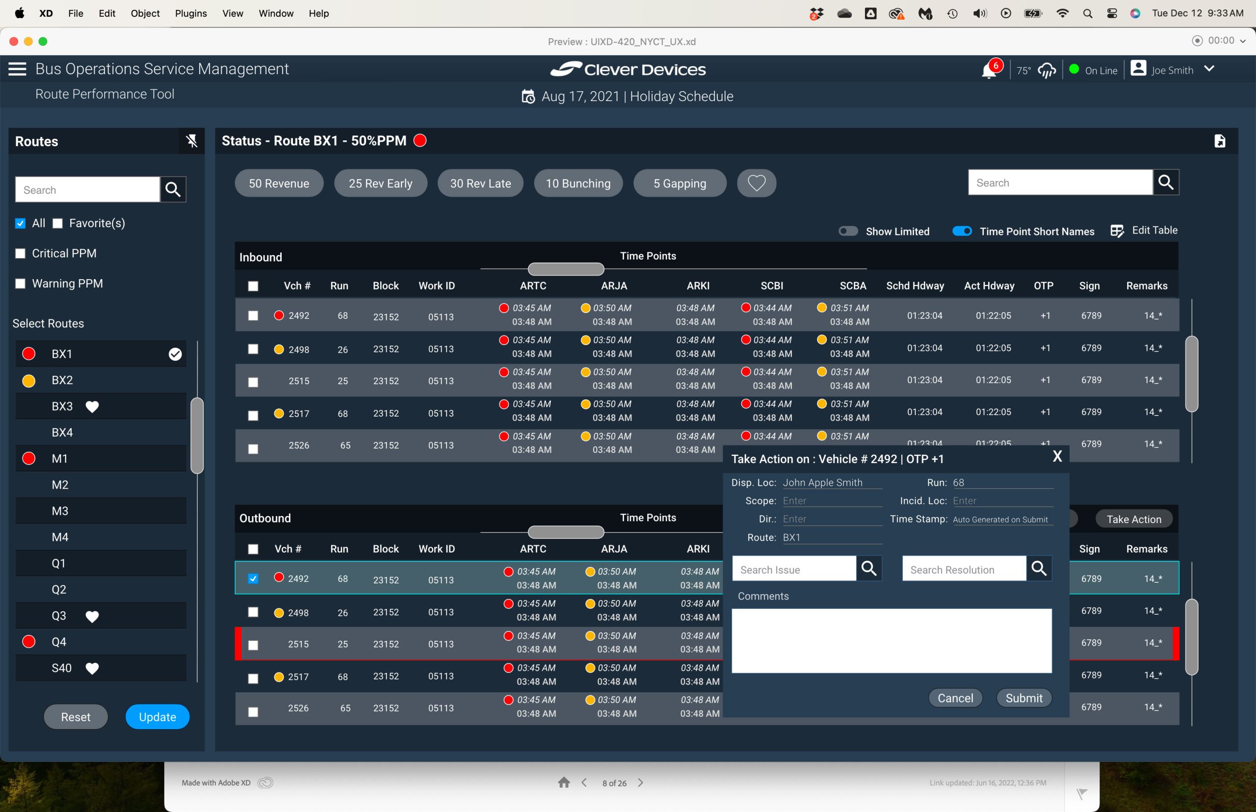
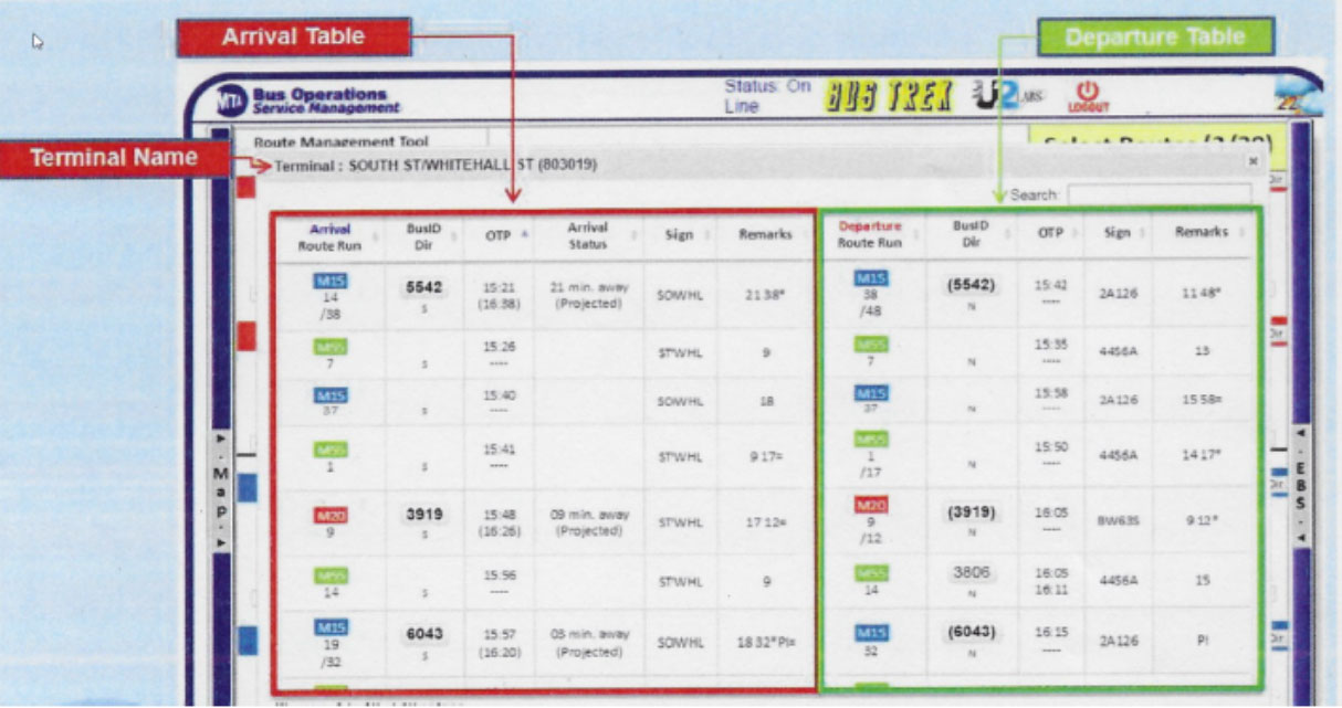
Clever Devices was brought in to redesign an internal tablet application used by NYCT field operators after the agency recognized improvements made across other transit products. The existing application suffered from an outdated interface, fragmented workflows, and inefficient data entry processes that slowed operators in the field.
One of the biggest usability issues involved logging vehicle problems and resolutions. In the legacy system, users were forced to navigate across multiple screens and dependent dropdown menus to complete a single task, making the process time-consuming and difficult to manage efficiently in fast-paced operational environments.
The goal of the redesign was to simplify workflows, modernize the user experience, and significantly reduce the time required for field operators to document and resolve vehicle issues.
The Approach
The redesign focused heavily on simplifying interaction patterns and reducing unnecessary steps throughout the application. Working closely with the project team, we restructured the workflow into a more streamlined and user-friendly experience centered around efficiency and clarity.
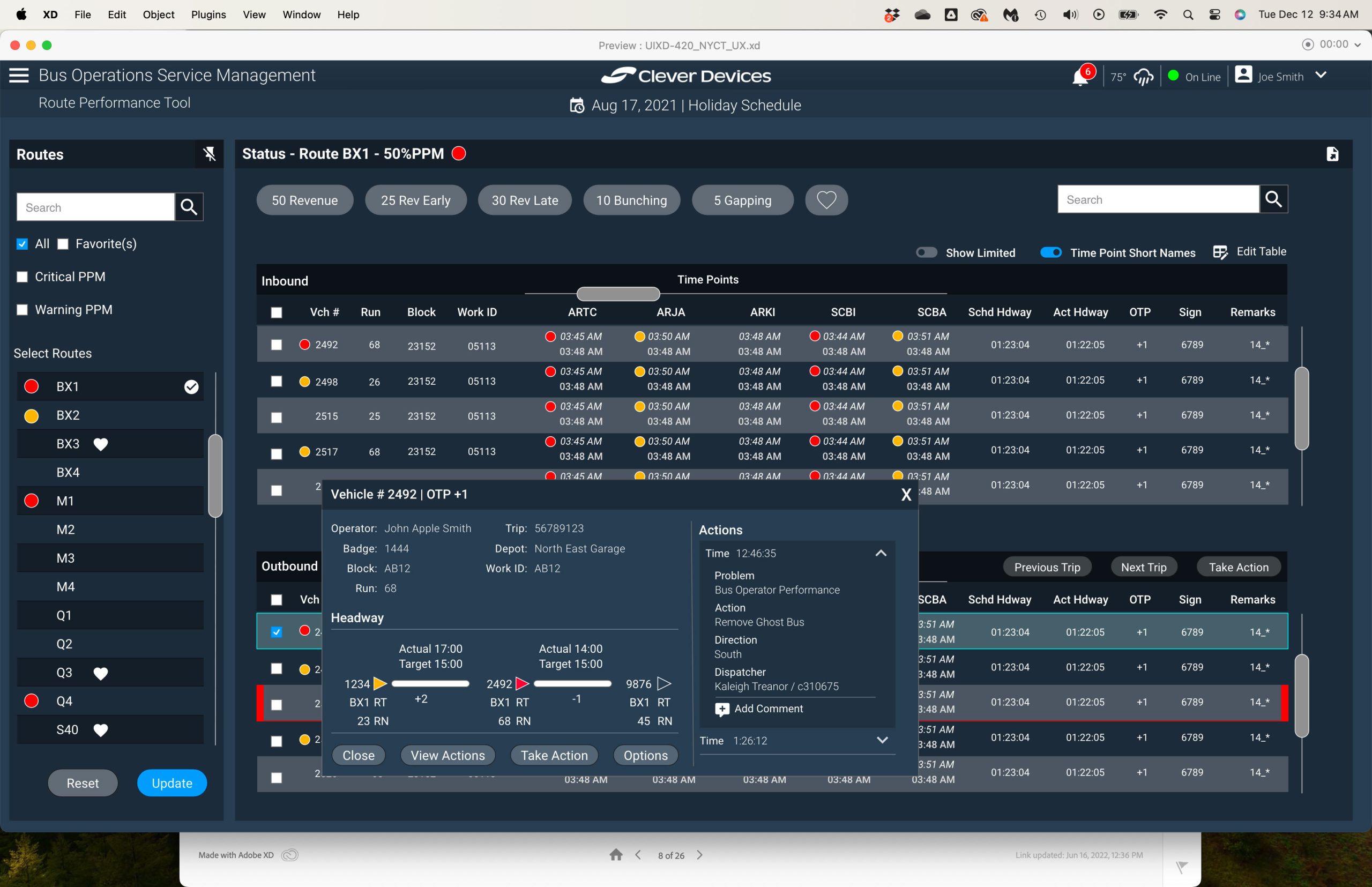
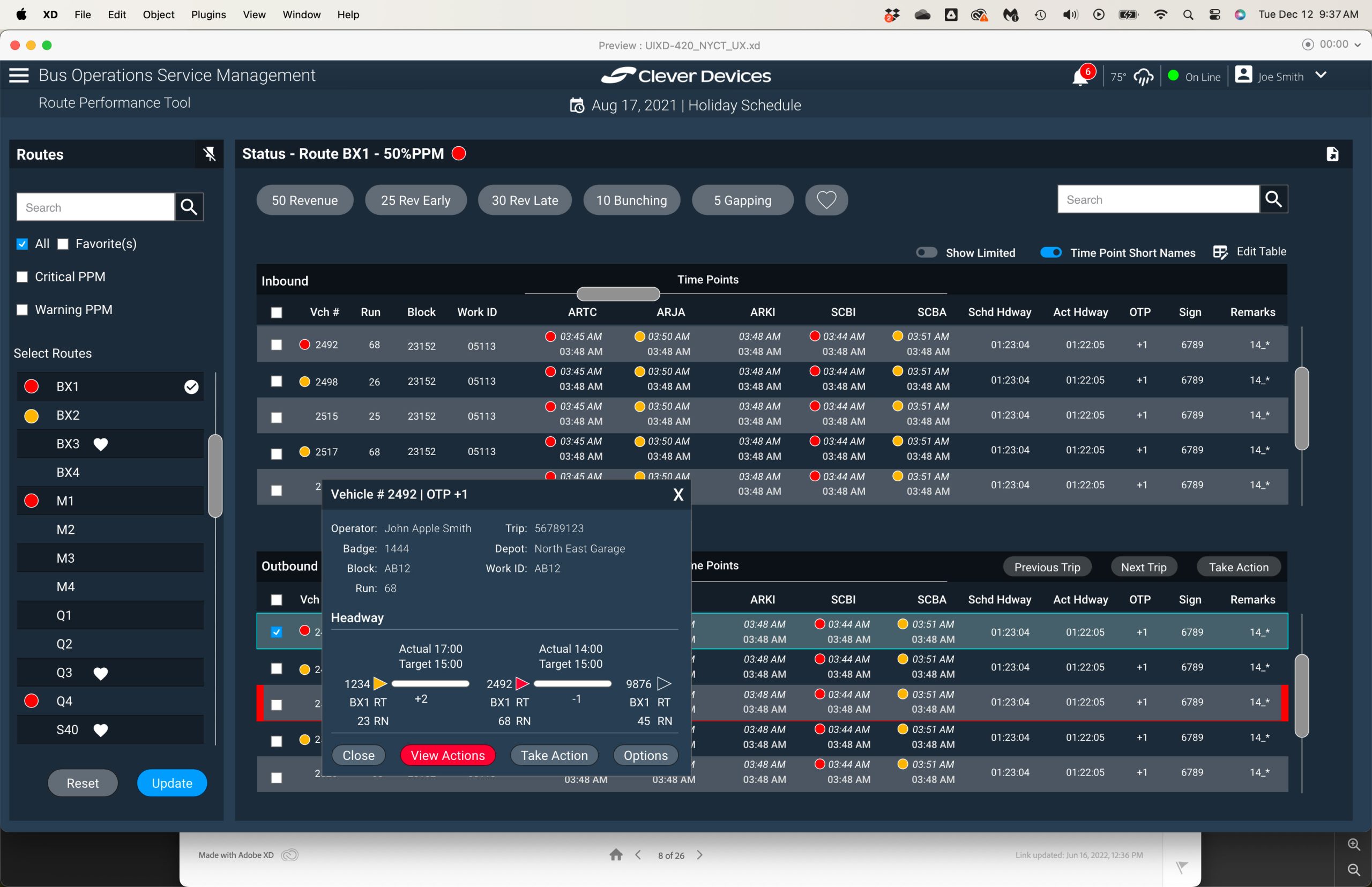
One of the most impactful improvements was consolidating a previously fragmented multi-screen process into a single contextual modal workflow preloaded with relevant vehicle and operational data. To further improve speed and usability, we replaced complex dependent dropdown structures with predictive type-ahead search functionality using agency-approved issue and resolution lists.
The interface itself was modernized with a cleaner visual hierarchy, improved spacing, clearer information architecture, and touch-friendly interaction patterns optimized for tablet use in field conditions.
Through iterative refinement and usability-focused thinking, the redesign emphasized simplicity as a way to improve both speed and accuracy for operators in real-world environments.
The Outcome
The redesigned application represented a substantial improvement over the legacy system, creating faster and more intuitive workflows for NYCT field operators. By reducing interaction complexity and minimizing navigation friction, the updated experience significantly streamlined the process of reporting and resolving vehicle issues.
The project generated strong enthusiasm among stakeholders and project owners, who were eager to present the redesigned experience to NYCT as a major advancement over the existing product.
A key takeaway from the project was the measurable value of simplifying complex systems. Replacing multiple dependent workflows with predictive search and contextual interfaces demonstrated how thoughtful UX decisions can dramatically improve efficiency in operational environments.
CAD Application Map & Vehicle Interface Redesign
Company: CleverDevices
Role: UX Design • UI Design • Interaction Design • Information Architecture
Tools: Figma • Adobe XD • Wireframing
CAD Application Map & Vehicle Interface Redesign
Company: CleverDevices
Role: UX Design • UI Design • Interaction Design • Information Architecture
Tools: Figma • Adobe XD • Wireframing
The Challenge
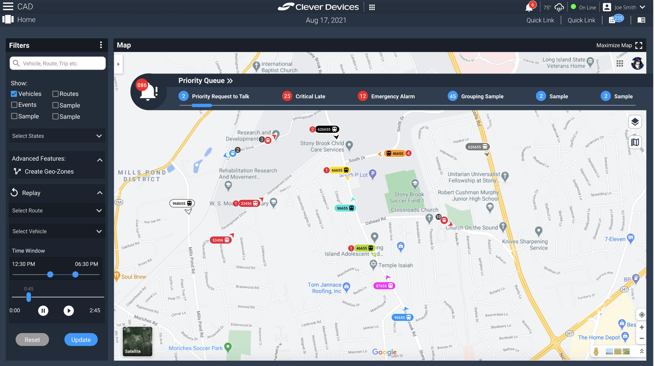
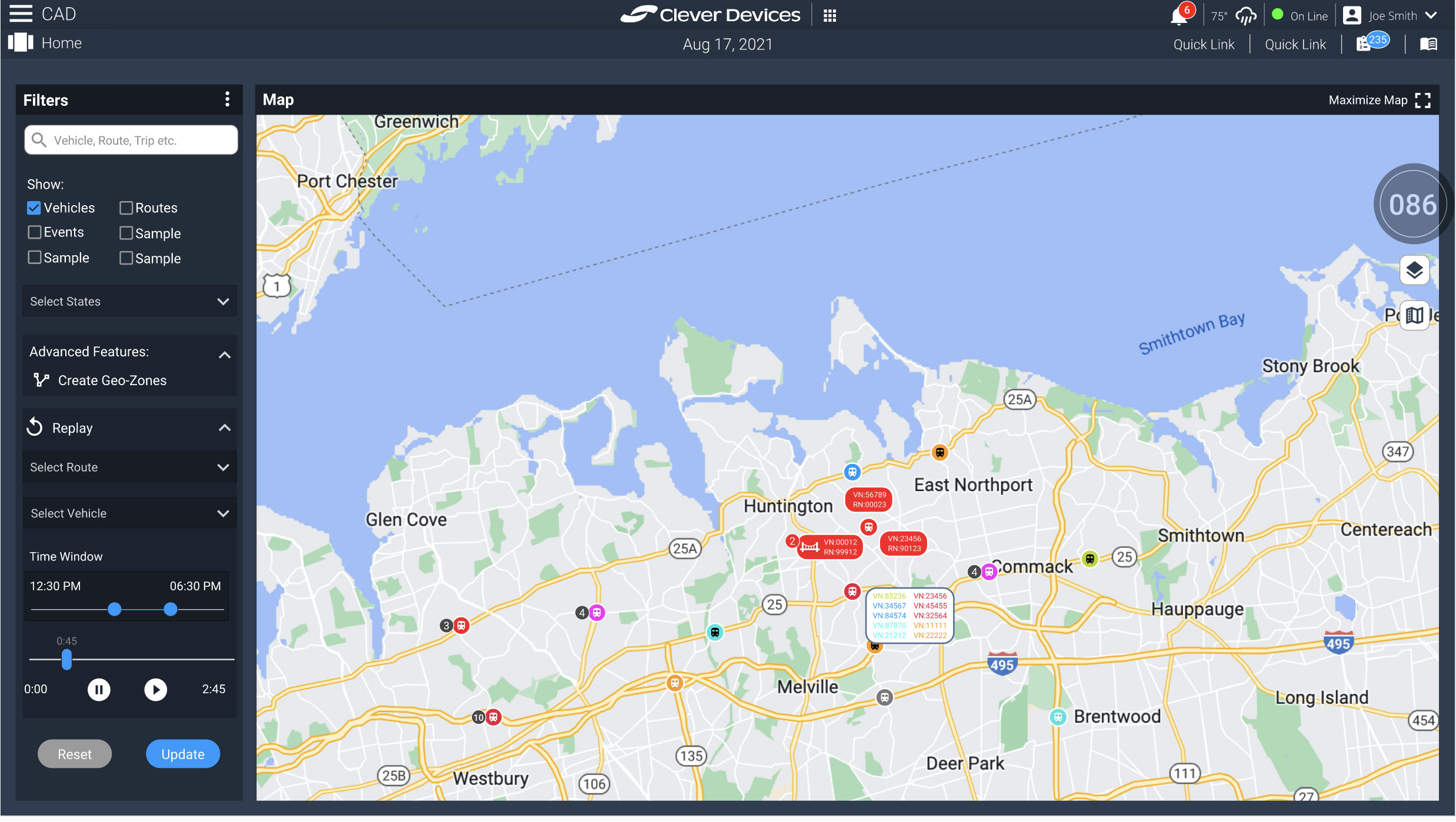
The CAD application was a large-scale operational platform used by mass transit agencies to manage fleet activity, vehicle status, and real-time operational workflows. Due to the complexity and size of the system, a full redesign would have taken years to complete, requiring the project to be approached incrementally.
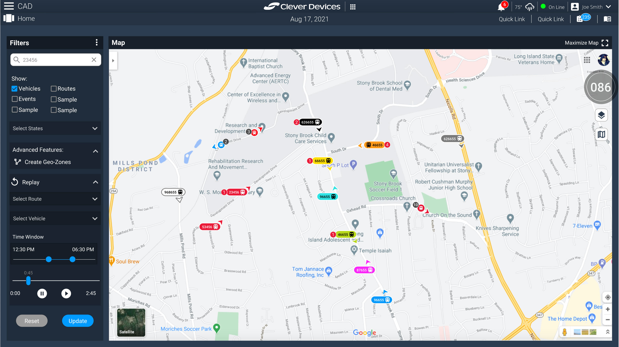
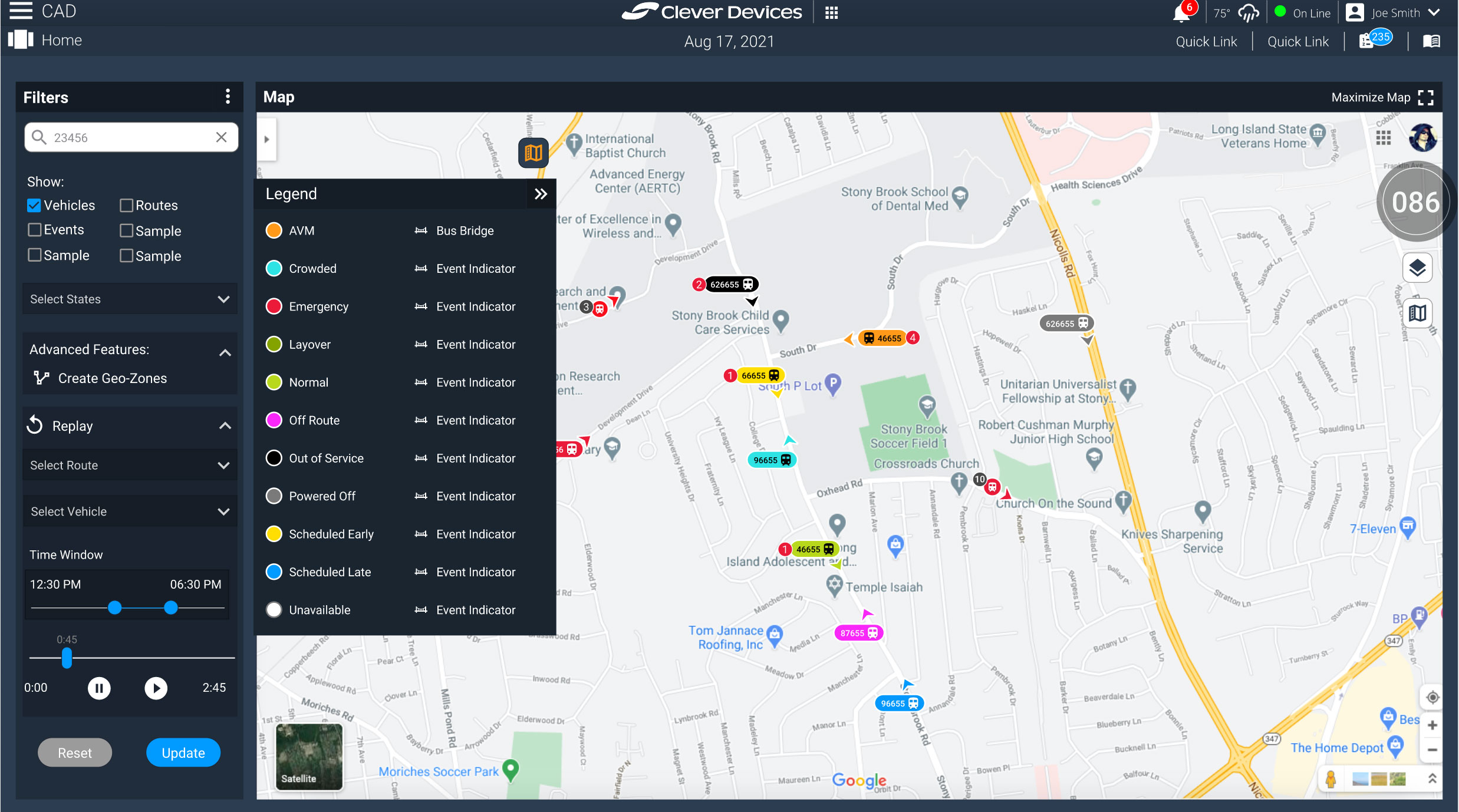
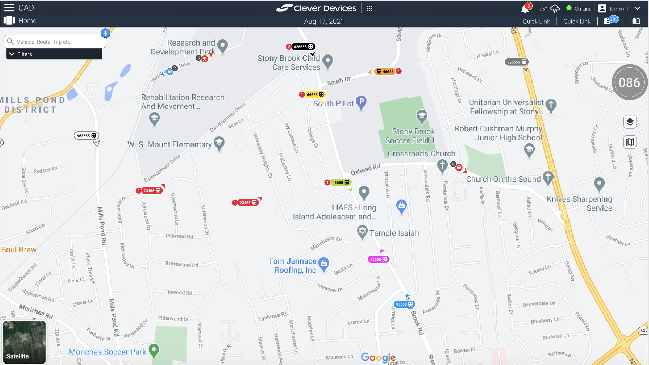
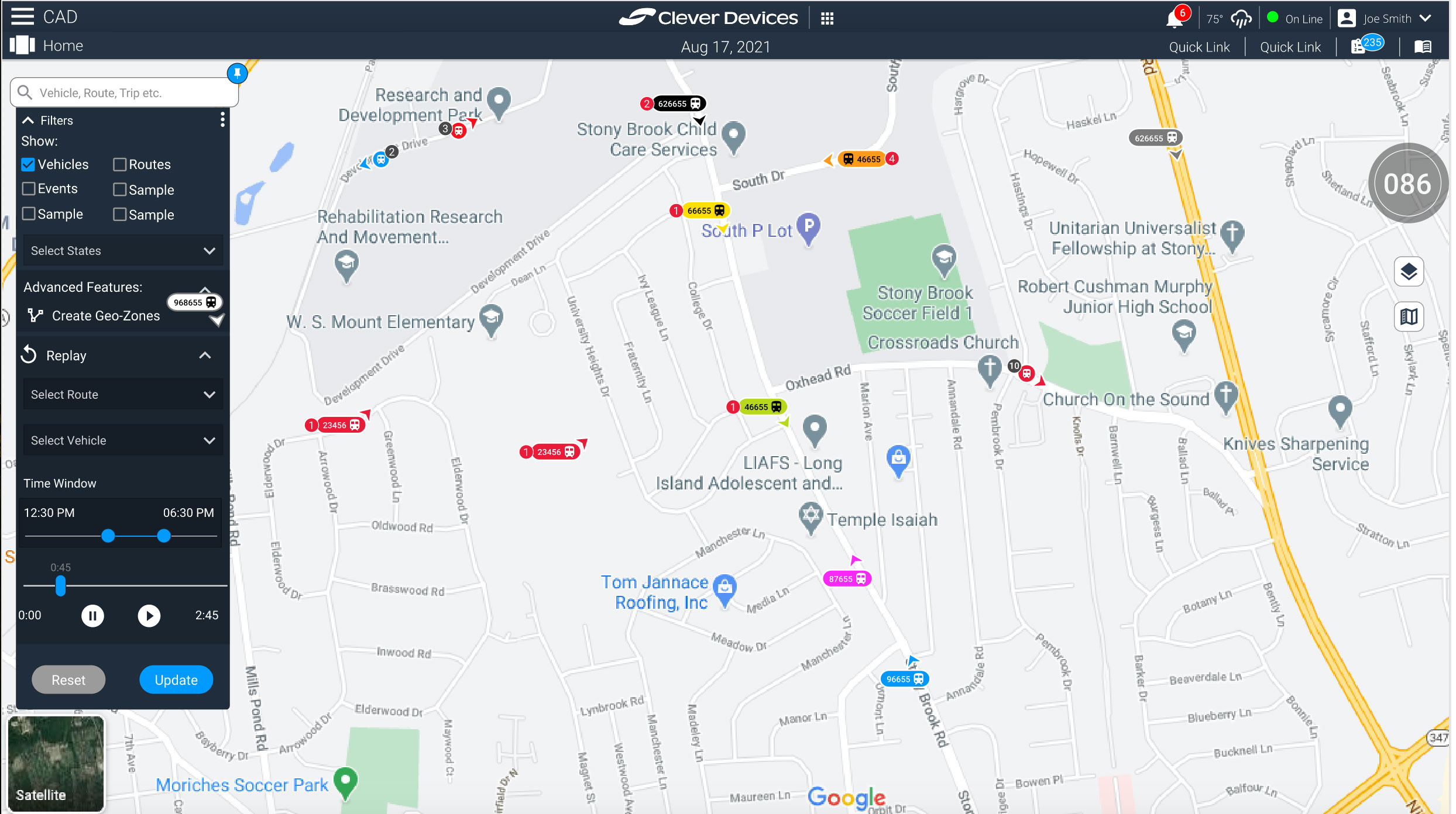
The map interface was identified as a critical starting point because the existing experience was visually outdated, difficult to navigate, and overloaded with information. One of the most significant usability challenges involved the vehicle icons themselves, which needed to communicate multiple layers of operational data while remaining readable at scale across dense transit environments.
Operators needed to quickly identify vehicle type, status, direction, event indicators, and IDs—often while viewing hundreds of active vehicles simultaneously on the map.
The Approach
The redesign process began by focusing on the smallest but most frequently interacted-with component: the vehicle icon system. The goal was to simplify information density without sacrificing critical operational visibility.
I explored ways to create a scalable visual hierarchy that allowed users to quickly interpret vehicle states through color coding, iconography, directional indicators, and contextual event markers. Particular attention was given to readability and interaction behavior across different zoom levels and operational conditions.
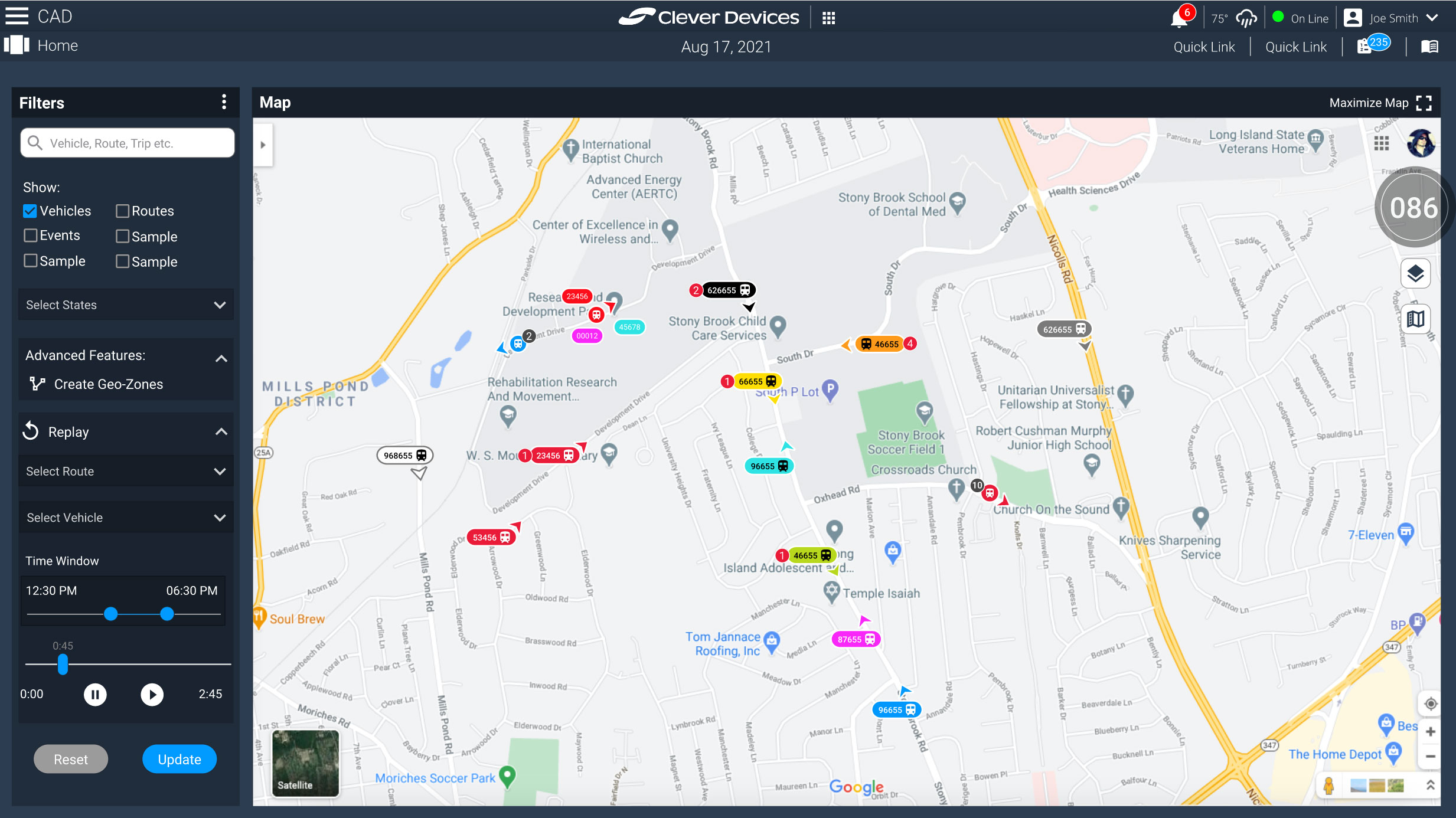
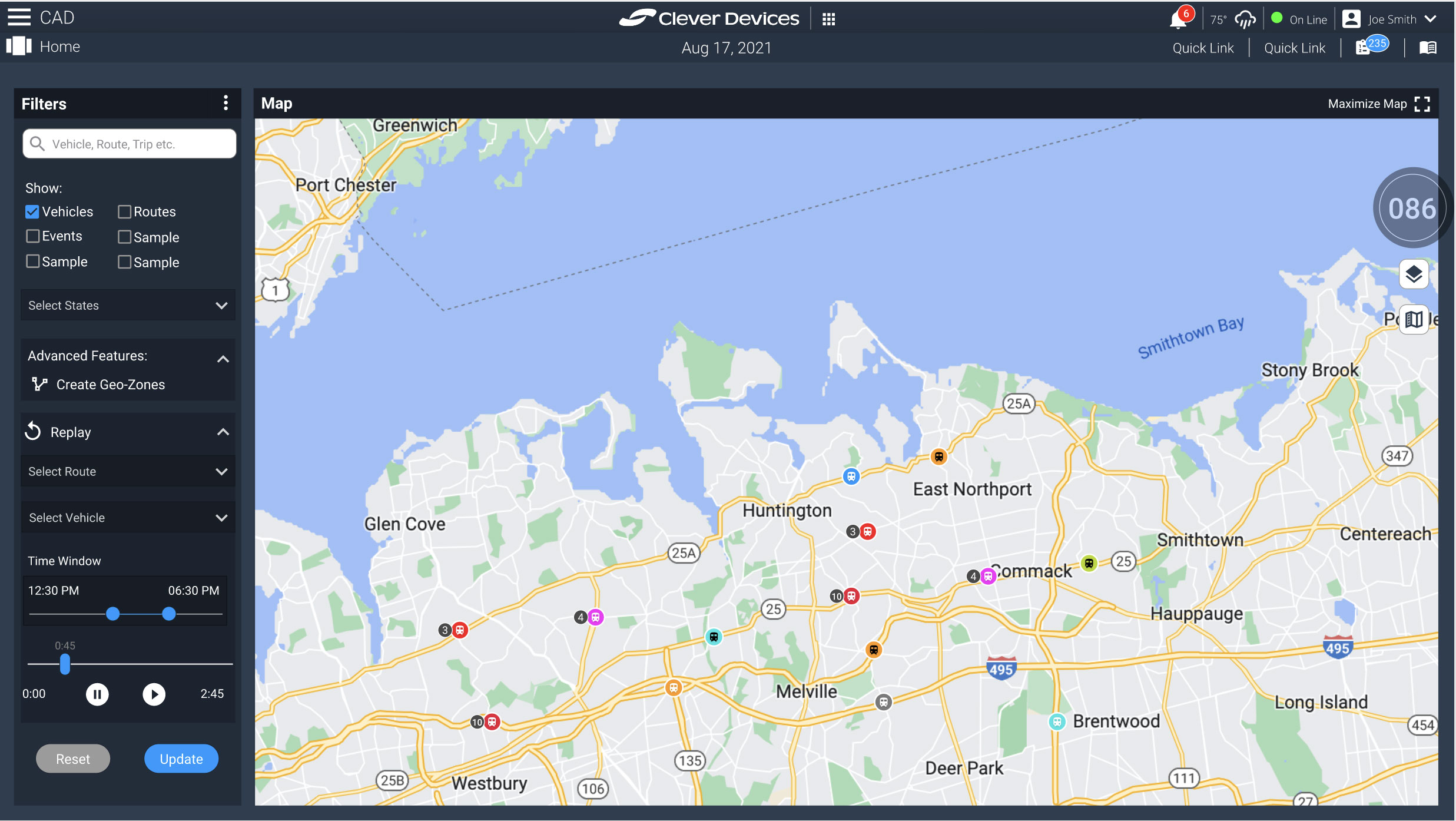
One of the major UX problems I identified was vehicle bunching, where overlapping icons made map interaction difficult and reduced situational awareness. Rather than relying on users to continuously zoom in and out to isolate vehicles, I proposed a more scalable interaction model.
The solution introduced grouped vehicle indicators that condensed overlapping vehicles into simplified cluster icons displaying vehicle counts. Selecting a cluster would progressively expand and reveal individual vehicles and associated operational details, allowing users to drill into specific events and actions without overwhelming the interface.
In parallel with the icon redesign work, I also contributed to broader UI enhancements and interaction improvements across the map experience to modernize usability and support more efficient operational workflows.
The Outcome
The redesign concepts introduced a more scalable and user-centered approach to handling complex fleet visualization within the CAD system. By simplifying dense operational data into clearer interaction patterns and progressive disclosure workflows, the proposed solutions improved readability, reduced visual clutter, and enhanced situational awareness for operators.
The concepts presented to product managers generated strong interest and helped establish a clearer direction for modernizing the platform’s mapping and operational experience while maintaining the depth of functionality required by transit agencies.
Enterprise Web Application Wireframing
Company: Prutech Inc
Role: UX Design • Wireframing • Information Architecture • Interaction Design
Tools: Figma • Wireframing • User Flow Mapping • UX Documentation
Enterprise Web Application Wireframing
Company: Prutech Inc
Role: UX Design • Wireframing • Information Architecture • Interaction Design
Tools: Figma • Wireframing • User Flow Mapping • UX Documentation
The Challenge
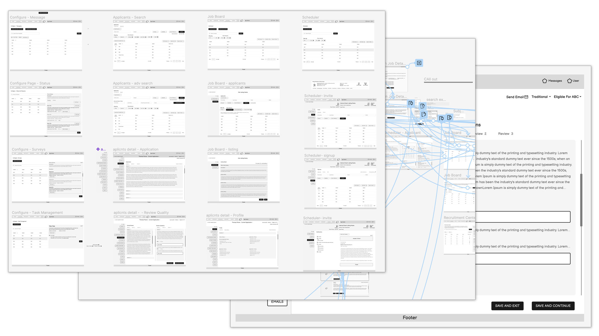
The project involved designing the foundational wireframe structure for a large-scale web application with complex workflows and multiple user interactions. The challenge was to translate business requirements, technical constraints, and operational goals into a clear and scalable user experience that could guide future design and development phases.
Because the application was still in early planning stages, the wireframes needed to serve as both a UX exploration tool and a communication framework between business analysts, stakeholders, and the IT team.
The Approach
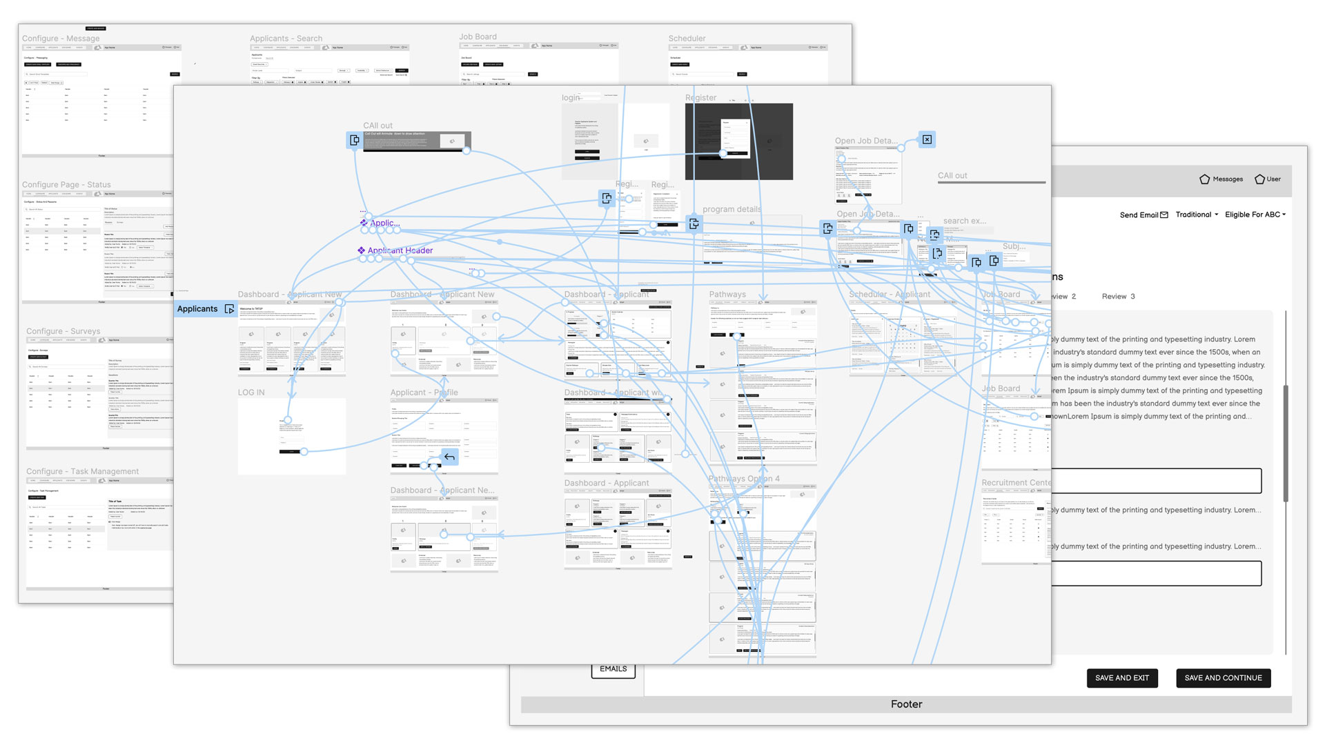
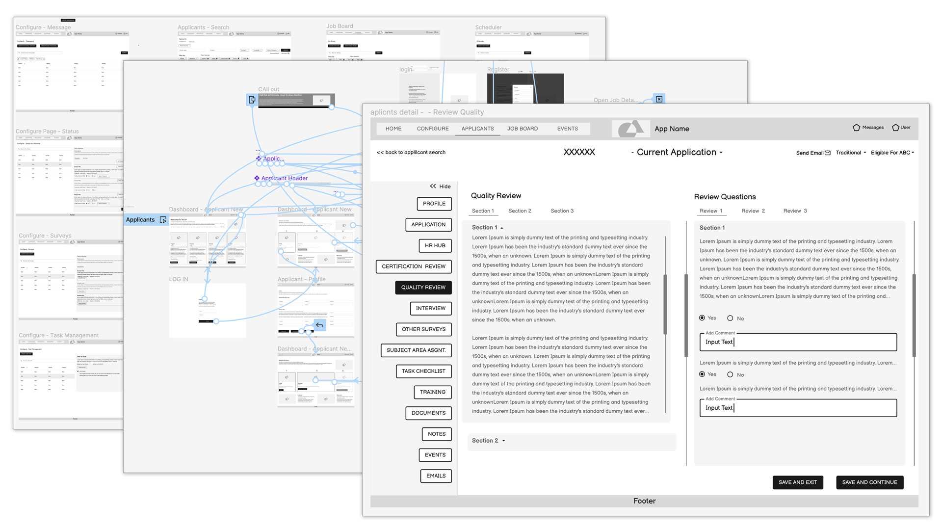
Working closely with business analysts and technical teams, I helped translate documented requirements and user task demonstrations into structured wireframe concepts that defined the application’s layout, workflows, and interaction patterns.
The process involved researching user flows, organizing information architecture, and designing wireframe systems that balanced usability with operational complexity. Throughout the project, I collaborated continuously with both the BA and IT teams, refining layouts and interaction patterns based on feedback gathered during review sessions and iterative discussions.
Flexibility and collaboration played a major role in the process, allowing the wireframes to evolve alongside shifting project requirements and technical considerations.
The Outcome
The resulting wireframe system established a strong UX foundation for the application’s future design and development phases. By translating complex requirements into structured user flows and interface concepts, the project helped align business, technical, and user experience goals early in the product lifecycle.
Beyond the deliverables themselves, the project reinforced the value of close cross-functional collaboration and iterative UX thinking when working within large enterprise environments.
Sometimes we need Reports
Company: Clever Devices
Tools: Adobe XD, HTML, Bootstrap, CSS(Sass), Javascript
Sometimes we need Reports
Company: Clever Devices
Tools: Adobe XD, HTML, Bootstrap, CSS(Sass), Javascript
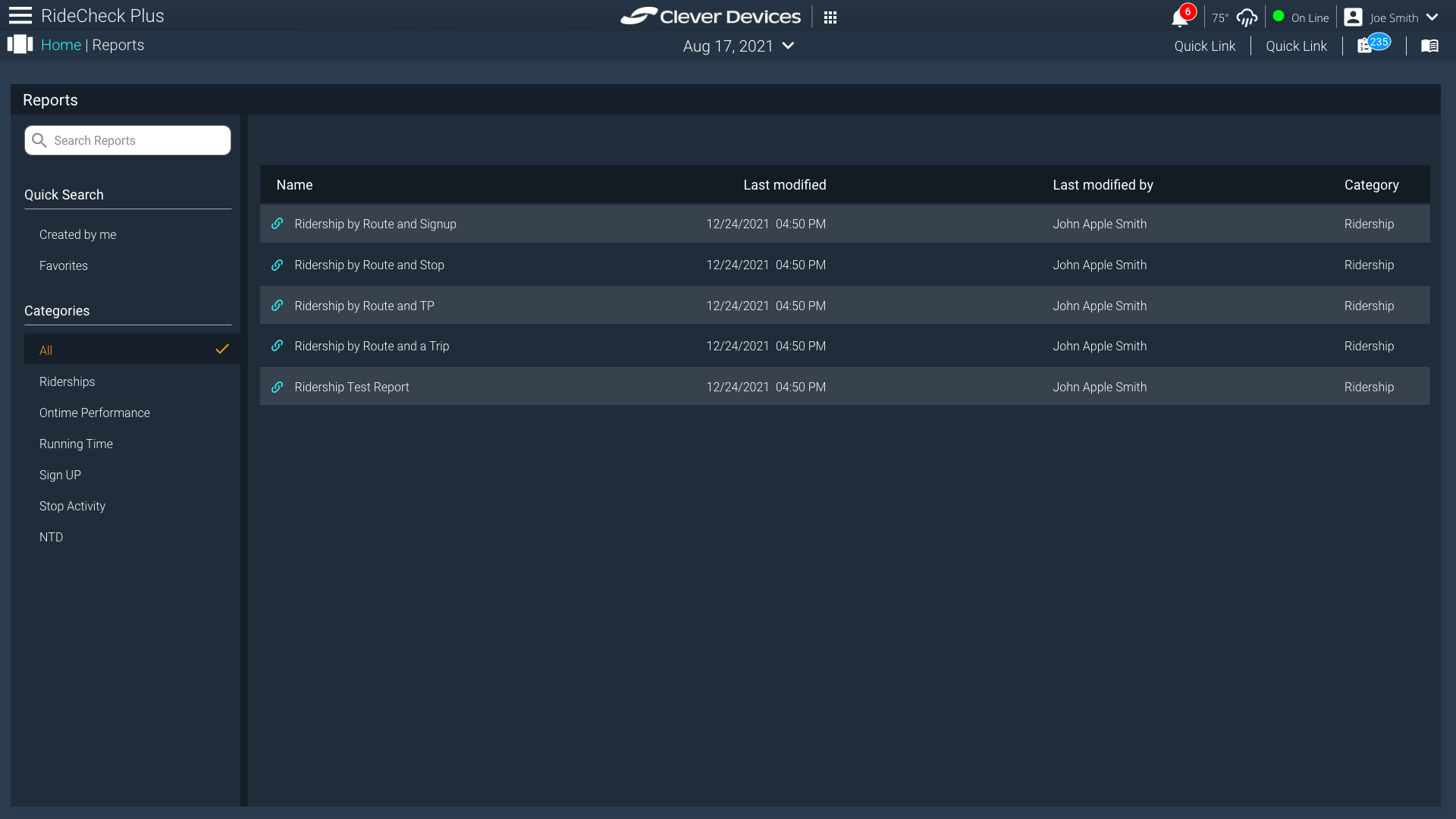
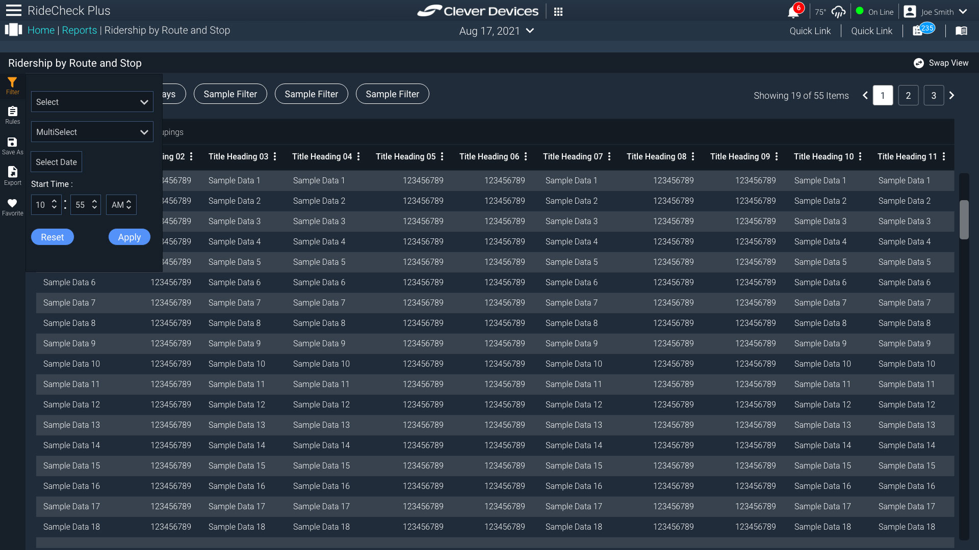
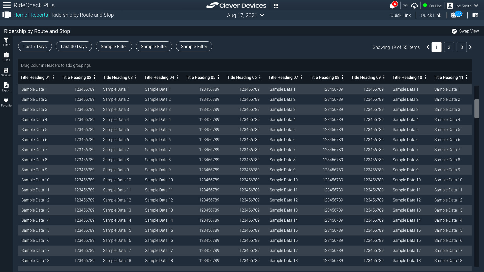
This project focused on redesigning a reporting application used to view, filter, and manage structured data across multiple report types. The existing experience lacked clarity in navigation and made it difficult for users to efficiently move between reports or refine data views.
Challenge
Users needed a more intuitive way to access and interact with multiple reports while maintaining the ability to filter and refine large datasets. The existing structure did not clearly separate navigation from data exploration, creating friction in task completion.
Approach
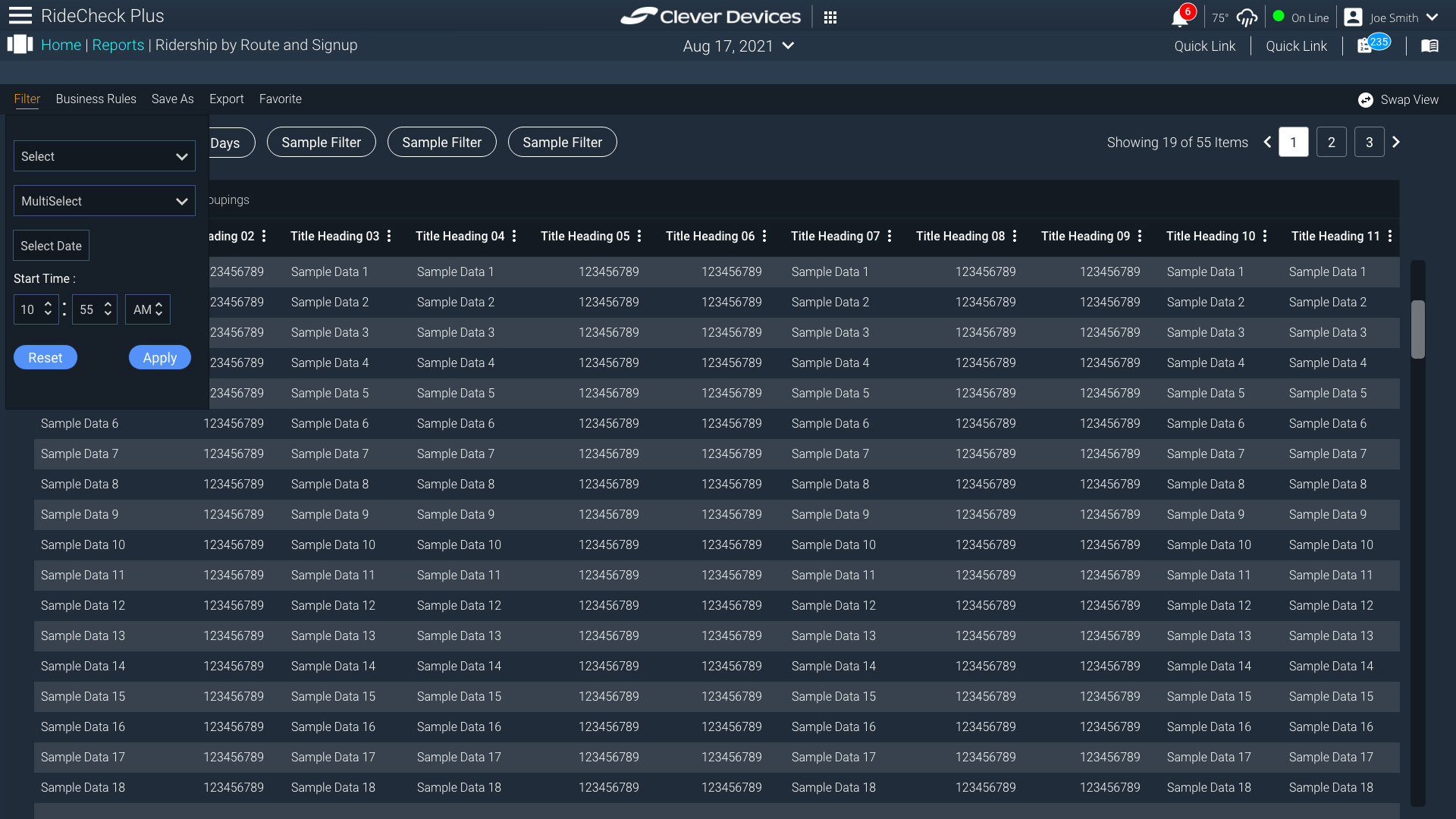
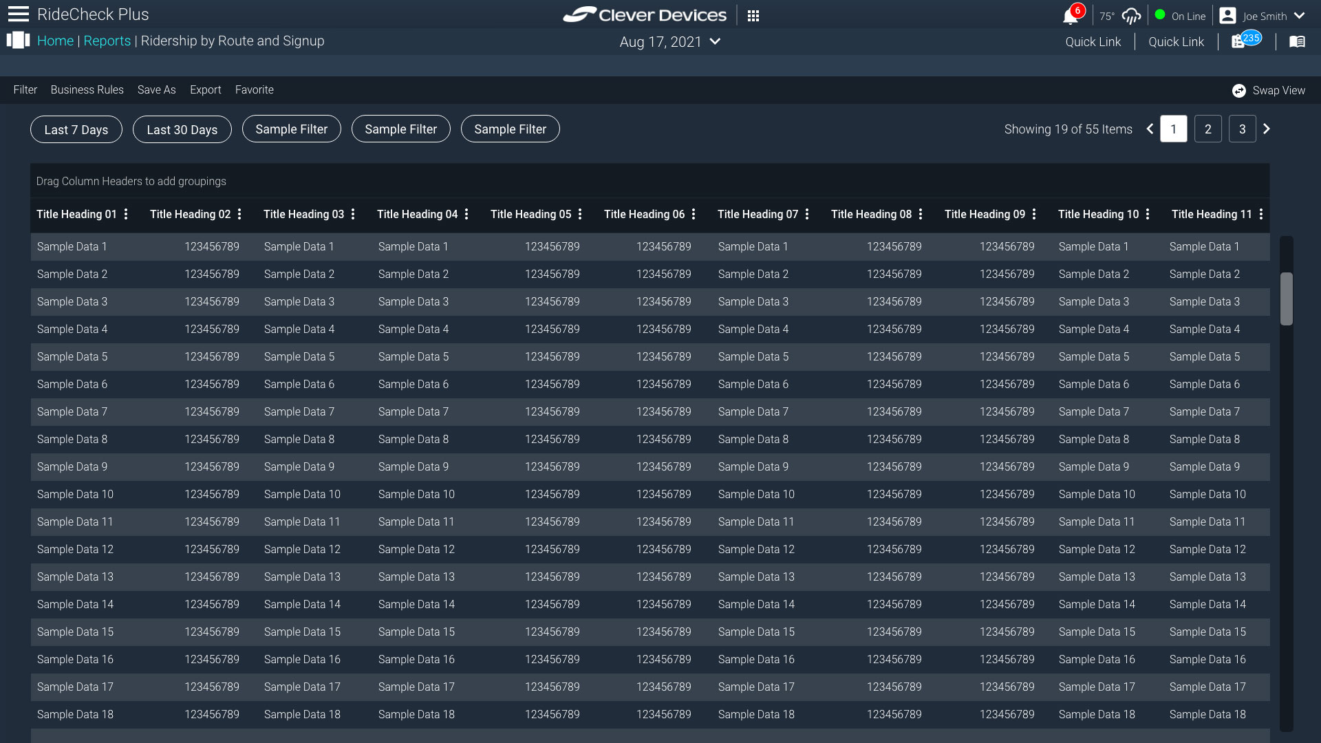
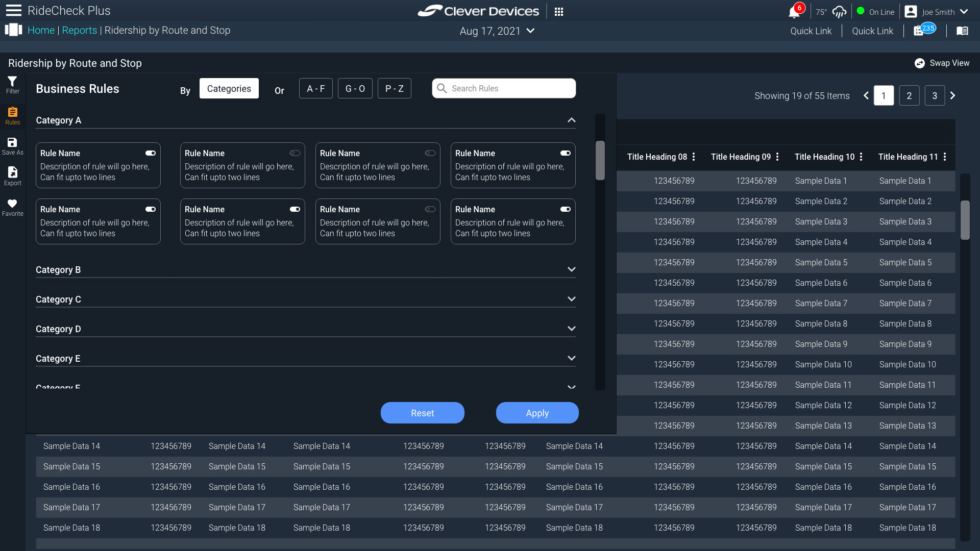
I redesigned the main reports interface and proposed two different navigation models for the sub-page experience. The first approach integrated report navigation into a top header layout, keeping controls closely tied to the primary content. The second approach introduced a persistent side navigation pattern to separate report selection from data interaction.
Both directions were designed to evaluate trade-offs between screen efficiency, scalability, and ease of access. The goal was to determine which structure best supported frequent report switching and filtering behavior.
Outcome
The proposed designs were well received by stakeholders and selected as the direction for the next phase of development. The final concept established a clearer structure for report navigation and provided a scalable foundation for expanding reporting functionality in future iterations.
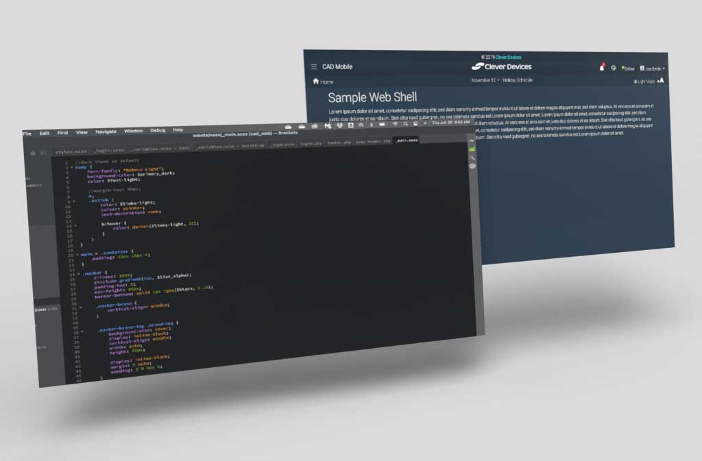
The ask from the stake holders, was to develop a web shell that the developers would utilize to create future applications. Since I had developed a design system that all our applications would follow, it would make the developers job easier if they all had the same starting point to work from. I created my own toggle for dark and light mode. Coded the CSS so that the swap would be easy. I wanted more control than having a frame work handle the swap. Our dark mode was based on shade of our corporate colors and used that as my baseline. There was still some work to do on the mobile portion of the site, but since this application was not meant to be utilized on a phone, the responsiveness was not necessary at the point of delivering the code to the developers. I used bootstrap 5, sass, and some minor javascript for this.
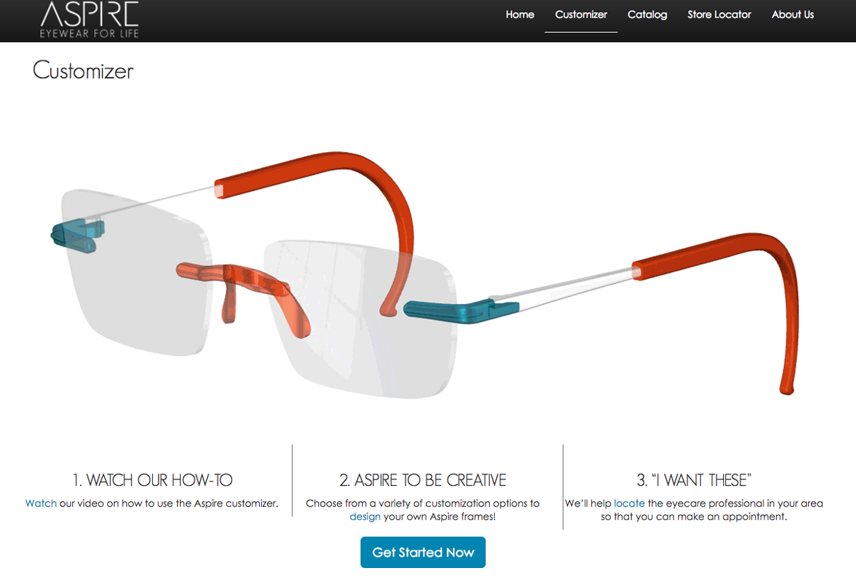

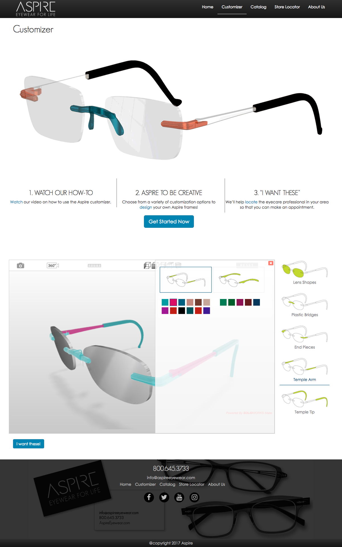

We have been working with a vendor for about a year to develop our own frame
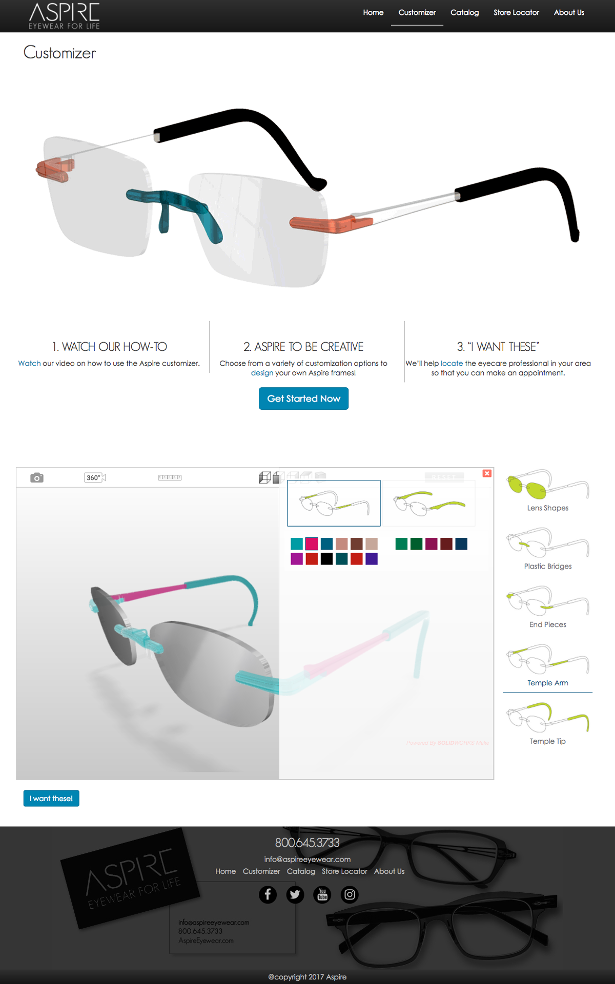
customizer. The UI that the vendor provided was very technical and good for a designer to use, but not a consumer looking to change pieces and colors.
In the first version of the customizer we were only able to change certain aspects. I mocked up some changes, and I created my own CSS which I provided to them to ensure that my changes would get done as expected. The small changes to the UI created for a cleaner more suer friendly approach. The customizer is not responsive and has more changes ahead but the current state was improved significantly.
Months later vendor provided us with a new implementation and we had more control over different aspects of the tool per our requests. So knowing we can change more of the tool, I mocked up a wireframe to show my team members how I envisioned the tool to work and how we can leverage more real estate by using an overlay to show the options based on the main selection. The team loved the concept as well as the managers, and we moved forward.
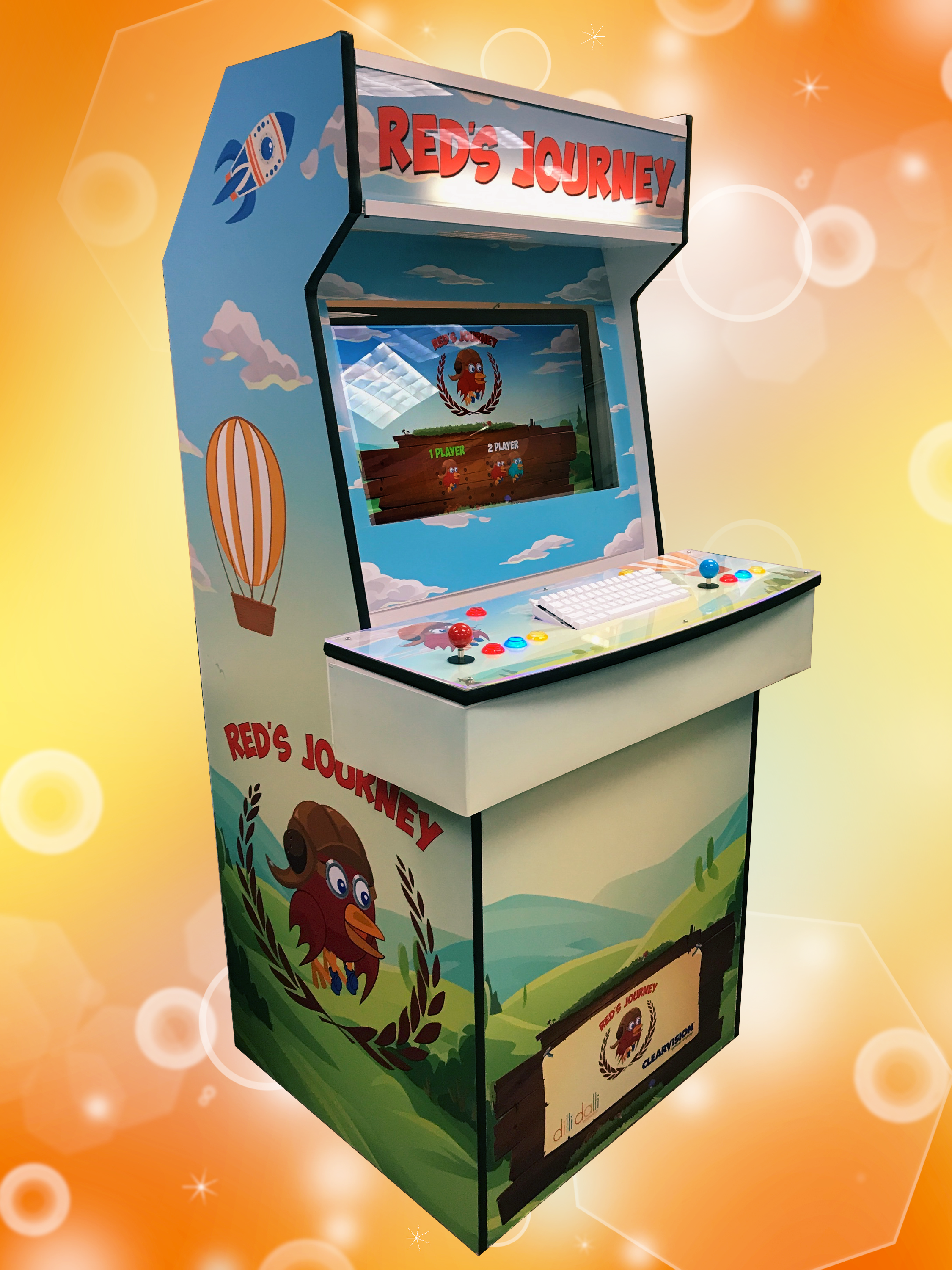
So not only did we create an android/iphone version, but we got a custom arcade cabinet made (thanks to Andres Gaete) arcade-pi.com. We developed a version of the game to be two player version of the game which adds some strategy and additional fun!
The arcade version brings back some nostalgia as well as adding that tactile feedback we all love. If your in Las Vegas for Vison Expo come check out ClearVision at Vision Expo West 2017 Booth #16087 to play on our arcade version.
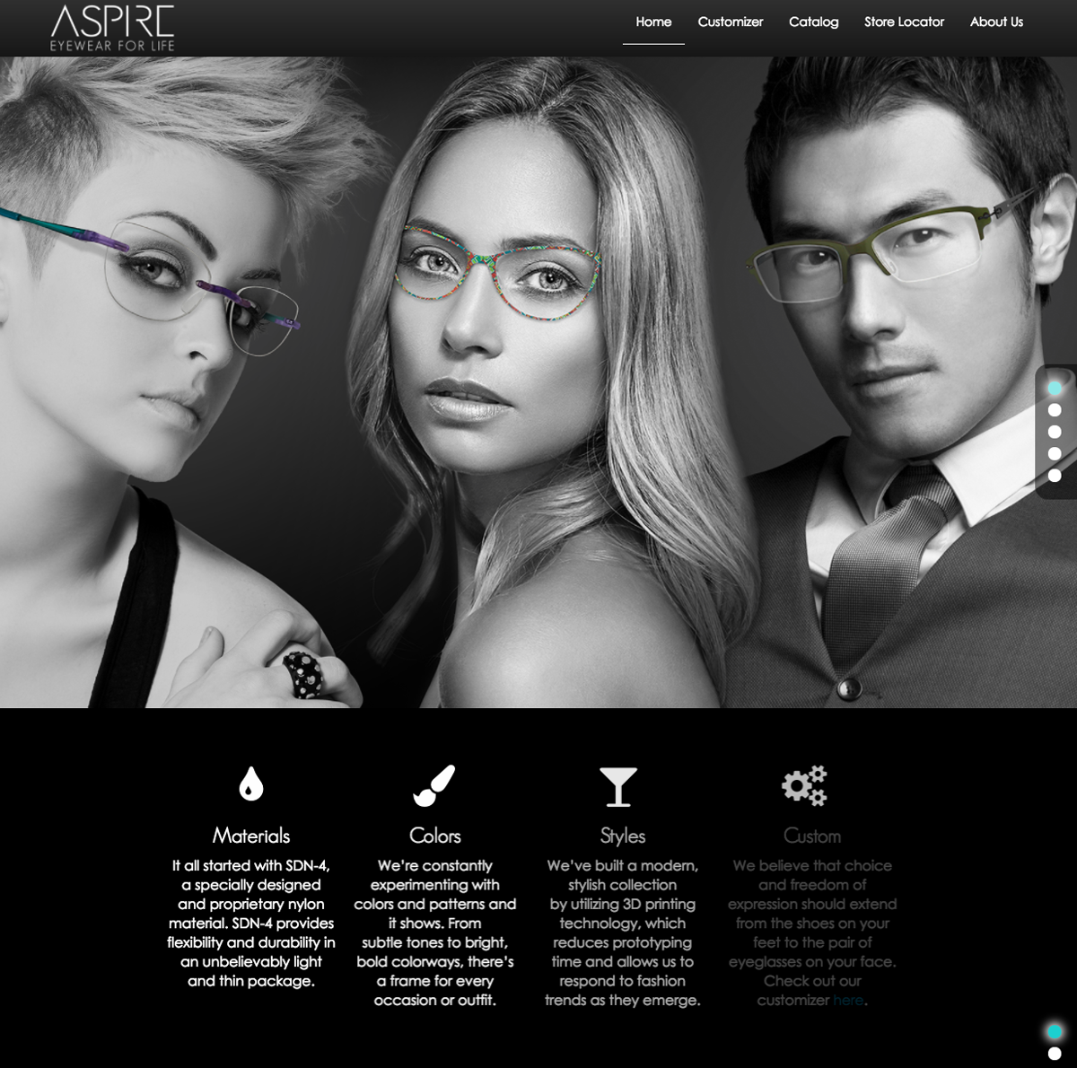
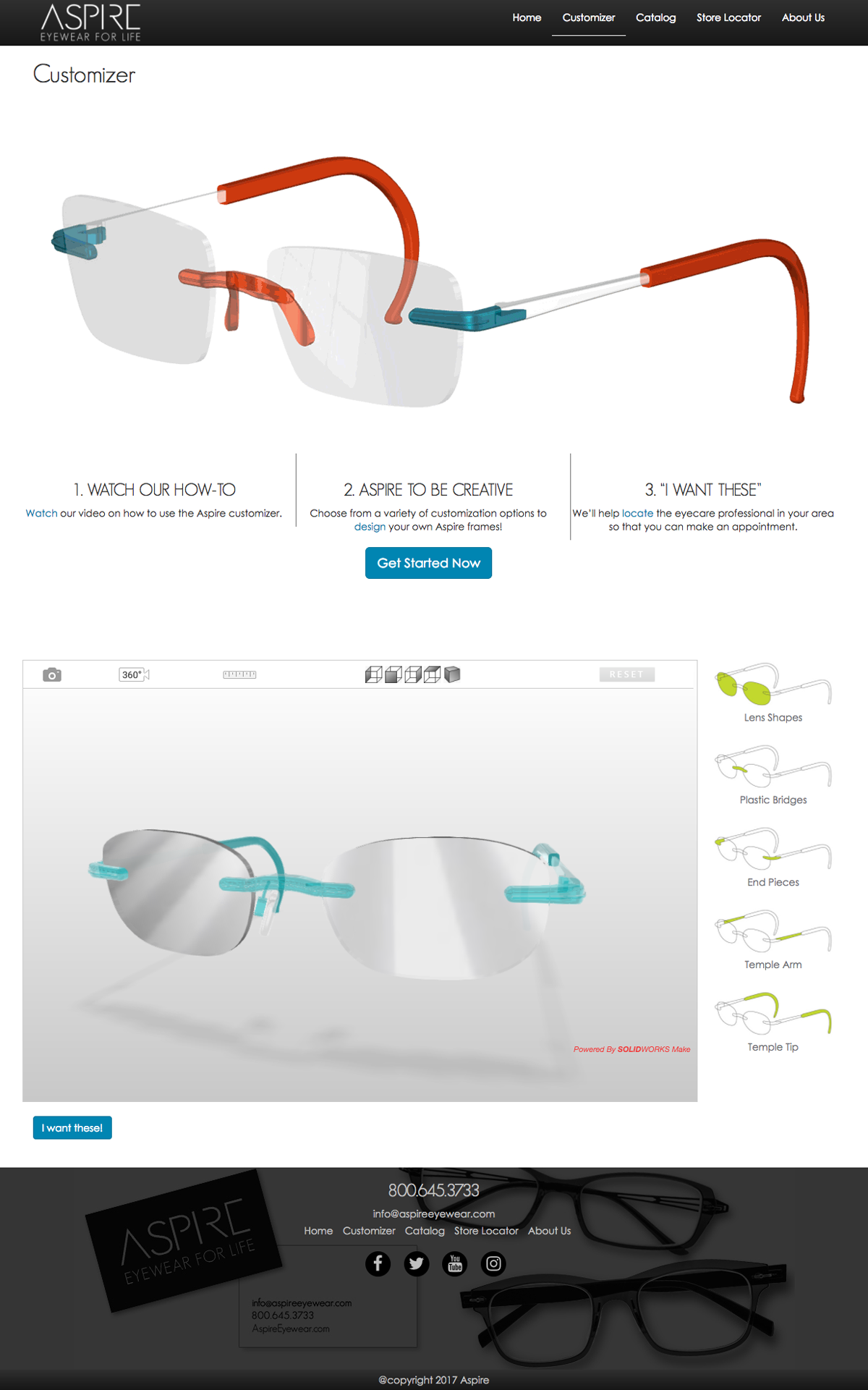
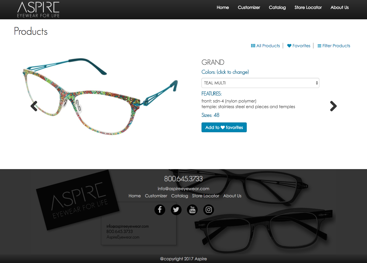
After designing and developing a new template for the Aspire brand it has finally gone live. I did wish I had more control over the images and copy for the site, but at least it was fun learning and implementing 75% of how I envisioned the site to look like.
The customizer was a fun project, got to rework the interface and make the user experience a more enjoyable encounter. There was a ton of back and forth between us and the vendor, but the overall exchange between us has created a great working relationship.
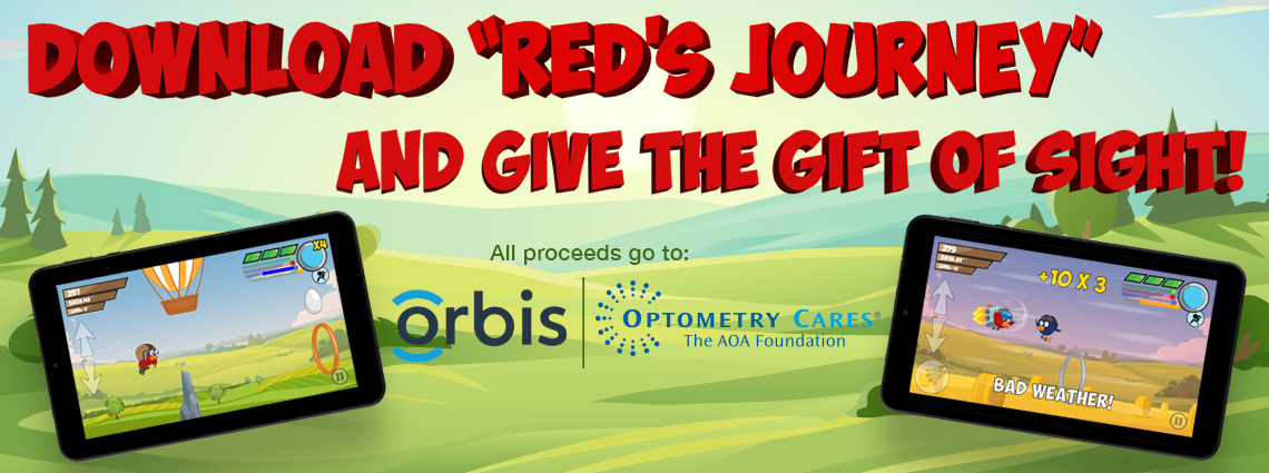
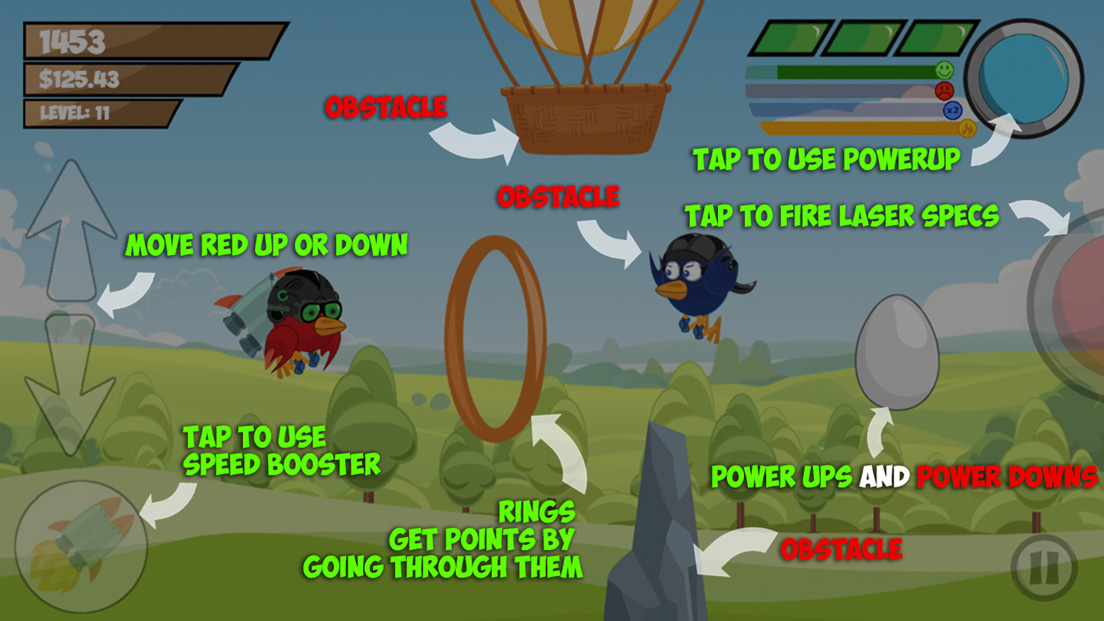
So after month’s of work, after many iterations, and after some user testing, we are launching the game on Sept. 14th. For more info check out this page. Reds Journey
I wore many hats during this project. From wire-framing, to character development, to UI/UX, front end development, and some strategy. So in short I learned alot! I also failed alot, but that’s all part of the learning process.
So in short please download our game, and please feel free to give back any feedback, and keep in mind all proceeds go to charity.
Thanks!!!

So we have moved towards a beta version of our game. We have created a desktop version, as well as porting over it to IOS and Android via phonegap. We are currently testing the game for bugs. Once we complete all testing, we will submit in App store and google play store.
It’s been fun, frustrating, but in the end very rewarding to have worked on this project!!
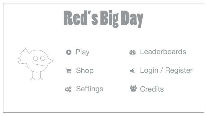
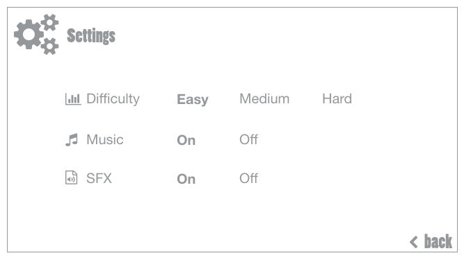
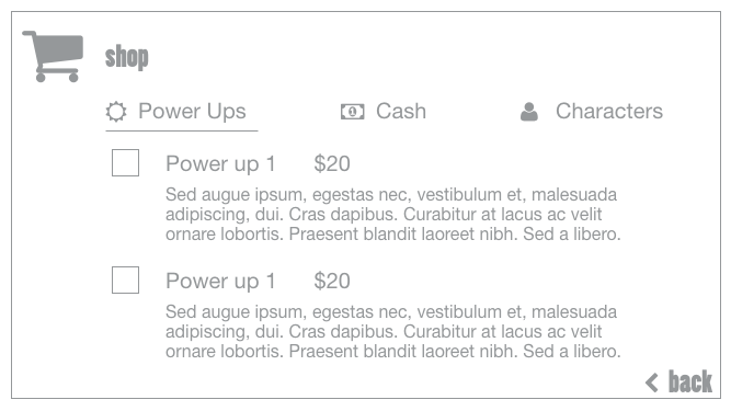
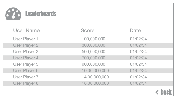
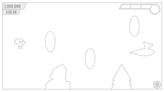
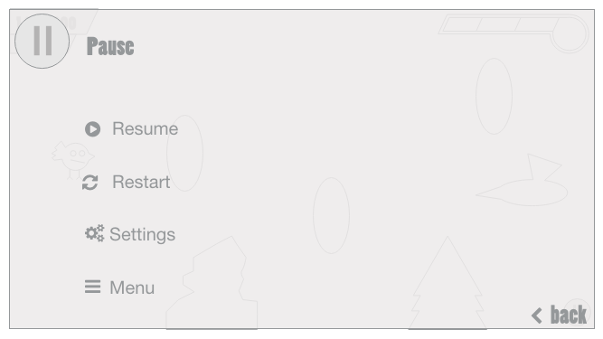
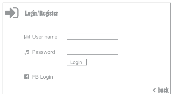
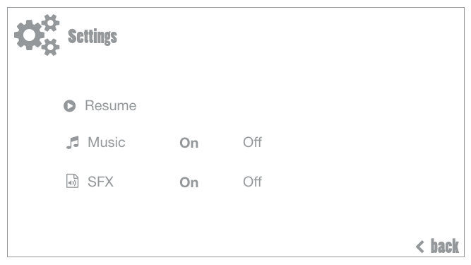
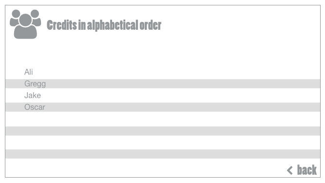
So we are at the beginning stages of building our game. We have an intern who’s focus in school is game development, so we are testing the waters and building a mobile app game.
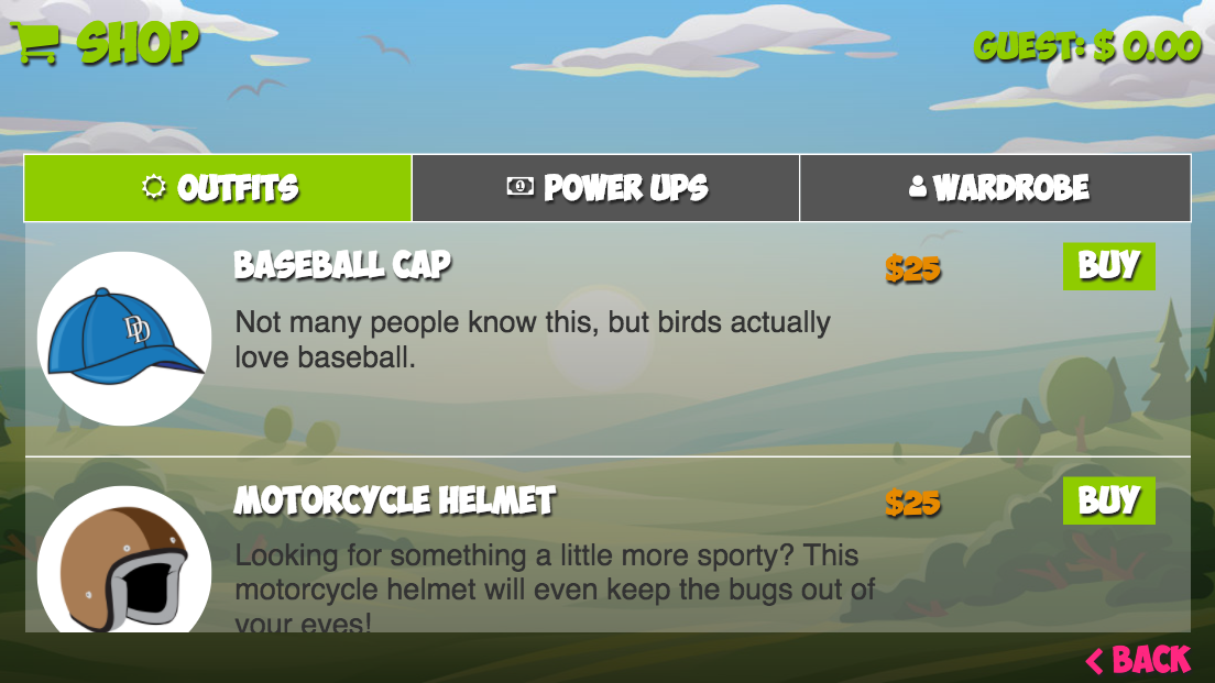
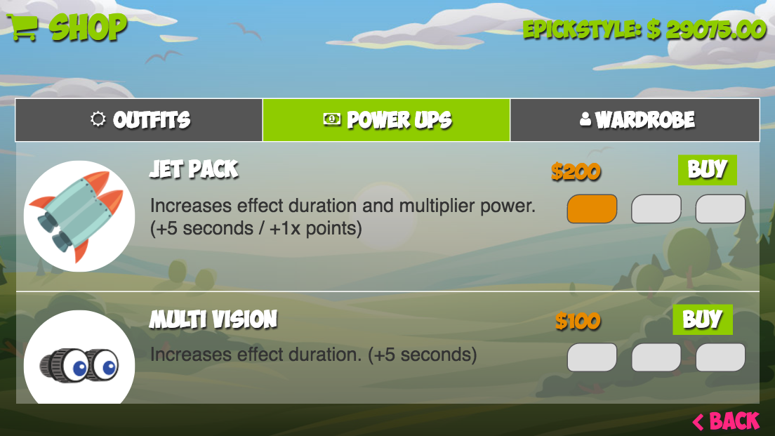
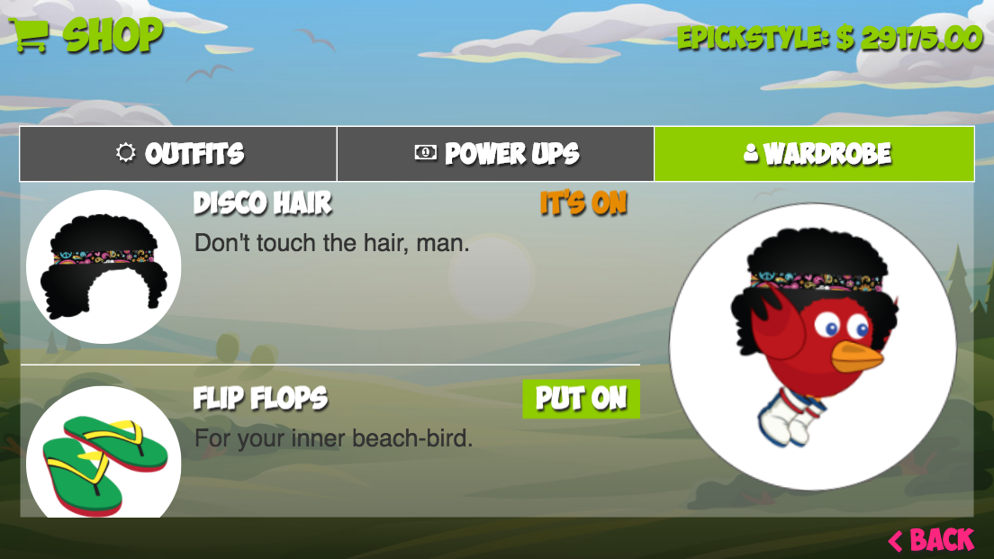
We are starting out as a mobile web game and then porting it over to IOS and android via PhoneGap. The screens you see are our part of our UI/UX portion.
I have developed these screens as we defined our our requirements for the game. From here, I will create the other screens that our game developer will add, for example the shop, the settings, etc in html.
Finally getting stoked about some of the work here!
Improving Data Visualization Through Rapid Prototyping
Company: Clear Vision Optical
Role: UX Designer / Interaction Designer
Tools: Adobe XD, HTML, Bootstrap, Javascript
Improving Data Visualization Through Rapid Prototyping
Company: Clear Vision Optical
Role: UX Designer / Interaction Designer
Tools: Adobe XD, HTML, Bootstrap, Javascript
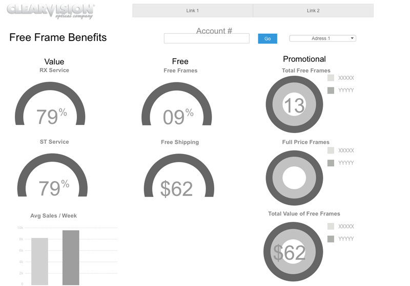
This project focused on rethinking an existing interface that displayed complex datasets through charts, tables, and structured reports. The initial version prioritized output over usability, making it difficult for users to quickly interpret information or identify meaningful insights.
Challenge
The primary challenge was improving how complex data was presented and consumed within the interface. Users needed a faster way to understand trends, compare values, and interact with datasets without being overwhelmed by dense or poorly structured visualizations. The existing design lacked clear hierarchy and did not effectively support exploratory analysis.
Approach
I began by analyzing the data requirements and identifying the key user goals when interacting with the system. Rather than focusing on replicating the existing layout, I explored alternative ways to structure and visualize the information.
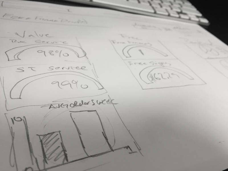
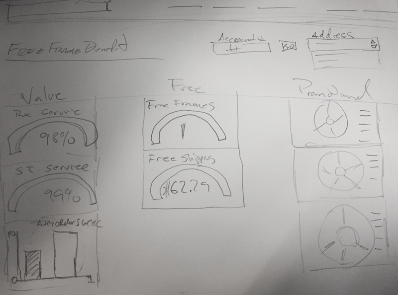
I created a series of low-fidelity wireframes to test different layout structures and information hierarchies. These early concepts focused on simplifying the interface and improving scanability, with particular attention given to how charts, filters, and supporting data were grouped.
From there, I moved into rapid prototyping, experimenting with different chart types and visualization patterns to better represent the underlying data. I evaluated how each approach supported comprehension, comparing static layouts against more interactive configurations that allowed users to explore the data more efficiently.
Throughout the process, I iterated based on usability considerations such as clarity, cognitive load, and visual hierarchy. The goal was not only to improve aesthetics but to ensure that users could interpret the data quickly and make informed decisions with minimal friction.
Once a refined direction was established, I transitioned the design into a working prototype to validate the interaction patterns and layout decisions in a more realistic environment.
Outcome
The final prototype provided a significantly clearer and more structured way to interact with complex datasets. Information was easier to scan, charts were more readable, and the overall experience reduced friction when navigating between data points and reports.
The improved design established a stronger foundation for development and demonstrated how thoughtful wireframing and rapid iteration can directly enhance usability in data-heavy applications.

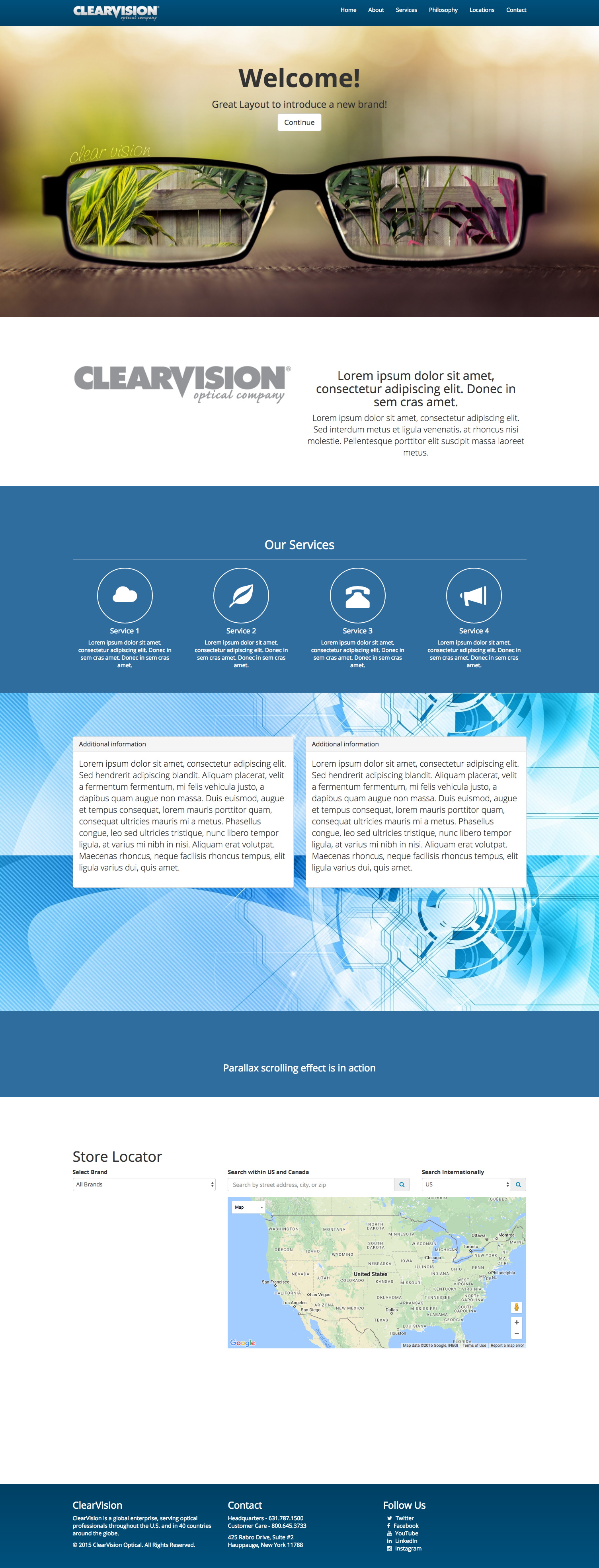
The challenge: Create a bootstrap parallax site.
Why? Cause I wanted to challenge myself!
Issues: Sharing code with non-parallax template and having sticky footer creating all sorts of problems.
Solution: Added body classes to both templates. Using php I passed the the classes and did a check for string position to see if the class had the parallax in it, if it does not echo the div with a class called wrapper which threw off the parallax site.
Problem solved!!
I have also created a style guide for our team to use. Its the homepage of this master template.
I have also customized the bootstrap framework, the responsive navigation is now a push menu.
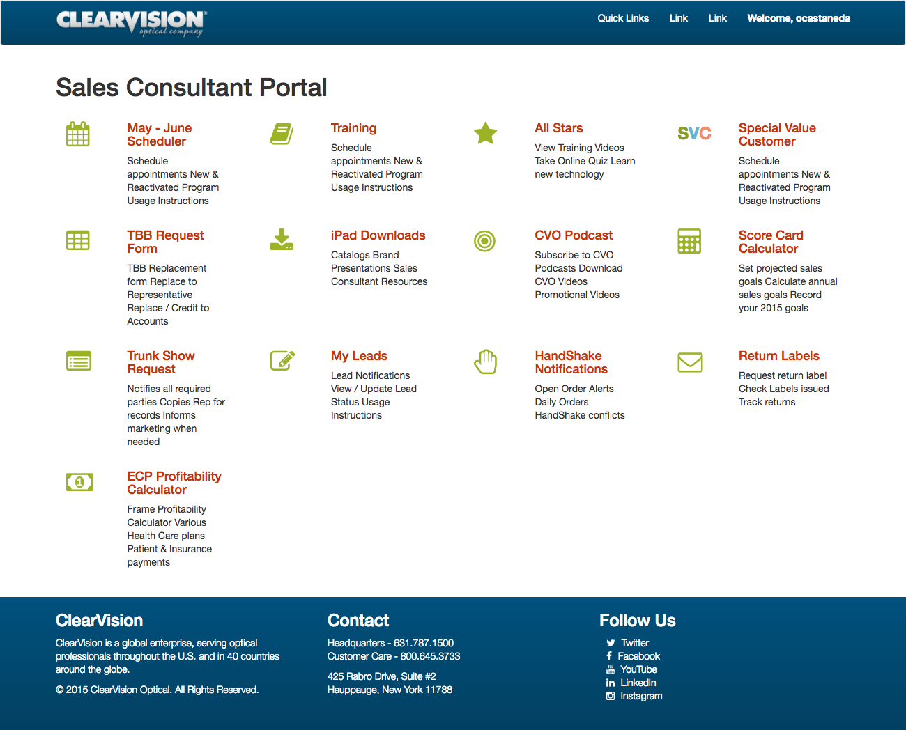
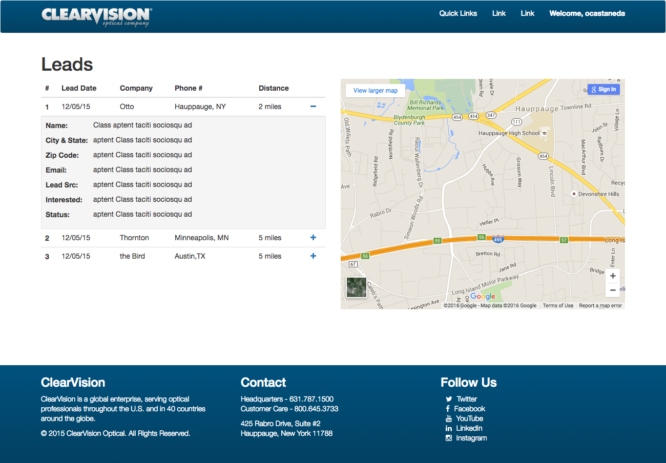
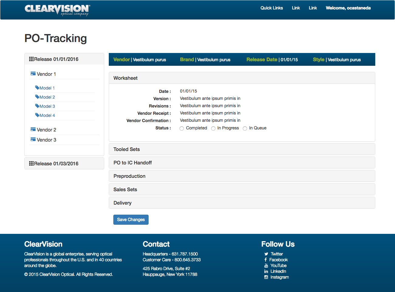
The project called for creating a new portal that was responsive. My approach was to build out a template that would house all our collective apps using the same principal foundation. This would solve the lack of consistency, between all the apps and since the template is built on on Bootstrap it would be responsive.
So far I’ve created 3 out of the 13 apps, I’m currently on hold until our backend team starts to pull content into the apps I have coded.

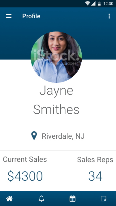
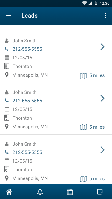
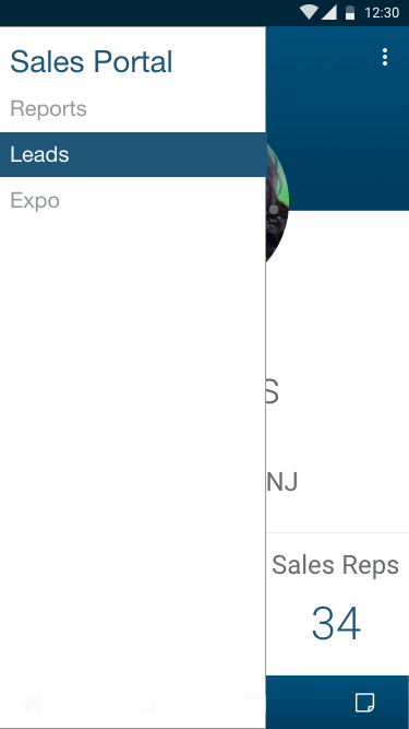
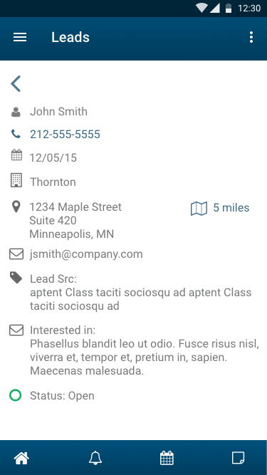
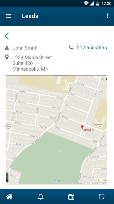
Problem: We need an app!! That is all I hear from higher ups at our company. The what they don’t realize is the lack of organization and direction is their main hurdle.
I stressed the importance of brainstorming, planning, and developing a strategy in order to get some solid requirements. With previous projects I have seen the waterfall effect of no proper direction and the project time exponentially grows due to improper management. With that said, I followed up with describing the proposed prototype.
… Company: Clear Vision Optical
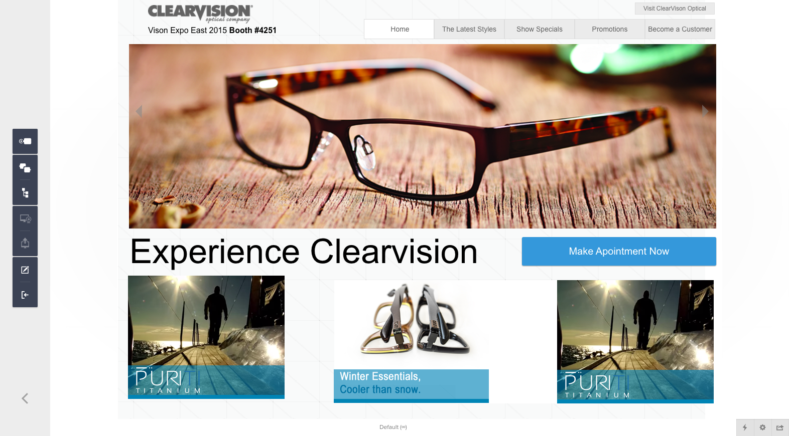
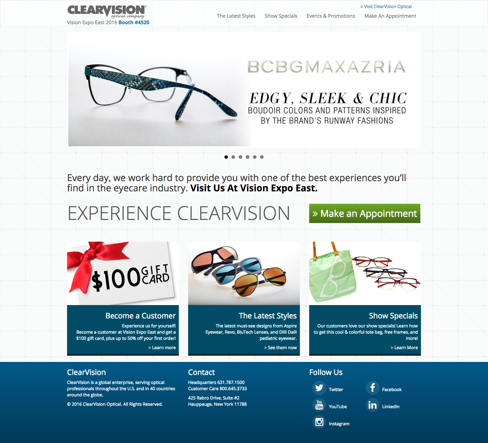
The problem with the project, I was asked to update content on an outdated site, with no cms. My solution was to redesign the the site as a responsive site built on WordPress for easy content management. I used our main site as a reference tool to capture elements that would keep you feeling like you were still part of the digital real estate of ClearVision Optical. The challenge for me was that this was my first real front end and backend build in WordPress.
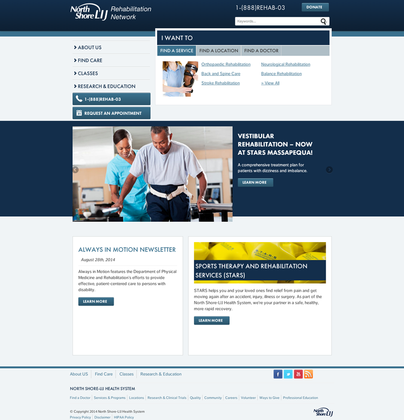

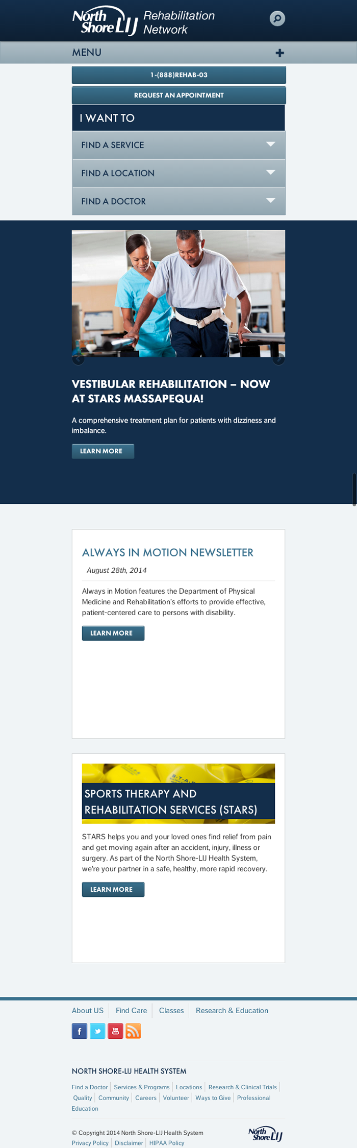
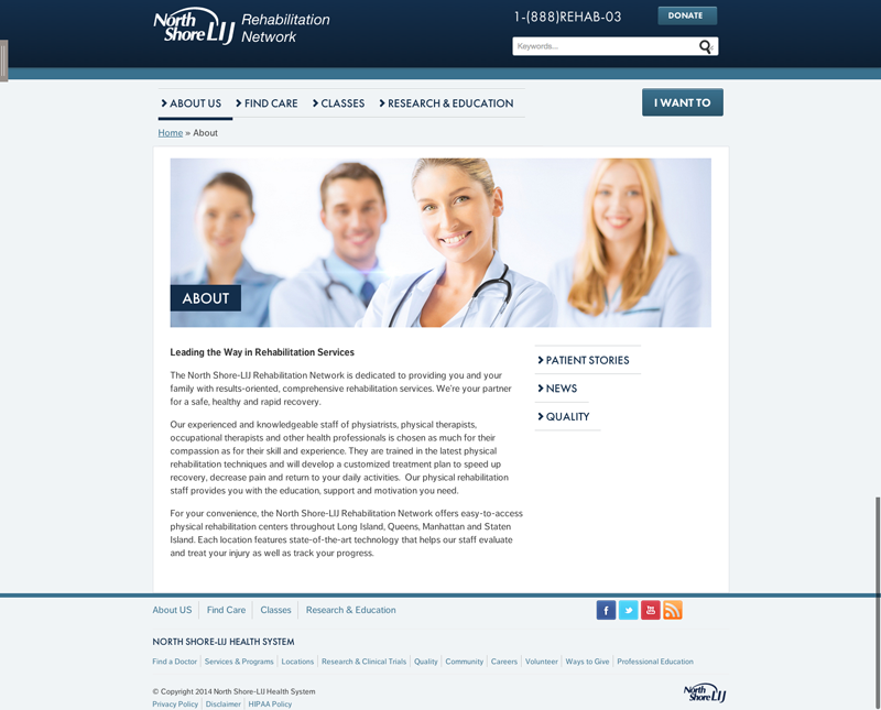
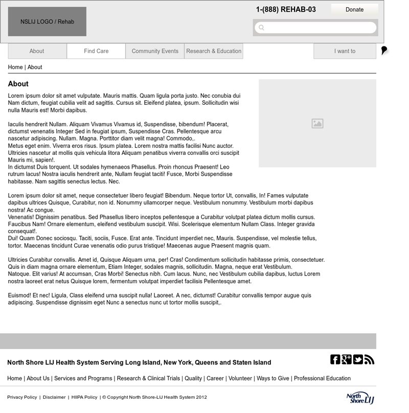
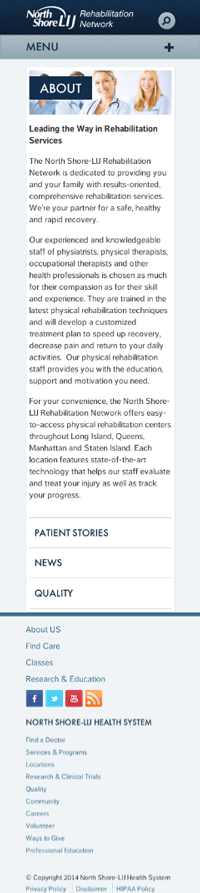
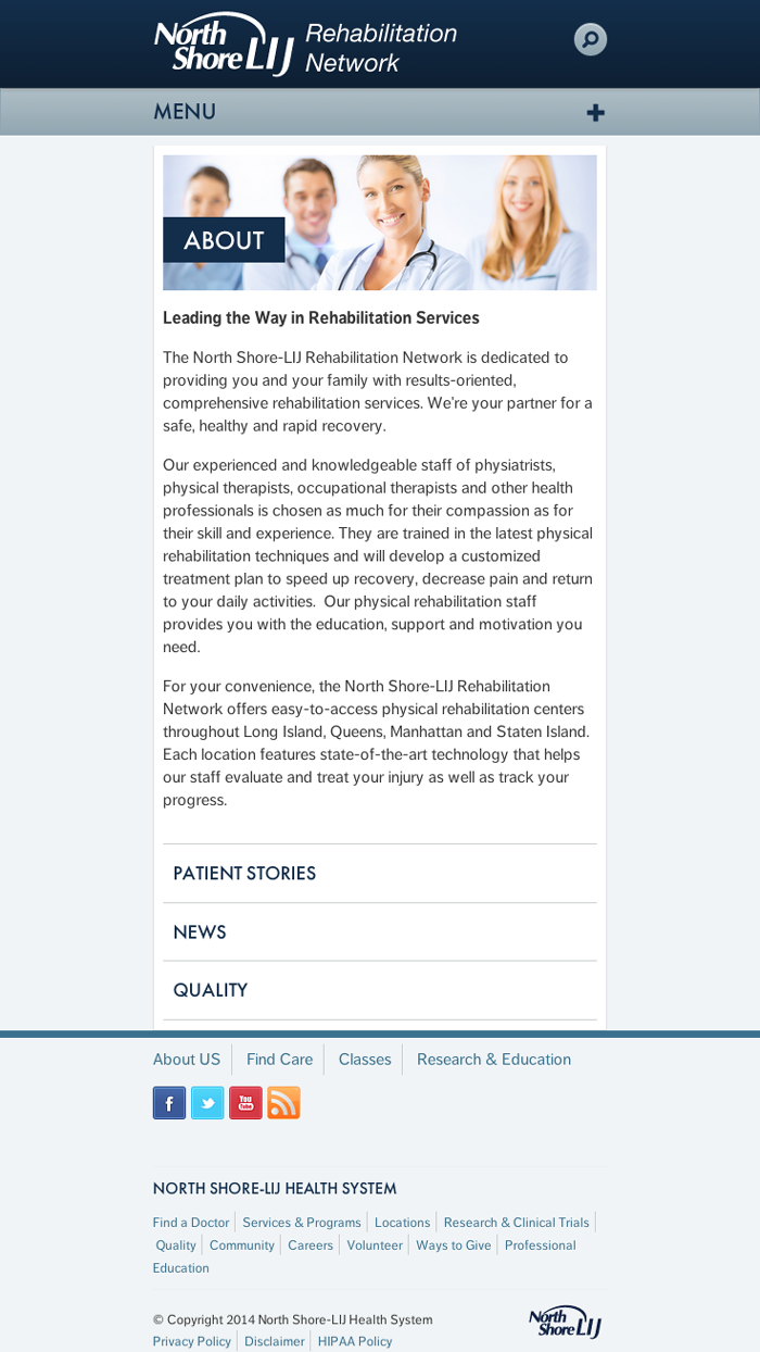
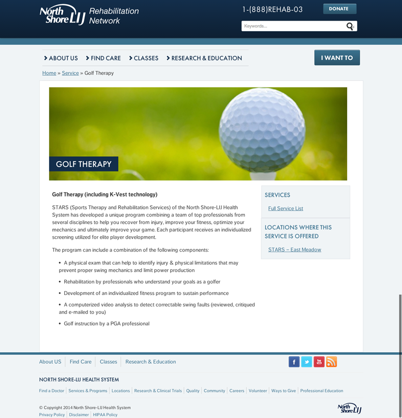
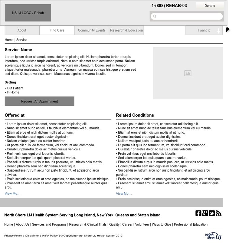
I worked closely with the Digital Strategist, project manager and leads from the Rehab center to deliver this website. The project was to use a predefined template but vary a bit from the template. We created some wireframes to give the business an idea of how the site will be structured. Since we had a very agile workflow, we took the wireframes and with rapid prototyping modified where we needed and completed the site as per the requestors requirements.
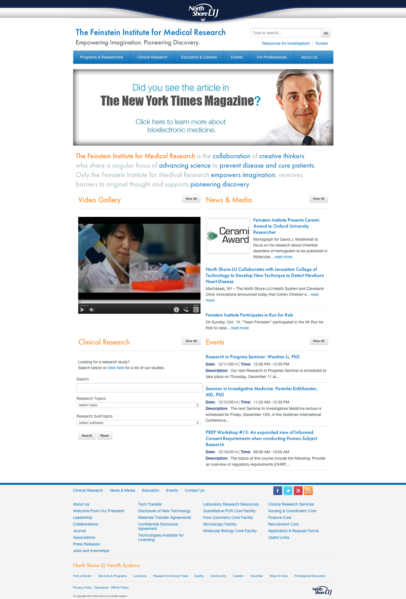
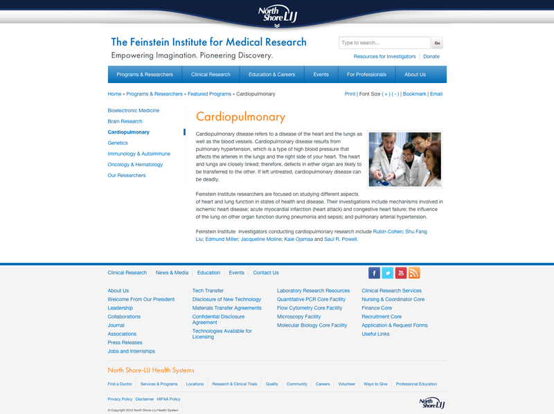
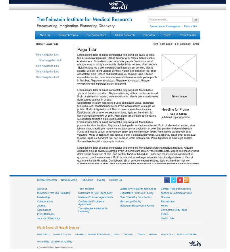

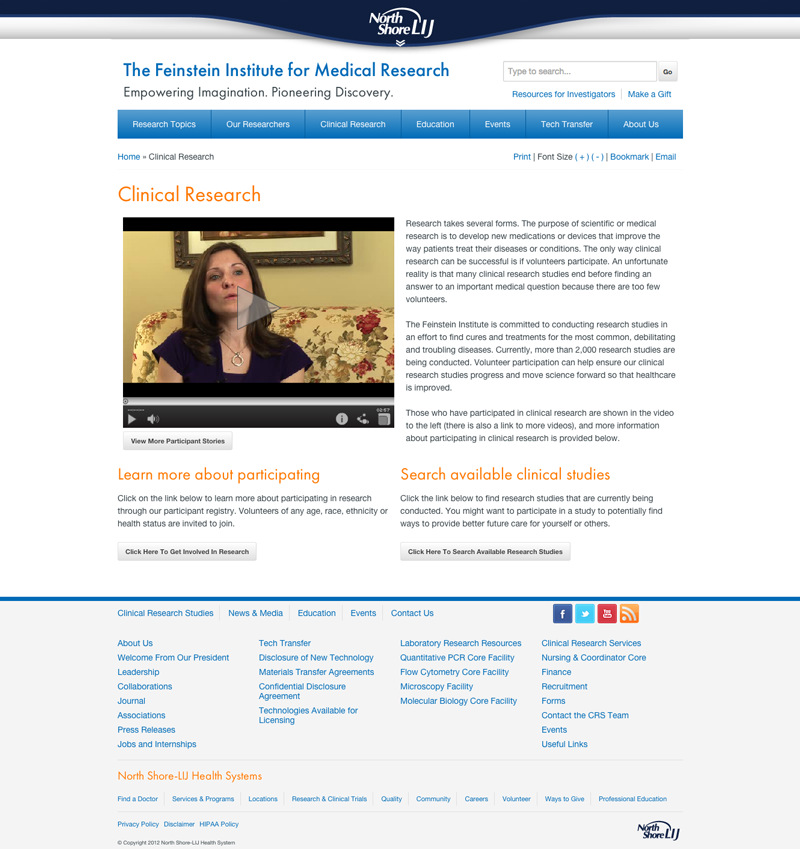

As the Digital Strategist, I worked closely with the project manager to gather requirements,create a site architecture, create some wireframes and then by doing some rapid protyping we were able to make adjustments where we needed to get the look and feel as intended and where we needed to tweak we did.
After a year of being live, as the Digital Strategist I reviewd some analytics and gathered new requirements and created a presentation to the President and Vice President of the Institute as well as other key members of the organization. The presentation explained why we needed to enhance sections of the website and to restructure the IA to increase visits to sections that were vital to the organization. The presentation was well recieved and the project was immediately approved.
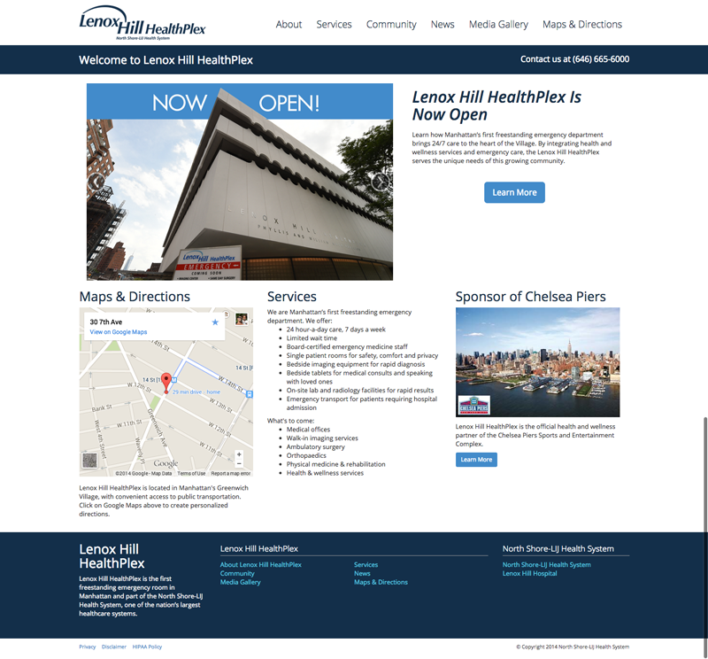
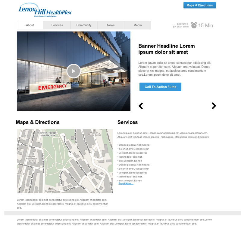
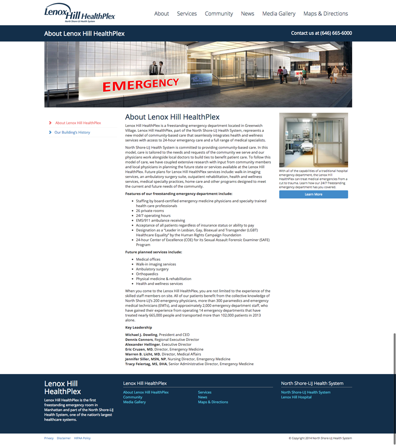
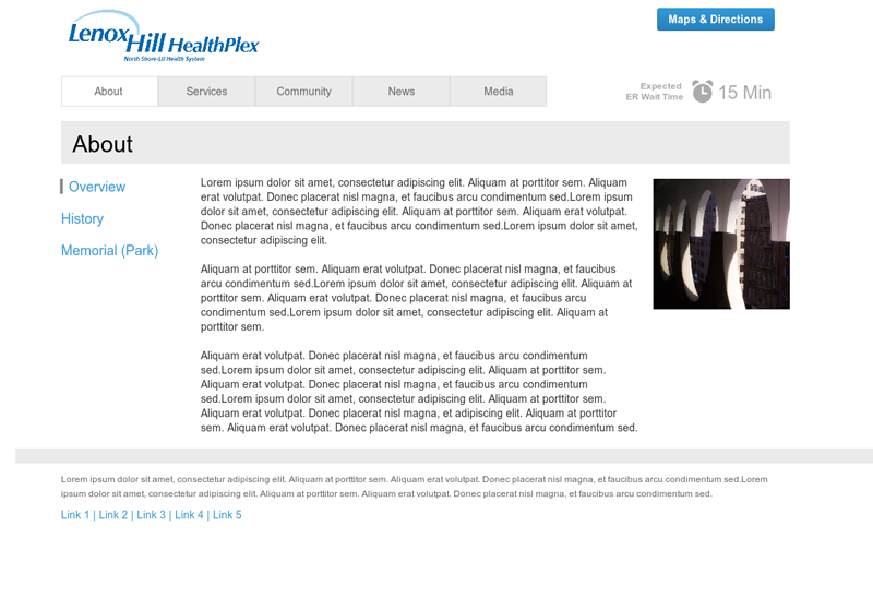
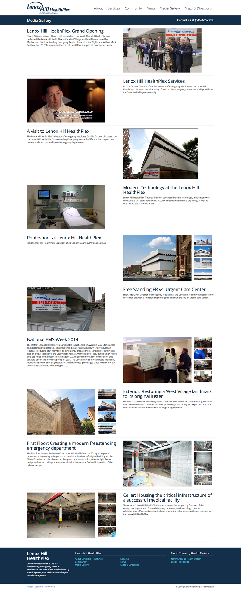
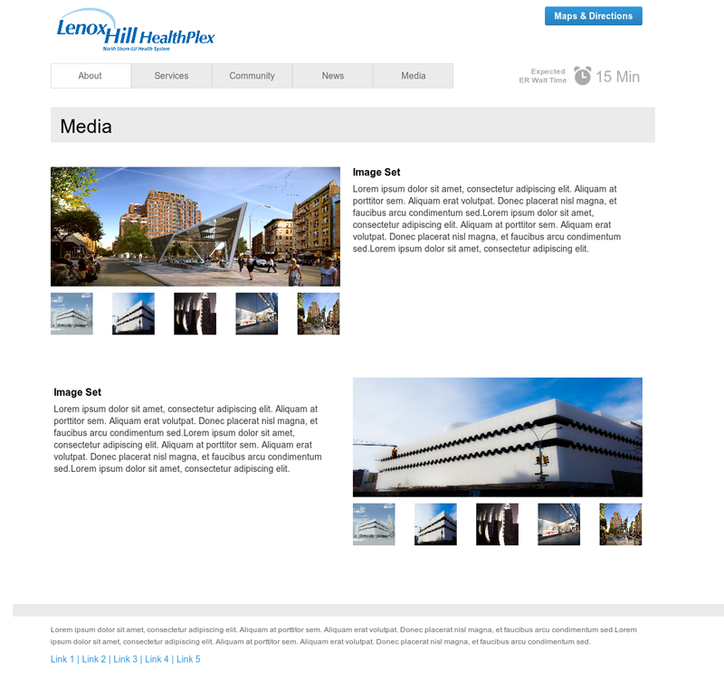
I worked closely with the Digital Strategist and project manager to create a design for a site that we did not have much idea what was needed. We had very little copy to work with. I created various wireframes and different prototypes to showcase the main message of the project. I had created a parallax version which was not approved and went with something more traditional and just made it look clean, modern, and made it responsive.
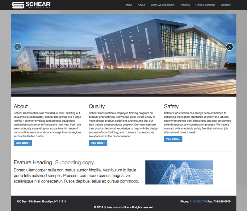
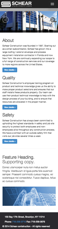

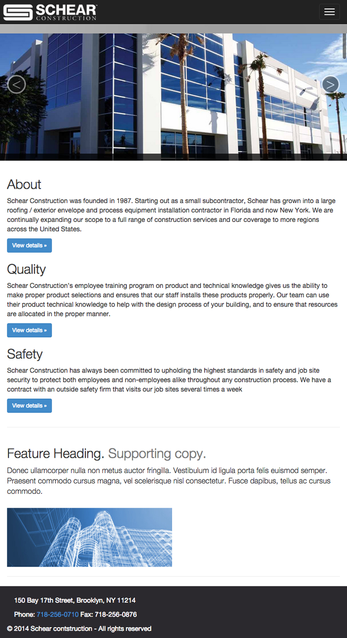
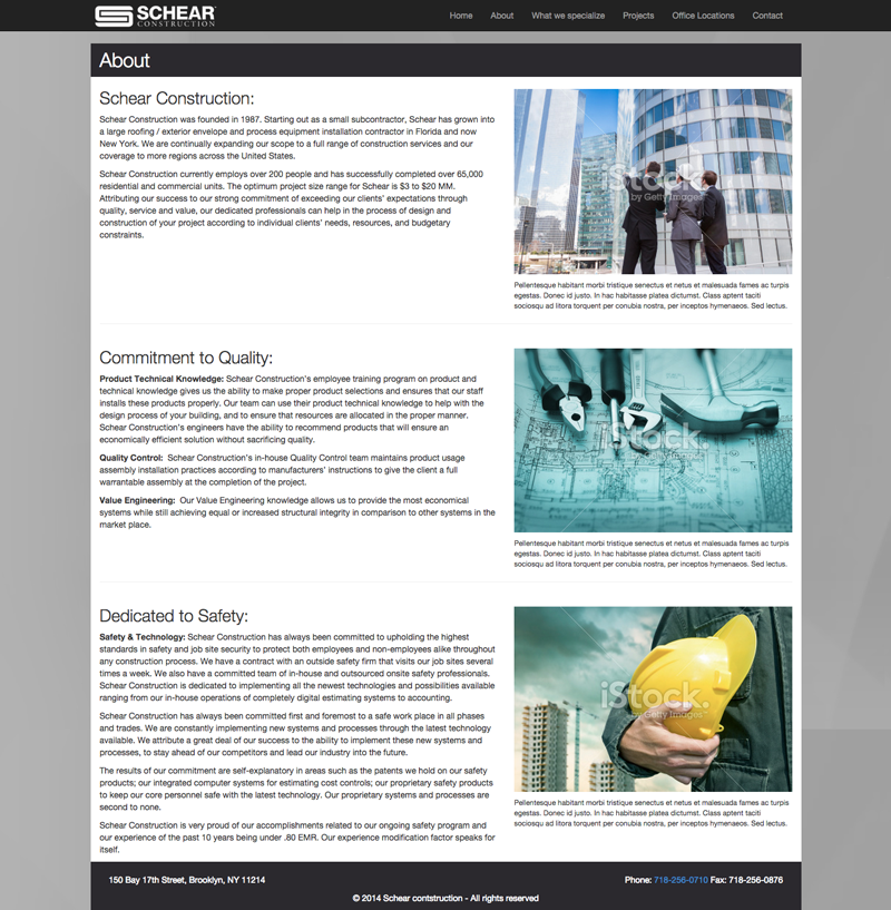


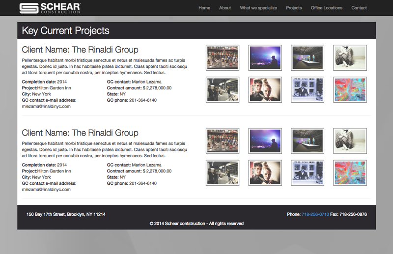


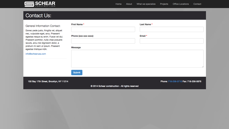
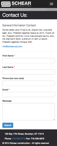
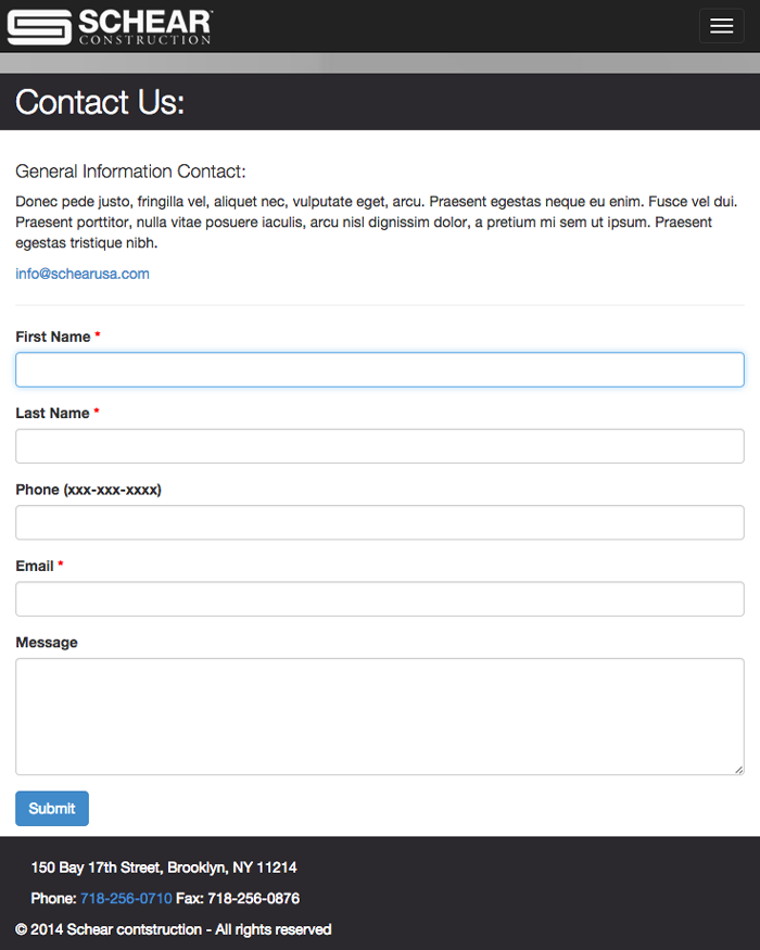
I was asked to create a simple design that would showcase what the company does, what projects they have done, and a way for customers to contact them. The design was clean, modern and fully responsive. This project is still in the works, I am awaiting copy and photo approvals.