Brand Experiences
Rebranding CSI to CSI Art Storage: A UX-Centered Transformation
Company: CSI
Role: • Branding
Tools: Adobe XD • Figma • Adobe CC
Rebranding CSI to CSI Art Storage: A UX-Centered Transformation
Company: CSI
Role: • Branding
Tools: Adobe XD • Figma • Adobe CC
The Challenge
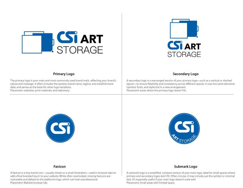
CSI needed to transition from a broader company identity into a premium art storage brand while maintaining recognition and trust with existing clients.
The Approach
I modernized the existing identity system while preserving recognizable brand equity, creating a refined visual language and responsive digital experience aligned with the company’s future direction.
The Outcome
The rebrand established a stronger market position for CSI Art Storage, providing a scalable visual identity and digital foundation that better reflects the company’s specialized services and long-term growth strategy.
Rebranding a Mission with Heart
Company: Adopt A boxer Rescue
Role: Logo Design • Brand Identity • Visual Design
Tools: Adobe Illustrator • Photoshop • Vector Illustration
Rebranding a Mission with Heart
Company: Adopt A boxer Rescue
Role: Logo Design • Brand Identity • Visual Design
Tools: Adobe Illustrator • Photoshop • Vector Illustration
The Challenge
Adopt a Boxer Rescue needed a new logo that could help strengthen brand recognition while supporting fundraising efforts through merchandise sales. The identity needed to feel approachable, memorable, and emotionally connected to the organization’s mission while remaining flexible enough for use across a variety of print and promotional applications.
The Approach
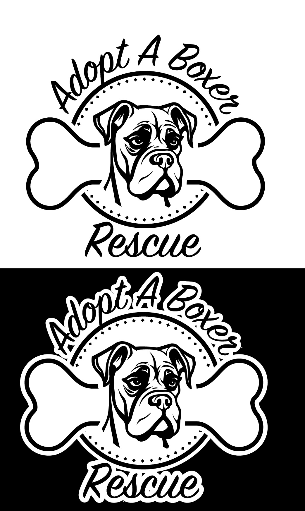
The design focused on capturing the personality and visual character of the breed by emphasizing the expressive features of the boxer’s face. To balance warmth and accessibility, I paired the illustration with typography that felt playful while remaining clean and highly legible across different sizes and formats.
Versatility was a key consideration throughout the process. The logo was developed to work effectively across merchandise, print materials, digital applications, and multiple color variations while maintaining strong visual recognition and readability.
The Outcome
The final identity provided Adopt a Boxer Rescue with a recognizable and flexible brand mark designed to support both awareness and fundraising initiatives. By combining an approachable visual style with scalable design considerations, the logo created a stronger foundation for merchandise, promotional campaigns, and future organizational branding efforts.
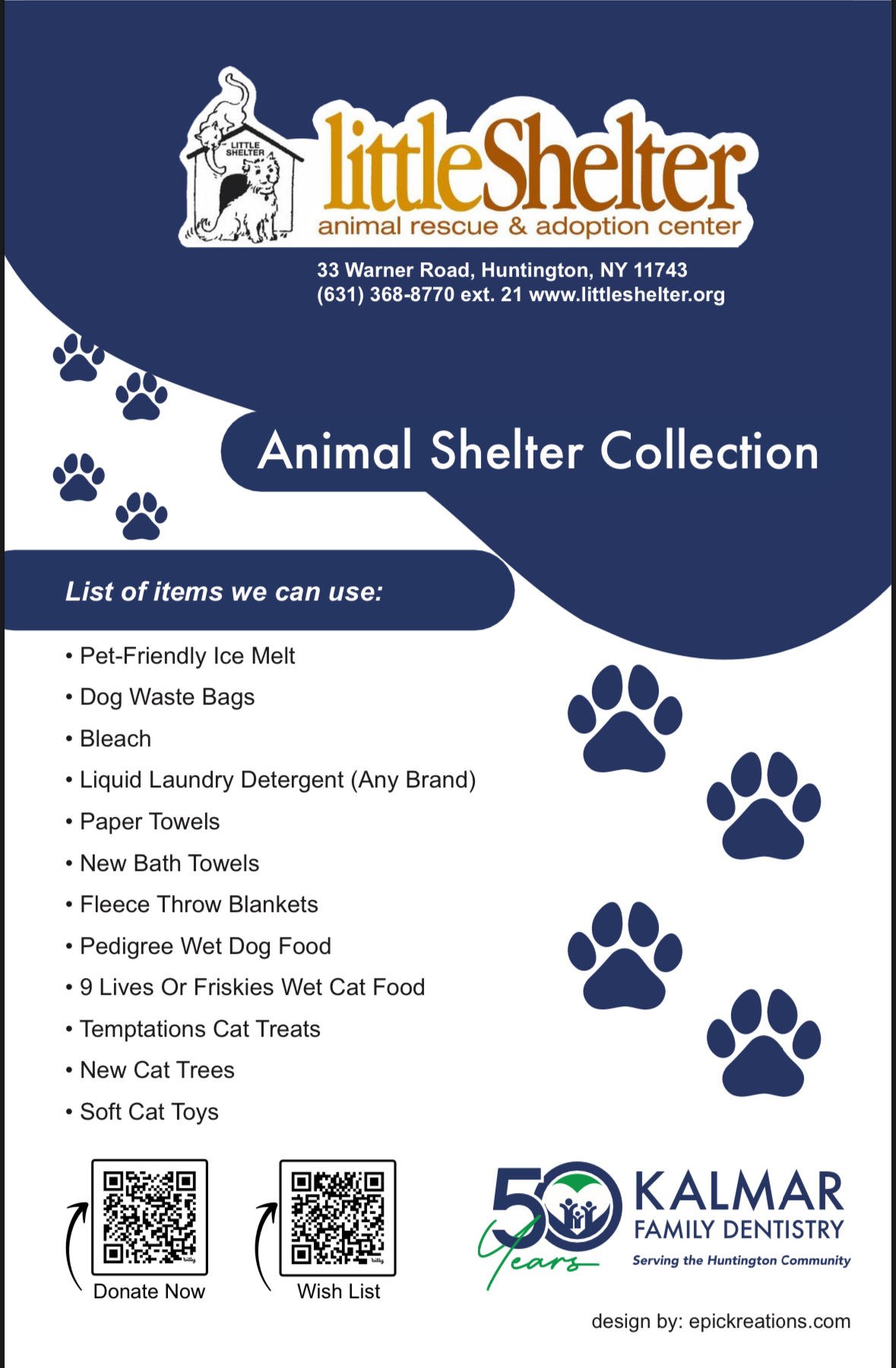
After receiving positive feedback on the revised logo I created for Kalmar Dentistry, they approached me with a new project: designing a flyer to support the Little Shelter Animal Rescue and Adoption Center. I was thrilled to take on the task, as it aligned perfectly with my passion for giving back to the community.
For the flyer, I aimed to create a playful and eye-catching design that would engage people and encourage them to take action. I incorporated vibrant colors, fun imagery, and engaging typography to make it stand out. To make the donation process more accessible, I added QR codes, allowing people to easily scan and donate directly from their phones.
Because I believe in the importance of community-driven projects and supporting causes like animal rescue, I chose to do this project pro bono. It was a rewarding experience to use my skills for a cause I deeply care about, while also contributing to the local community.
Tribute Band Identity Design
Company: Hella Doubt Tribute Band
Role: Logo Design • Brand Identity • Visual Design
Tools: Adobe Illustrator • Photoshop • Typography Exploration • Vector Design
Tribute Band Identity Design
Company: Hella Doubt Tribute Band
Role: Logo Design • Brand Identity • Visual Design
Tools: Adobe Illustrator • Photoshop • Typography Exploration • Vector Design
The Challenge
Hella Doubt, a No Doubt tribute band, needed a logo that captured the energy, personality, and recognizable influence of the original band while still establishing its own identity. The project required balancing nostalgia and familiarity with a fresh visual approach that could work across promotional materials, merchandise, and live performances.
With complete creative freedom, the challenge became creating a design that felt authentic to the ska-punk and “Rock Steady” era aesthetic without feeling overly derivative.
The Approach
Drawing inspiration from the visual energy and stylistic influence associated with No Doubt’s iconic era, I explored concepts that blended bold typography, playful attitude, and modern graphic elements. The design direction focused on channeling the vibrant and expressive personality connected to the band’s music and stage presence while subtly referencing the visual style associated with Gwen Stefani and the “Rock Steady” period.
Through iterative exploration, I developed a logo system that balanced retro inspiration with a cleaner and more contemporary execution, allowing the identity to feel both recognizable and performance-ready.
Versatility was also an important consideration, ensuring the logo could scale effectively across digital promotions, social media, merchandise, and live event branding.
The Outcome
The final logo delivered a strong visual identity that captured the spirit and energy of the tribute band while giving them a recognizable brand presence ahead of their debut performances. The project successfully combined nostalgic influence with modern styling, resulting in a flexible identity designed to support both marketing and live entertainment applications.
Full Brand & Website Launch
Company: Lucky Star Entertainment
Role: Brand Strategy • UX Design • UI Design • Front-End Development
Tools: Figma • Adobe XD • Bootstrap • HTML • CSS • JavaScript
Full Brand & Website Launch
Company: Lucky Star Entertainment
Role: Brand Strategy • UX Design • UI Design • Front-End Development
Tools: Figma • Adobe XD • Bootstrap • HTML • CSS • JavaScript
The Challenge
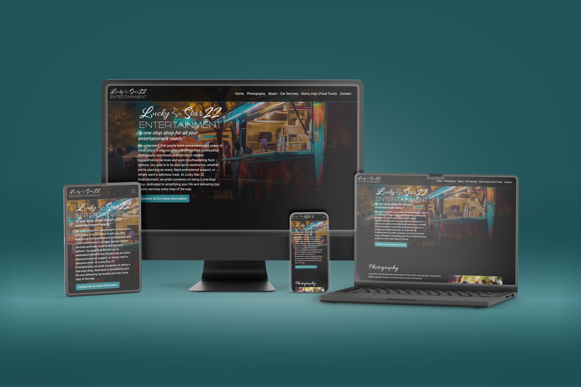
The client needed a professional digital presence to help secure funding and establish credibility for a new business, but lacked both a defined brand identity and an existing website. The challenge was not only to design and develop a responsive website, but to first create a cohesive visual foundation that could guide the company’s positioning, messaging, and future growth.
The Approach
Rather than approaching the project as only a website build, I proposed a full brand-to-digital solution that connected identity, user experience, and development into a unified process.
The project began with brand exploration and logo development to establish the company’s visual direction and overall tone. While the branding approvals were in progress, I simultaneously began building the foundational Bootstrap framework that would support the responsive website experience.
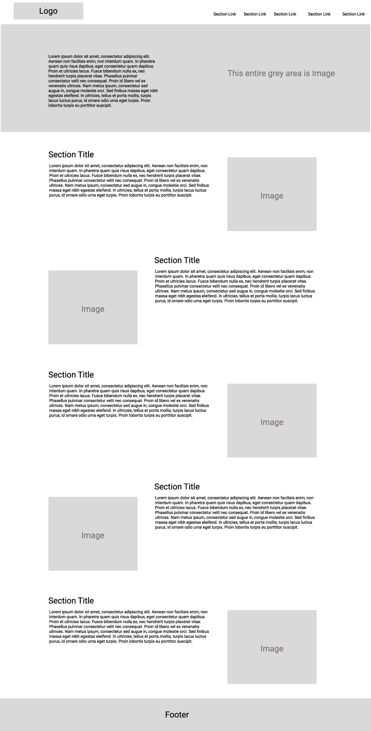
Once the visual identity was approved, I moved into UX planning, wireframing, and site architecture to define the structure, user flow, and content hierarchy. High-fidelity interface designs were then created to refine the visual experience before transitioning into front-end development and implementation.
By handling both the design and development process, the final product maintained consistency from concept through execution while streamlining communication and iteration throughout the project lifecycle.
The Outcome
The project resulted in a cohesive brand identity and fully responsive digital experience that provided the client with a professional foundation to launch and grow their business. By aligning branding, UX strategy, and development under a unified creative direction, the final website delivered a polished experience designed to build trust, communicate credibility, and support future scalability.
Drive Up Dj’s
Company: Drive Up Dj's
Role: Brand Identity Designer
Tools: Illustrator
Drive Up Dj’s
Company: Drive Up Dj's
Role: Brand Identity Designer
Tools: Illustrator
Challenge
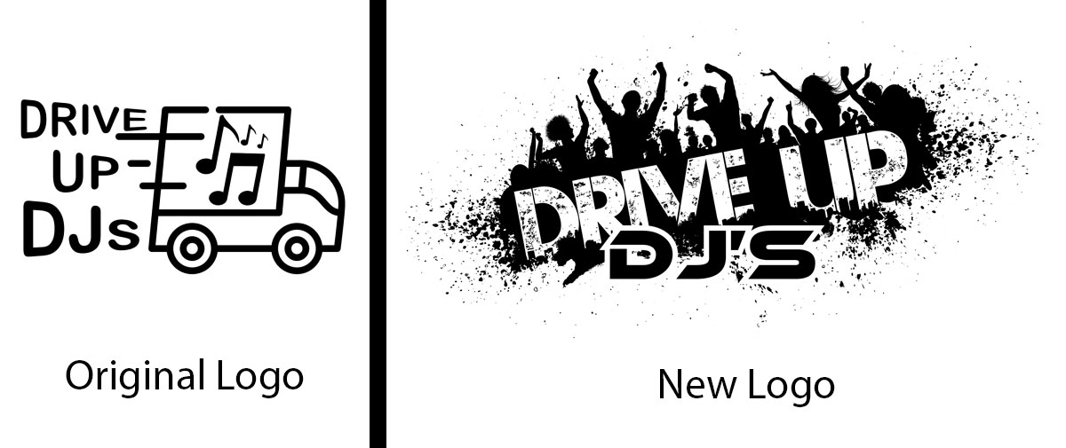
The client needed a distinctive brand identity for their DJ and entertainment business. They wanted to avoid the common industry clichés of turntables, headphones, and music-related icons, while still capturing the energy and excitement associated with live events and celebrations.
Approach
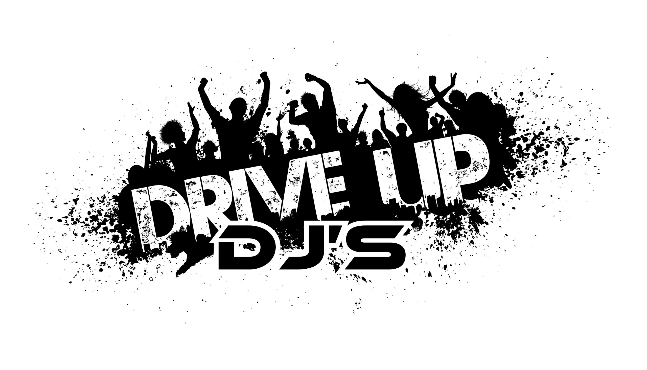
Rather than relying on traditional DJ imagery, I explored concepts centered around movement, energy, and audience engagement. Through multiple rounds of sketching and refinement, I developed a visual direction inspired by the excitement of people coming together on the dance floor. The final design focused on creating a memorable identity that reflected the company’s personality while differentiating it from competitors in the entertainment industry.
Outcome
The selected logo successfully captured the vibrant and energetic spirit of the brand while avoiding overused visual tropes commonly found in the industry. The final identity provided the company with a distinctive mark that could be applied consistently across marketing materials, promotional products, and digital platforms.
Branding and Product Communication for ADI
Company: ADI Honeywell Subsidiary
Role: Graphic Designer & Production Artist
Tools: Indesign, Illustrator, Photoshop
Branding and Product Communication for ADI
Company: ADI Honeywell Subsidiary
Role: Graphic Designer & Production Artist
Tools: Indesign, Illustrator, Photoshop
Challenge
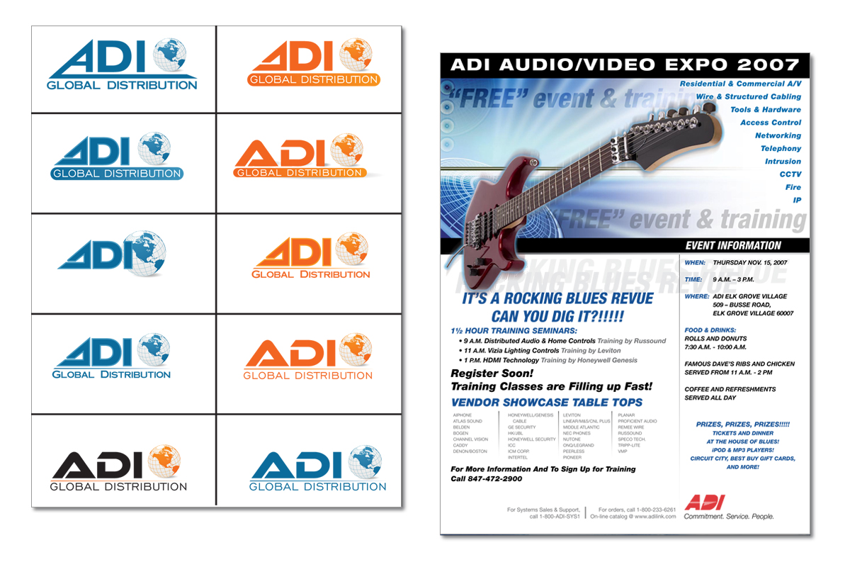
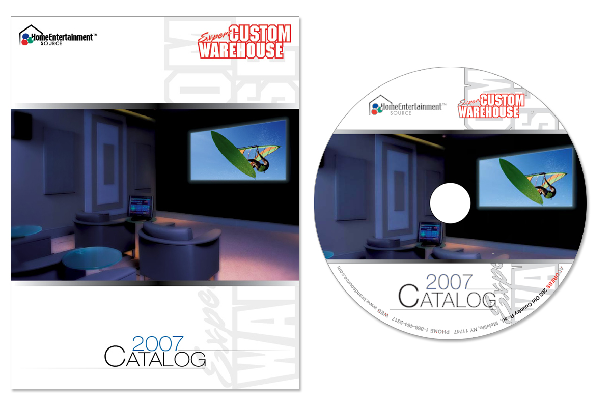
Honeywell needed marketing and product collateral that supported branding initiatives and product communication across both print and digital formats. The materials needed to maintain visual consistency while presenting complex information in a clear and professional manner.
Approach
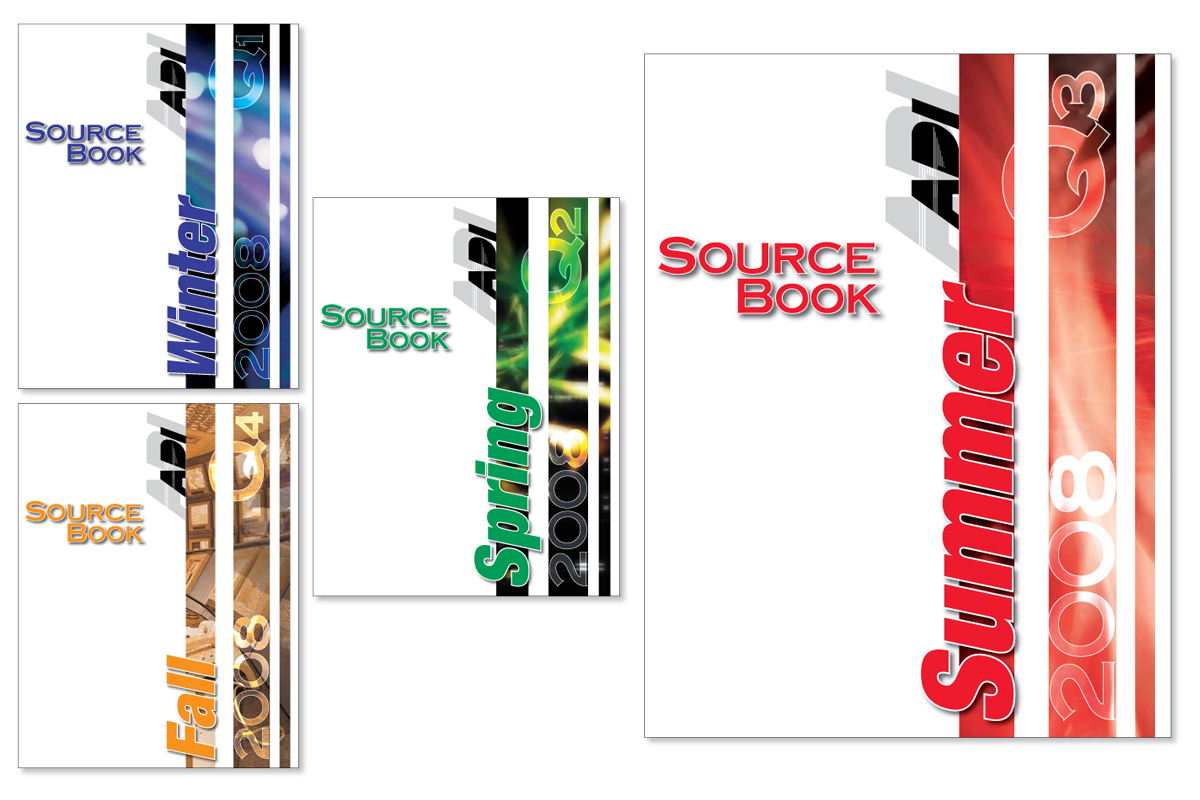
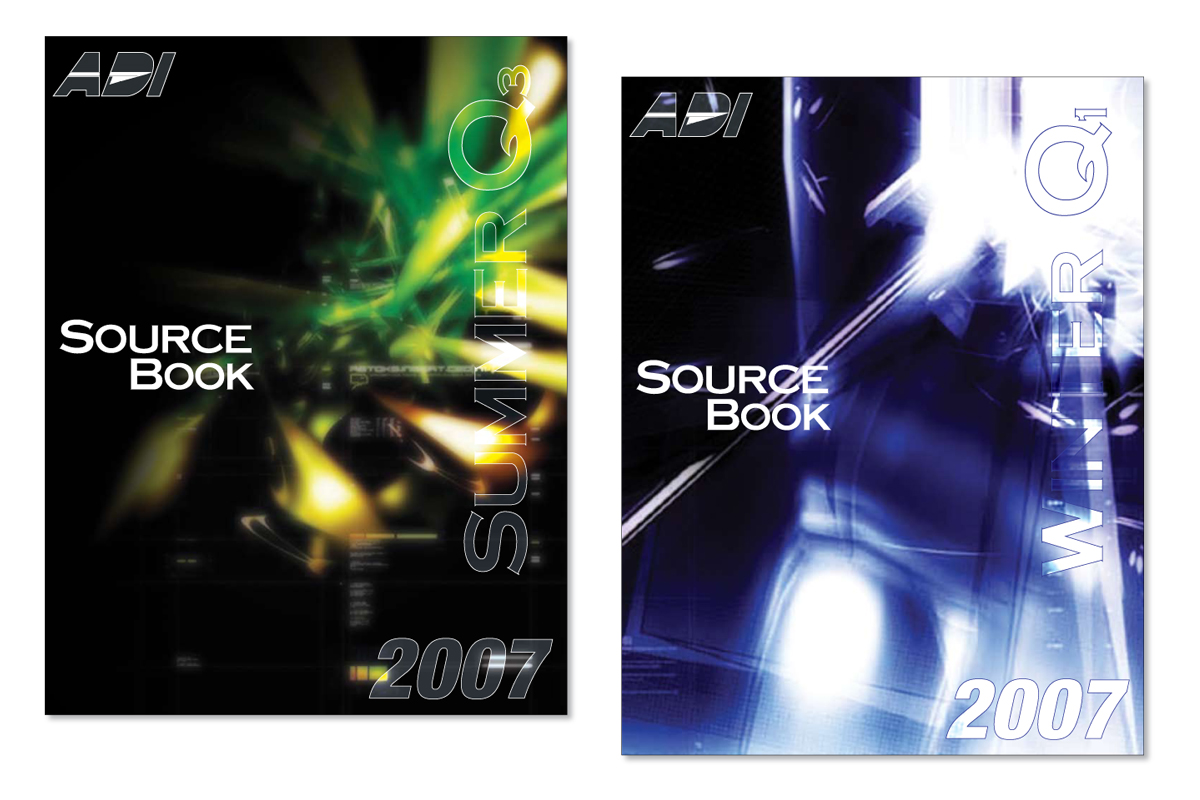
Developed a range of creative concepts, including catalog cover designs and logo explorations for rebranding initiatives. Produced print-ready marketing materials such as sales flyers and product catalogs, designing both the cover and interior page layouts. To support multiple distribution channels, the catalog was also adapted into a CD-ROM format, ensuring a consistent user experience across print and digital media.
Outcome
Delivered a cohesive collection of marketing assets that supported Honeywell’s branding and product communication efforts. The final materials were prepared for production and distribution, providing customers with accessible product information through both traditional print and digital formats.
Designing for a Fast-Paced Industry
Company: Paintball Sports International
Role: Assistant Art Director
Tools: Indesign, Photoshop, Illustrator
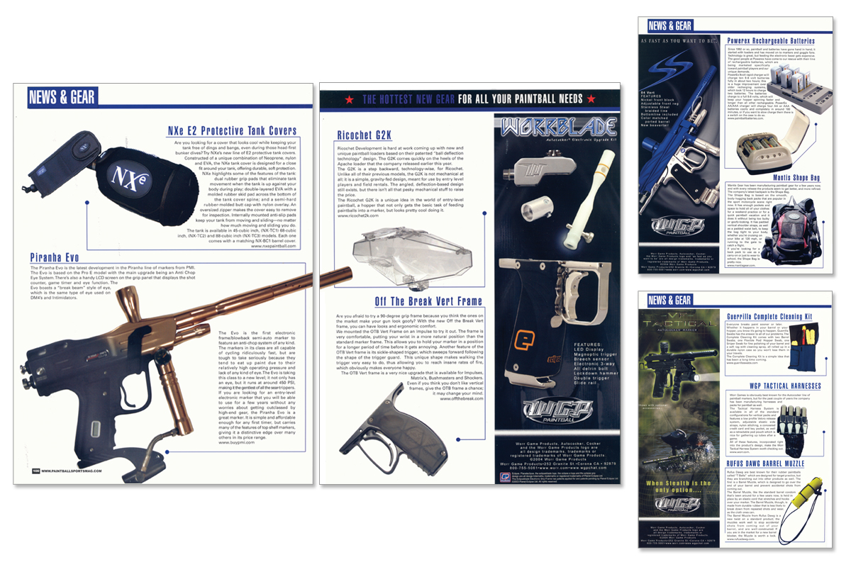
Designing for a Fast-Paced Industry
Company: Paintball Sports International
Role: Assistant Art Director
Tools: Indesign, Photoshop, Illustrator
The Challenge
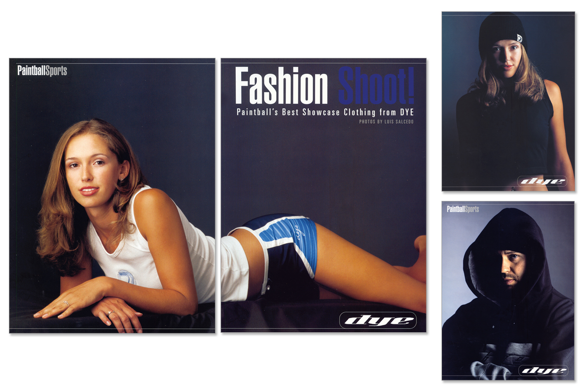
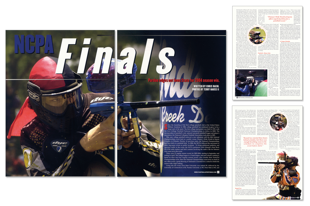
Create engaging editorial layouts that balanced visual storytelling, advertising requirements, and large amounts of industry content while maintaining a consistent look and feel across each issue of the magazine.
The Approach
Designed feature spreads, recurring sections, and product-focused editorial content for publication. This included layout design for the News and Gear sections, organizing content into reader-friendly formats, and developing visually compelling product showcases using photography, typography, and strong information hierarchy. Collaboration with editors, photographers, and advertisers ensured that each piece aligned with the magazine’s brand standards while meeting production deadlines.
The Outcome
Contributed to the successful production of multiple magazine issues by delivering engaging editorial experiences that highlighted industry news, equipment releases, and featured stories. The work helped maintain a consistent visual identity throughout the publication while supporting both editorial and advertising objectives.
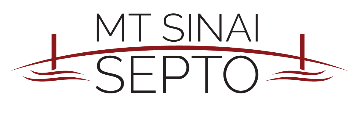
The Mount Sinai Special Education Parent Teacher Organization (SEPTO) had reached out that they were looking to create a logo for their organization. The direction was that they wanted something that conveyed bridging a gap, so they wanted a bridge in the logo. The end result was something that they loved and was starting to tie all their information together. This was done as PRO-BONO as a way to give back to the community.
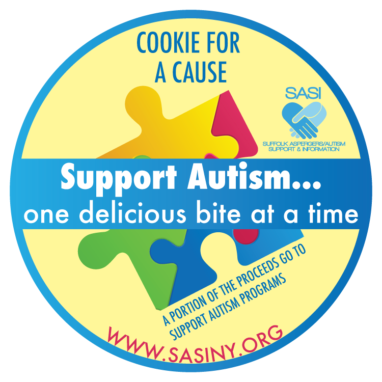
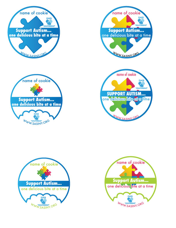
Was contacted to design a cookie label so that they can sell cookies to fundraise for their charity. They had requested to use a puzzle piece in their label, and wanted various options, with some having a bite out of the label. The end result was chosen without the bite mark, and the the yellow background was requested after seeing several iterations. The work was done PRO-BONO in order to help the charity as much as possible.
This client approached me to create a very clean logo that would show in part some science behind her company. The final and approved logo was done to match her existing site, and the client loved it.
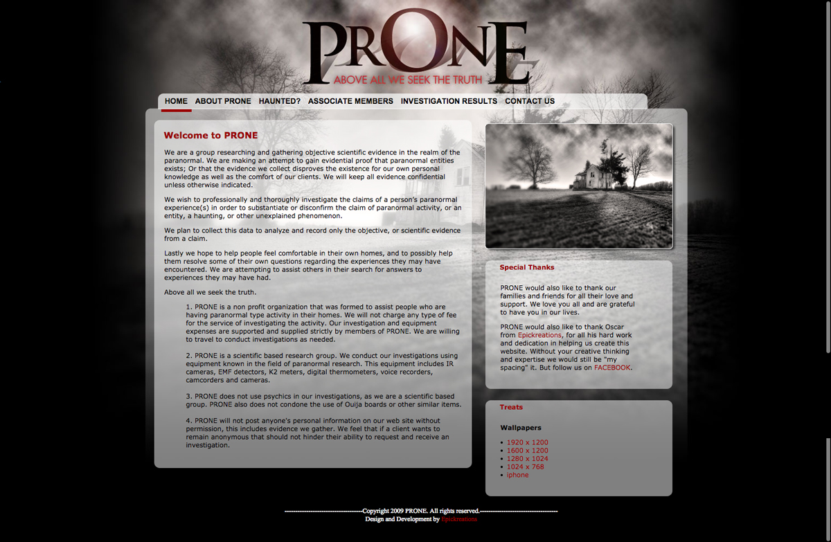
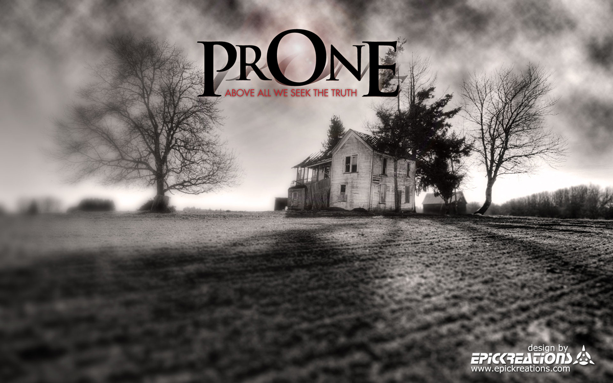
This paranormal research group approached me to create their Corporate Identity for them. This would include the creation of a logo, business cards, and also a website. I was given full design freedom on this project. With that liberty I wanted the logo to show the eeriness of what this group did. With that same idea I designed the site to compliment the logo.

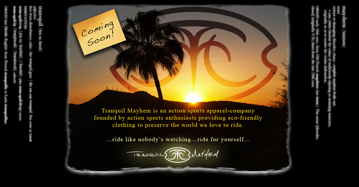
I was approached to create a unique logo. They wanted the logo to show a sense of tranquility and chaos as their name signifies.

I was approached by the organizer at the time and they wanted to update their logo. They wanted something that encapsulated the spirit of youth and a way to show that united we can make a difference, which is the use of the handprints. Once the logo was approved and finalized I designed a website for them. The design never got to development due to changes within the organization. This was done as pro bono.
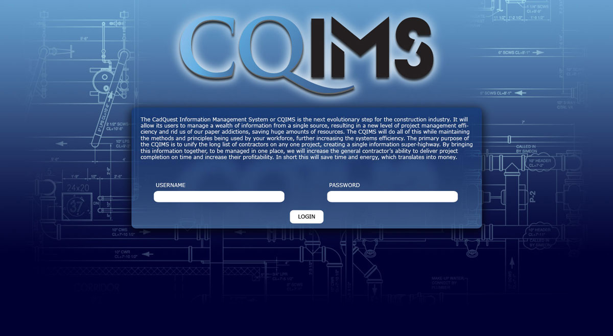
Cadquest requested a logo that would not isolate them to one area. They wanted to show that they will be a global entity as the company continues to grow its client base. The splash page was created as a temporary page until their website and application would be built. They did have some testing with some clients which was why they needed to have a login on the splash page.
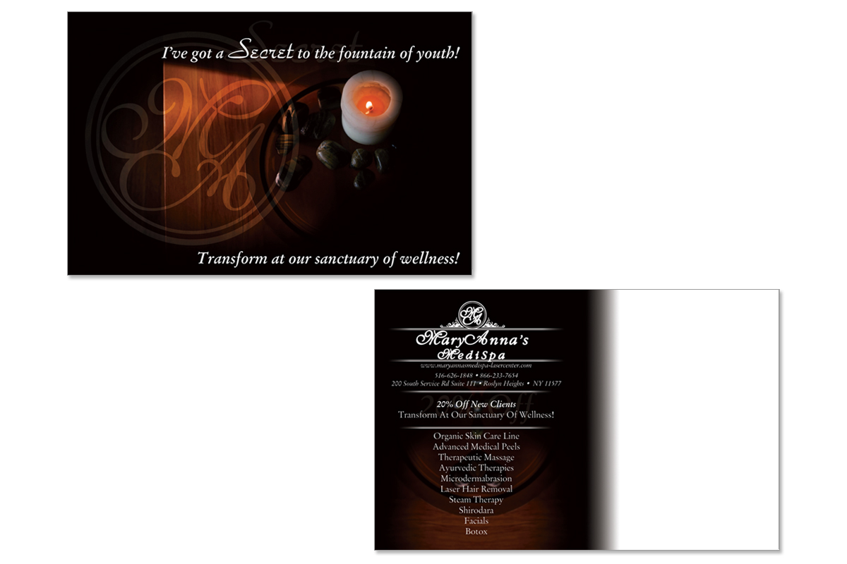
Client had asked to create a postcard that gave a sense of serenity.