Digital Experiences
« BackImproving Data Visualization Through Rapid Prototyping
Company: Clear Vision Optical
Role: UX Designer / Interaction Designer
Tools: Adobe XD, HTML, Bootstrap, Javascript
October 24, 2016 at 4:16 pm
Improving Data Visualization Through Rapid Prototyping
Company: Clear Vision Optical
Role: UX Designer / Interaction Designer
Tools: Adobe XD, HTML, Bootstrap, Javascript
October 24, 2016 at 4:16 pm
This project focused on rethinking an existing interface that displayed complex datasets through charts, tables, and structured reports. The initial version prioritized output over usability, making it difficult for users to quickly interpret information or identify meaningful insights.
Challenge
The primary challenge was improving how complex data was presented and consumed within the interface. Users needed a faster way to understand trends, compare values, and interact with datasets without being overwhelmed by dense or poorly structured visualizations. The existing design lacked clear hierarchy and did not effectively support exploratory analysis.
Approach
I began by analyzing the data requirements and identifying the key user goals when interacting with the system. Rather than focusing on replicating the existing layout, I explored alternative ways to structure and visualize the information.
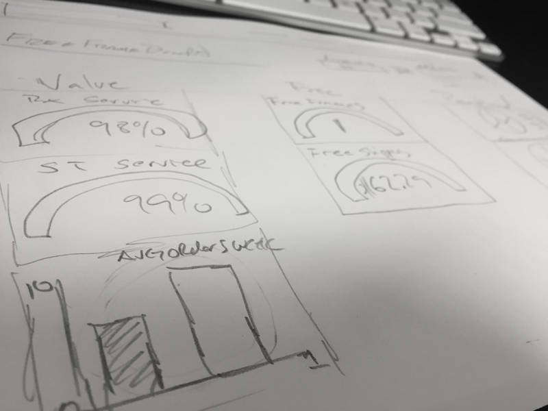
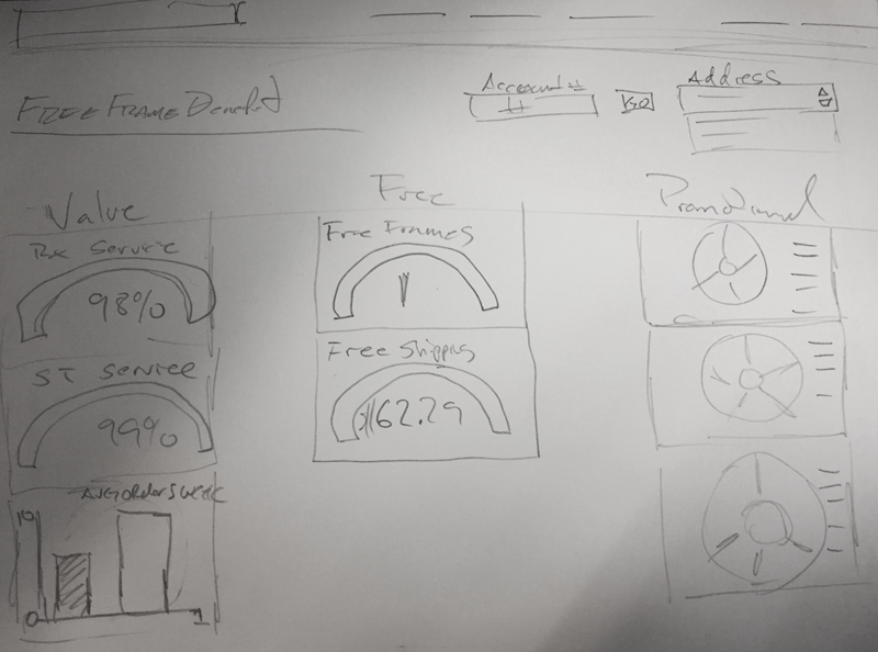
I created a series of low-fidelity wireframes to test different layout structures and information hierarchies. These early concepts focused on simplifying the interface and improving scanability, with particular attention given to how charts, filters, and supporting data were grouped.
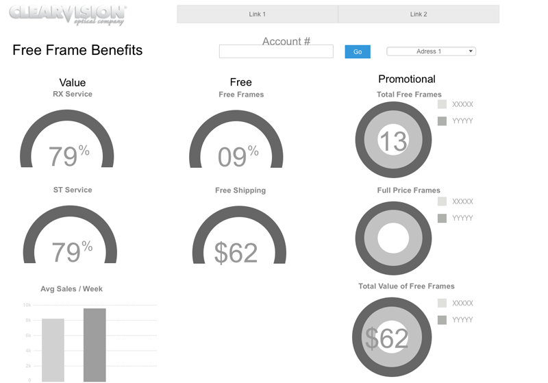
From there, I moved into rapid prototyping, experimenting with different chart types and visualization patterns to better represent the underlying data. I evaluated how each approach supported comprehension, comparing static layouts against more interactive configurations that allowed users to explore the data more efficiently.
Throughout the process, I iterated based on usability considerations such as clarity, cognitive load, and visual hierarchy. The goal was not only to improve aesthetics but to ensure that users could interpret the data quickly and make informed decisions with minimal friction.
Once a refined direction was established, I transitioned the design into a working prototype to validate the interaction patterns and layout decisions in a more realistic environment.
Outcome
The final prototype provided a significantly clearer and more structured way to interact with complex datasets. Information was easier to scan, charts were more readable, and the overall experience reduced friction when navigating between data points and reports.
The improved design established a stronger foundation for development and demonstrated how thoughtful wireframing and rapid iteration can directly enhance usability in data-heavy applications.