Design
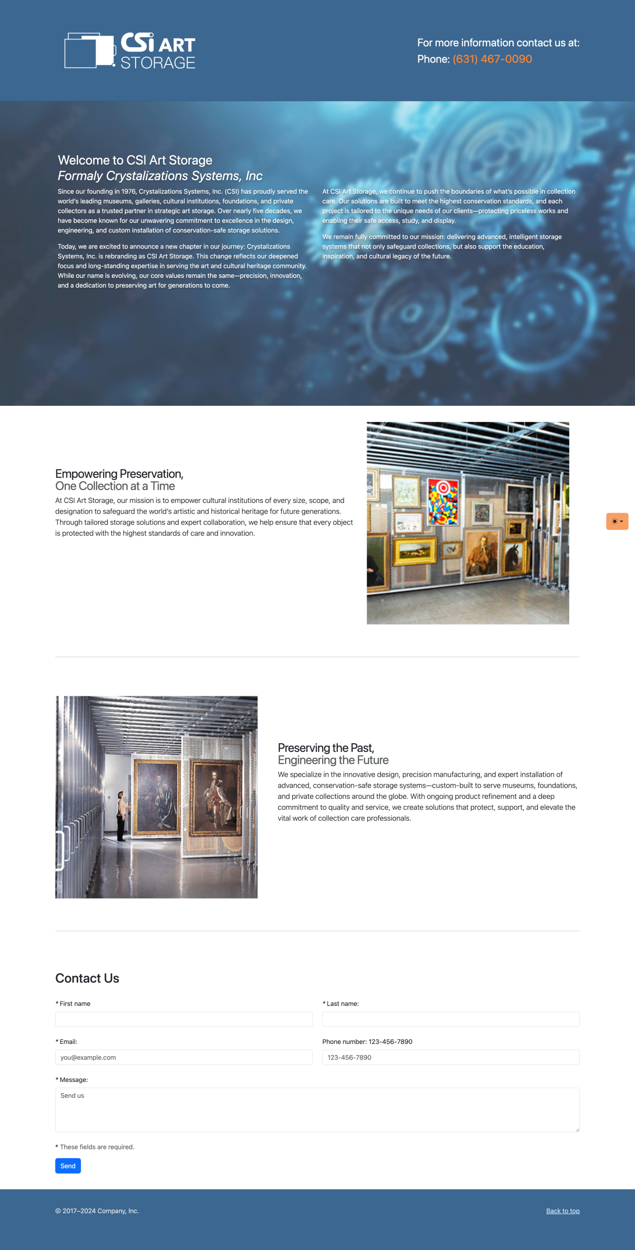
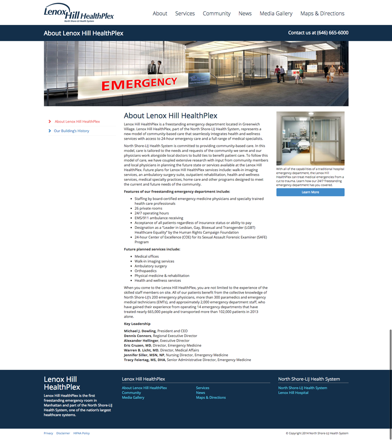
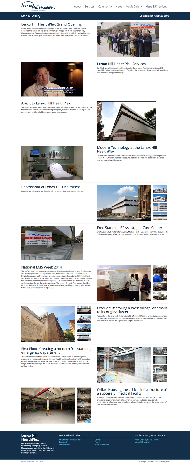
I was brought on to lead the rebranding initiative for CSI, repositioning the company as CSI Art Storage in alignment with their strategic shift to focus exclusively on high-end art storage solutions. The goal was to retain brand recognition while clearly communicating the new direction.
To achieve this, I preserved the iconic “CSI” lettering from the original identity—leveraging its existing equity—but modernized the typography and visual style to convey a more sophisticated, design-forward aesthetic. The updated brand integrates “Art Storage” in a way that’s clean, legible, and immediately clarifies the company’s niche.
An essential part of the visual identity is a custom-designed icon that reflects CSI’s flagship product—an innovative art storage system that will be central to their future offerings. This icon serves as both a branding element and a functional visual cue that aligns with the brand’s purpose and product design.
In parallel with the brand refresh, I designed and developed a temporary landing page to establish a digital presence during the content transition phase. Prioritizing usability and responsiveness, the layout is minimal yet informative, with flexible space reserved for future photo and video content. We’re currently in the process of producing original media and sourcing high-quality stock images, so the site remains in a soft-launch/testing phase. Once the final assets are ready, the page will be updated to fully reflect the new brand’s visual storytelling.
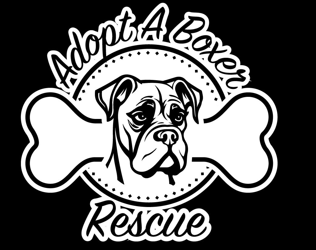
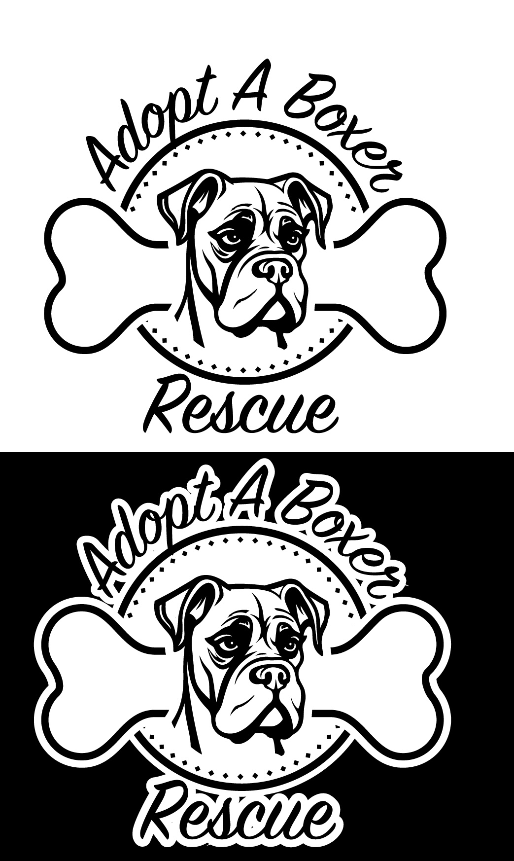
I was tasked with creating a logo to help raise funds for the adoption agency through merchandise sales. My goal was to highlight the beauty of these dogs by focusing on their faces, complemented by a playful yet easily readable font. I designed the logo to be versatile, ensuring it could be effectively used across various materials and colors.
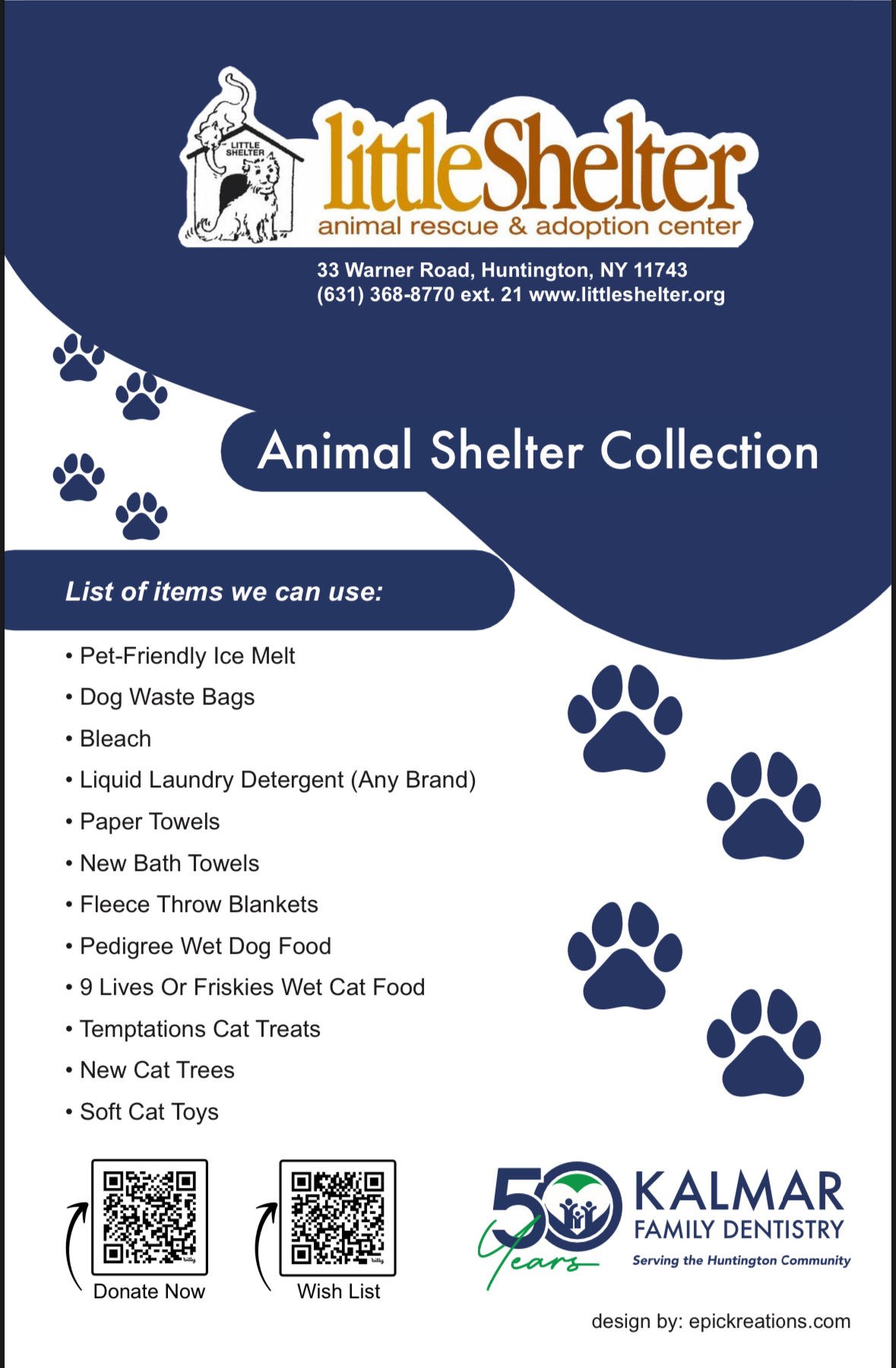
After receiving positive feedback on the revised logo I created for Kalmar Dentistry, they approached me with a new project: designing a flyer to support the Little Shelter Animal Rescue and Adoption Center. I was thrilled to take on the task, as it aligned perfectly with my passion for giving back to the community.
For the flyer, I aimed to create a playful and eye-catching design that would engage people and encourage them to take action. I incorporated vibrant colors, fun imagery, and engaging typography to make it stand out. To make the donation process more accessible, I added QR codes, allowing people to easily scan and donate directly from their phones.
Because I believe in the importance of community-driven projects and supporting causes like animal rescue, I chose to do this project pro bono. It was a rewarding experience to use my skills for a cause I deeply care about, while also contributing to the local community.
I was recently approached to design a logo for a No Doubt tribute band and given complete artistic freedom to bring their vision to life. This creative liberty allowed me to explore different concepts, and I decided to infuse the “Rock Steady” vibe, which is emblematic of No Doubt’s iconic sound, into the design. My goal was to capture the energy and essence of the band while subtly paying homage to Gwen Stefani, whose style and influence are central to No Doubt’s identity. After experimenting with various design elements, I created a logo that balanced these ideas, blending the band’s ska-punk roots with a modern flair. The band was thrilled with the final result, and I’m excited to see the logo come to life when they take the stage for their debut performance soon.
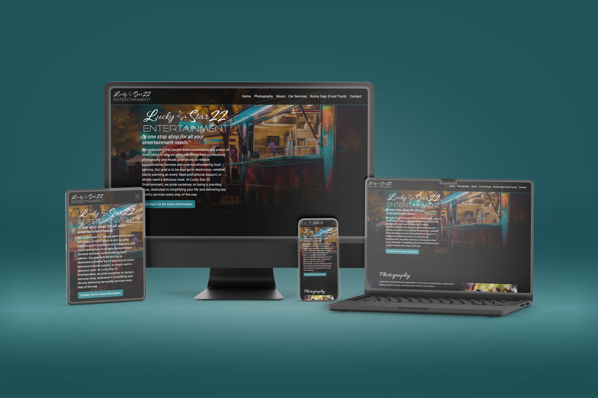
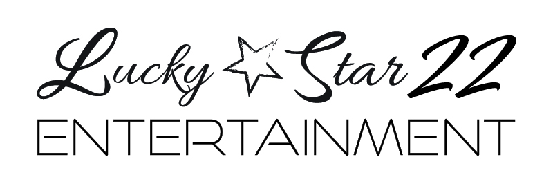
I was brought on to develop a website for a company lacking a logo and a clear corporate vision. I recommended a comprehensive approach, starting with the creation of a full brand identity, which would then inform the design of the logo and the overall user experience of the responsive website.
The process began with designing the logo, followed by creating a wireframe in Figma to establish the structure and flow. From there, I developed a high-fidelity prototype in Adobe XD to refine the design and interaction details. The final step was building the fully responsive website using Bootstrap, ensuring a seamless experience across devices.
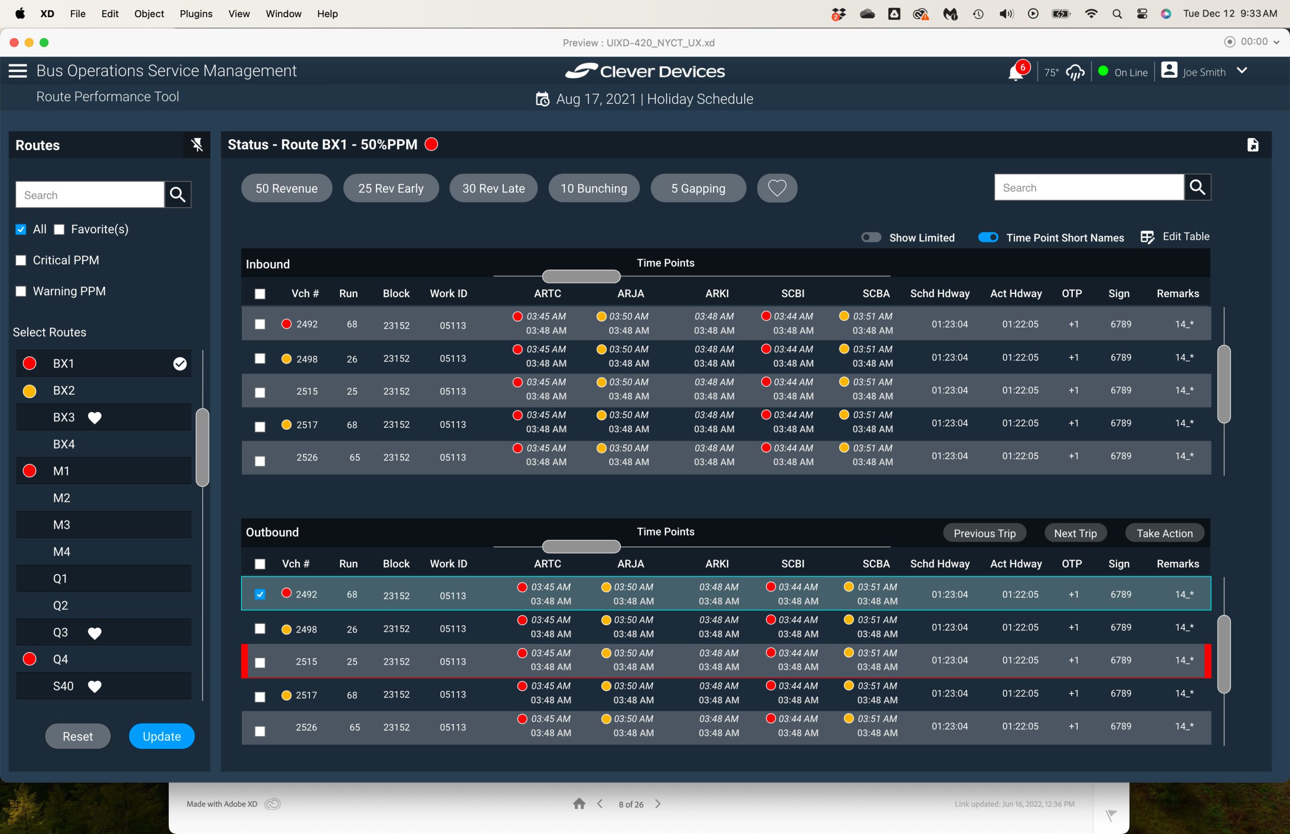
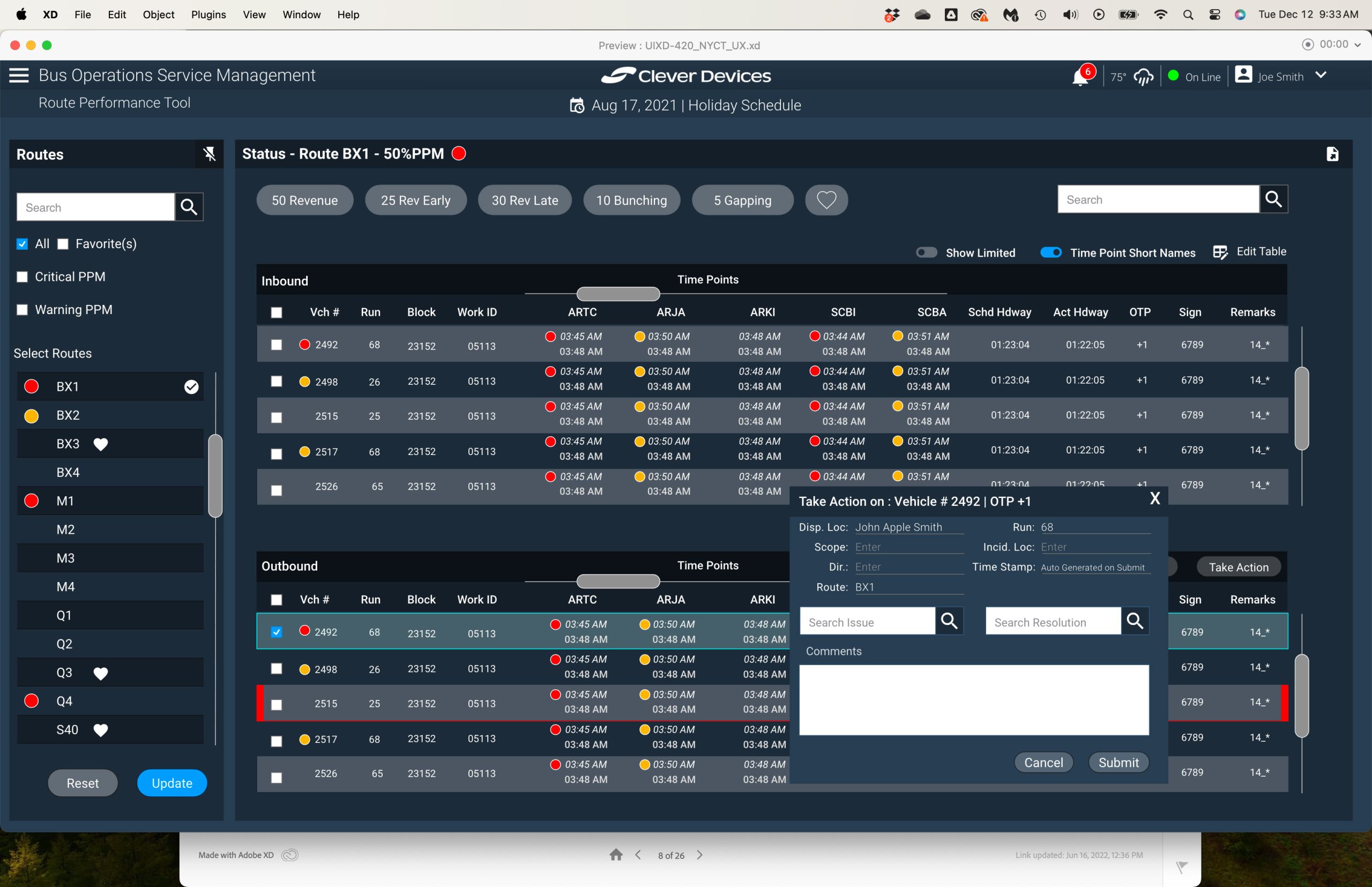
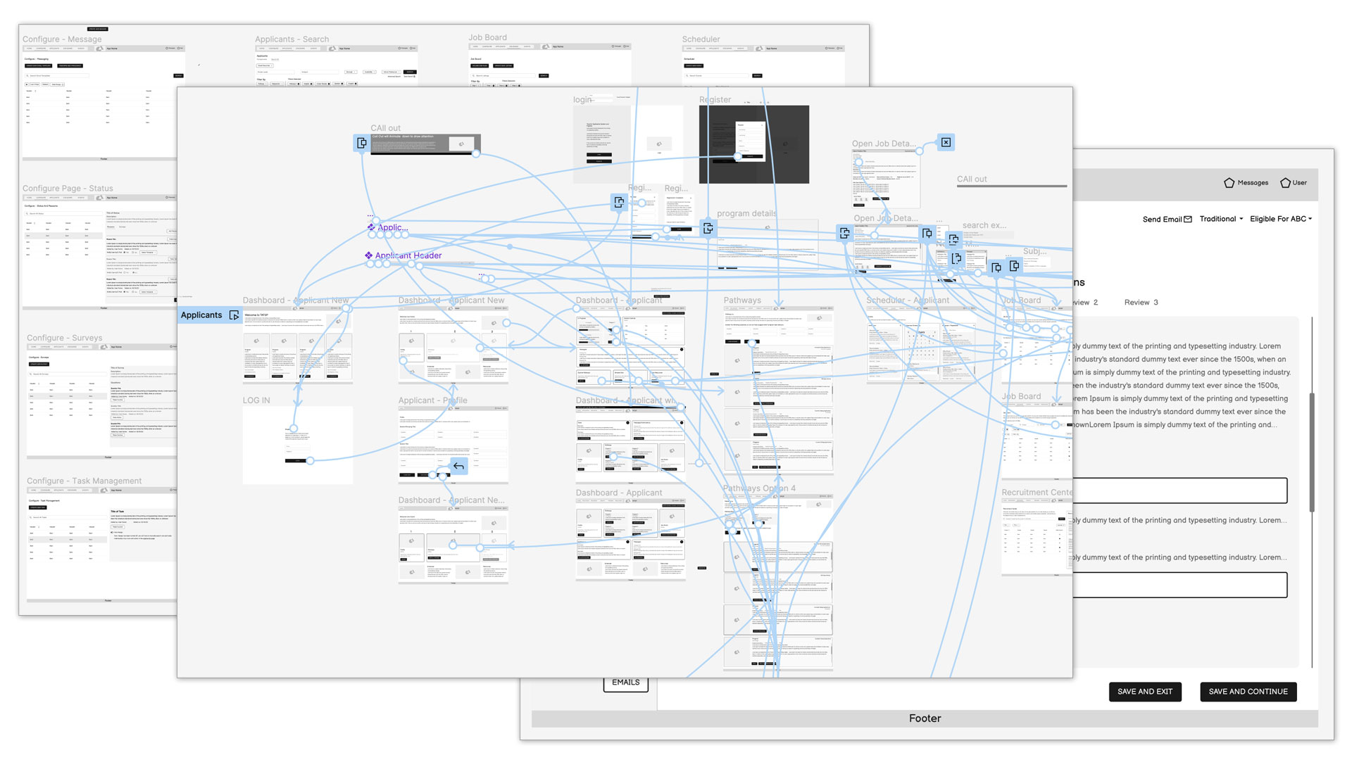
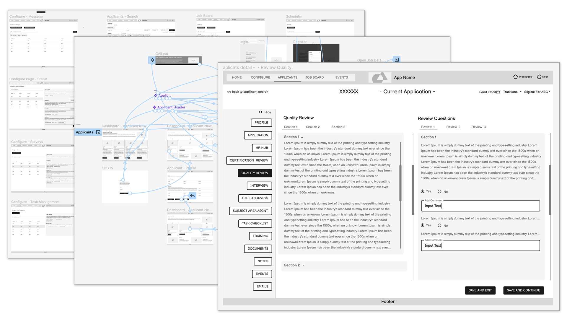
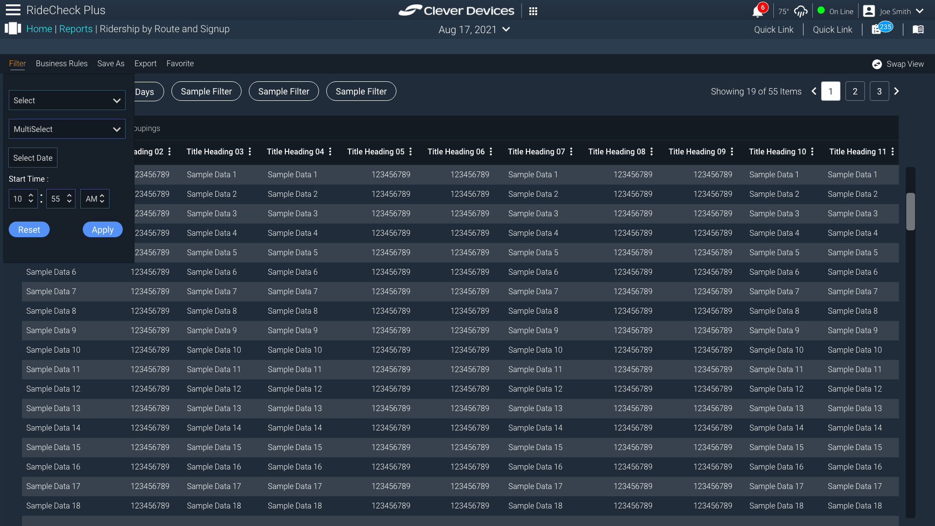
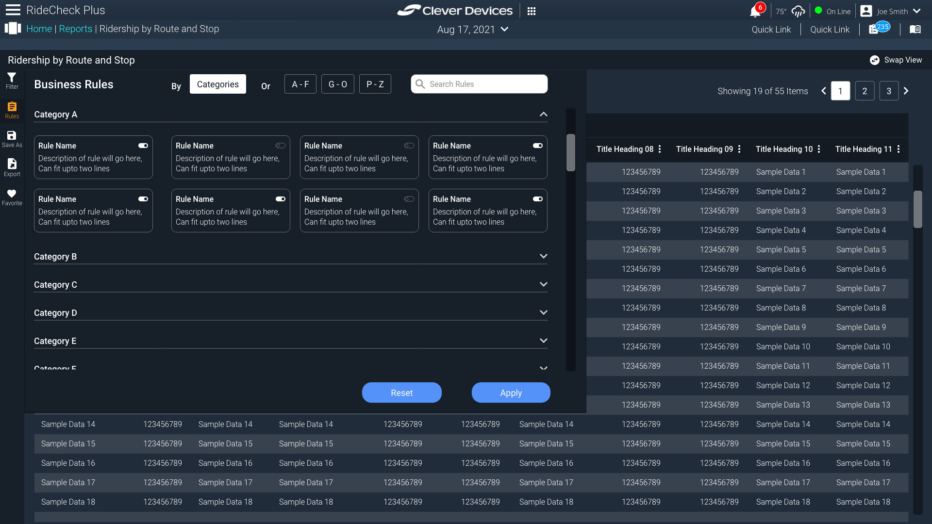
CleverDevices was enlisted to enhance an existing product utilized by NYCT. Although NYCT had originally developed the product in-house, they opted for CleverDevices to take over the project after witnessing enhancements made to other products. While still in the design phase, the project owners were highly satisfied with the progress and eagerly anticipated showcasing the project to NYCT.
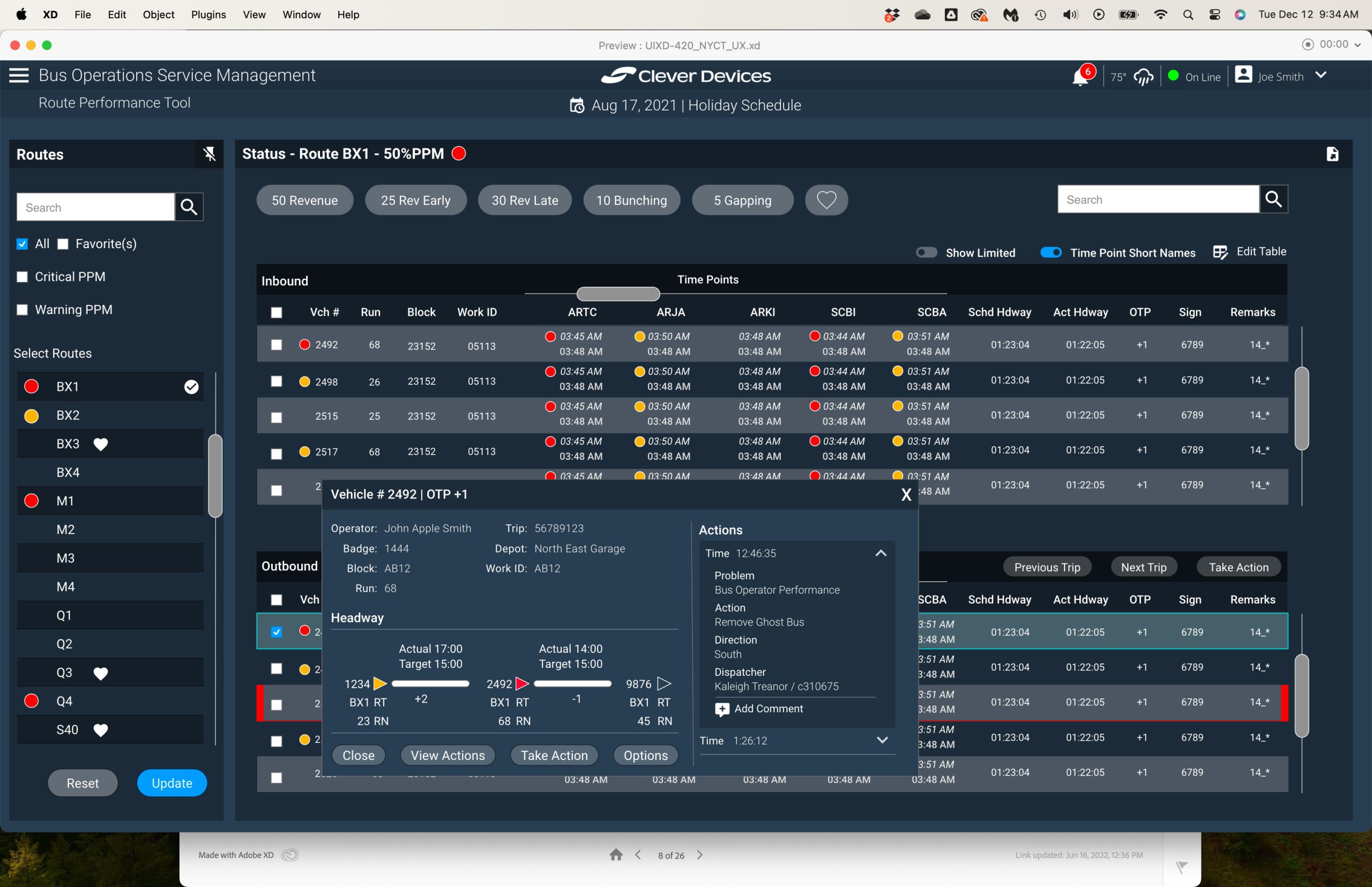
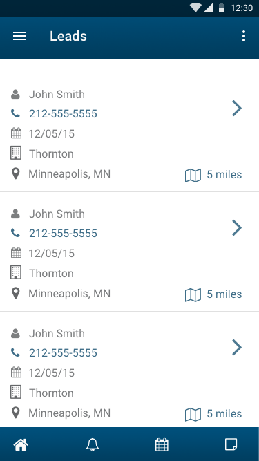
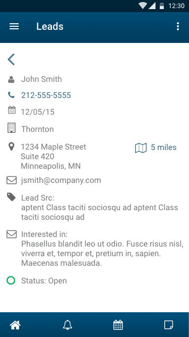
The primary issue with the product was the prolonged duration field operators required to input actions (such as identifying problems and implementing solutions) for vehicles. This posed significant challenges for the agency in tracking both problems and corresponding solutions. In the legacy application, this task was fragmented across at least three different views. However, we streamlined it into a single, user-friendly pop-up form preloaded with as much relevant information as possible. Additionally, implementing type-ahead functionality simplified the selection of issues and resolutions, utilizing a list previously vetted by the agency.
Addressing the outdated design and complex user interaction of the product was a key objective.
Upon my departure from the company, the outcome was a newly redesigned product that generated considerable excitement among the project owners, eager to showcase the improvements to NYCT. This marked a substantial enhancement over the existing system, notably accelerating workflows for users.
A valuable lesson gleaned from this experience was the effectiveness of simplicity in saving time. For instance, in one challenging section, we replaced three dependent dropdown menus from the old application with a predictive search feature. Through iterative refinement, we discovered that simplicity significantly expedited the user’s process of inputting problems and solutions.
The gallery shows some examples and the last image was the original application.

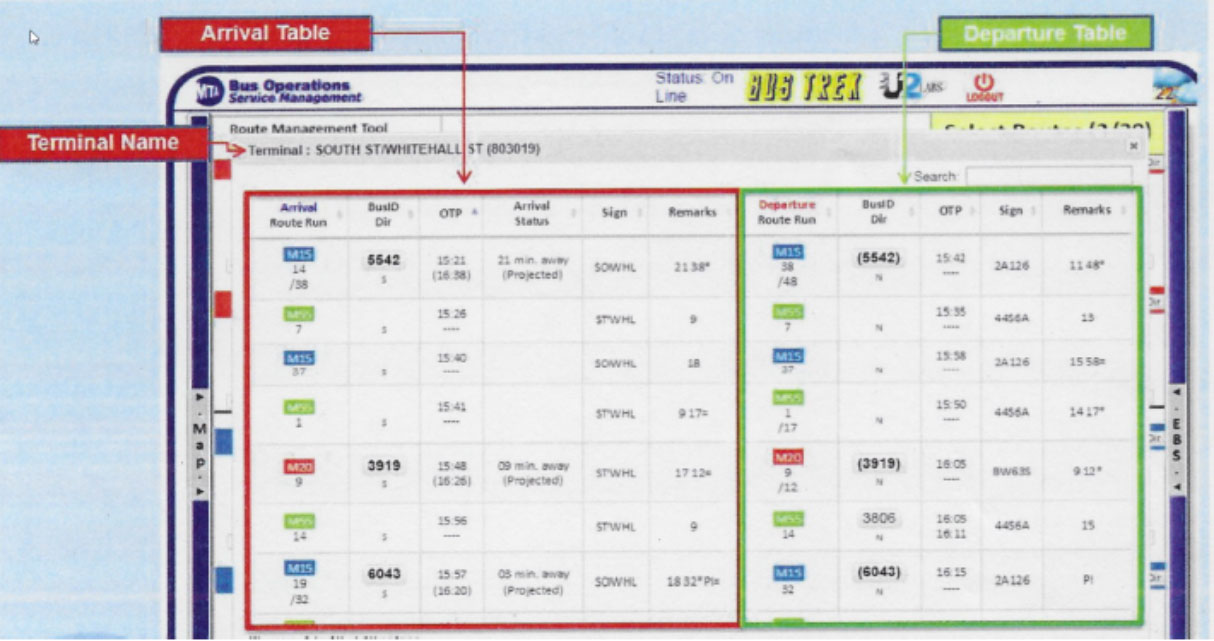
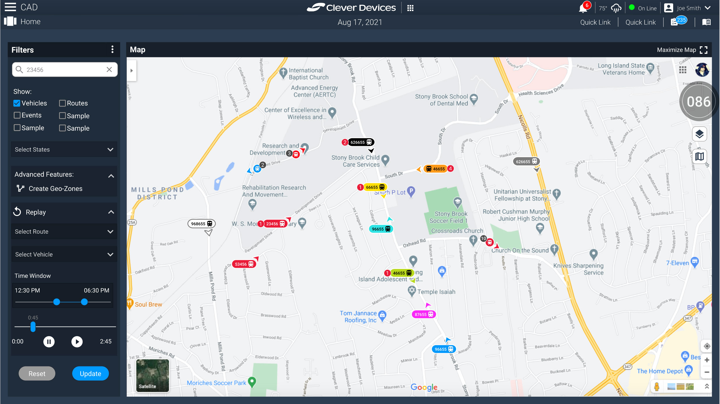
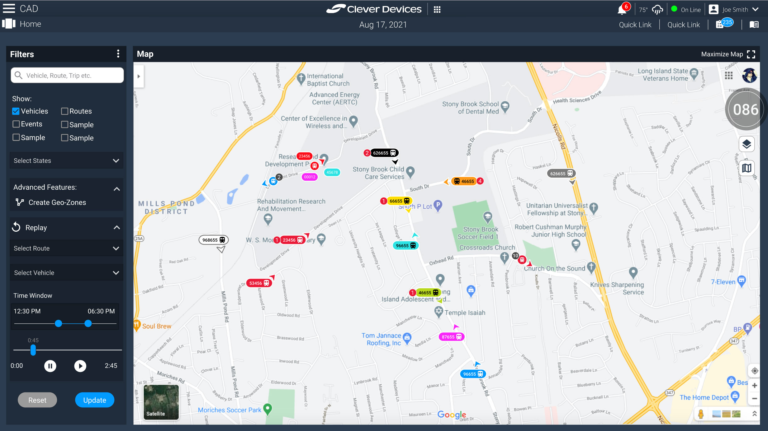
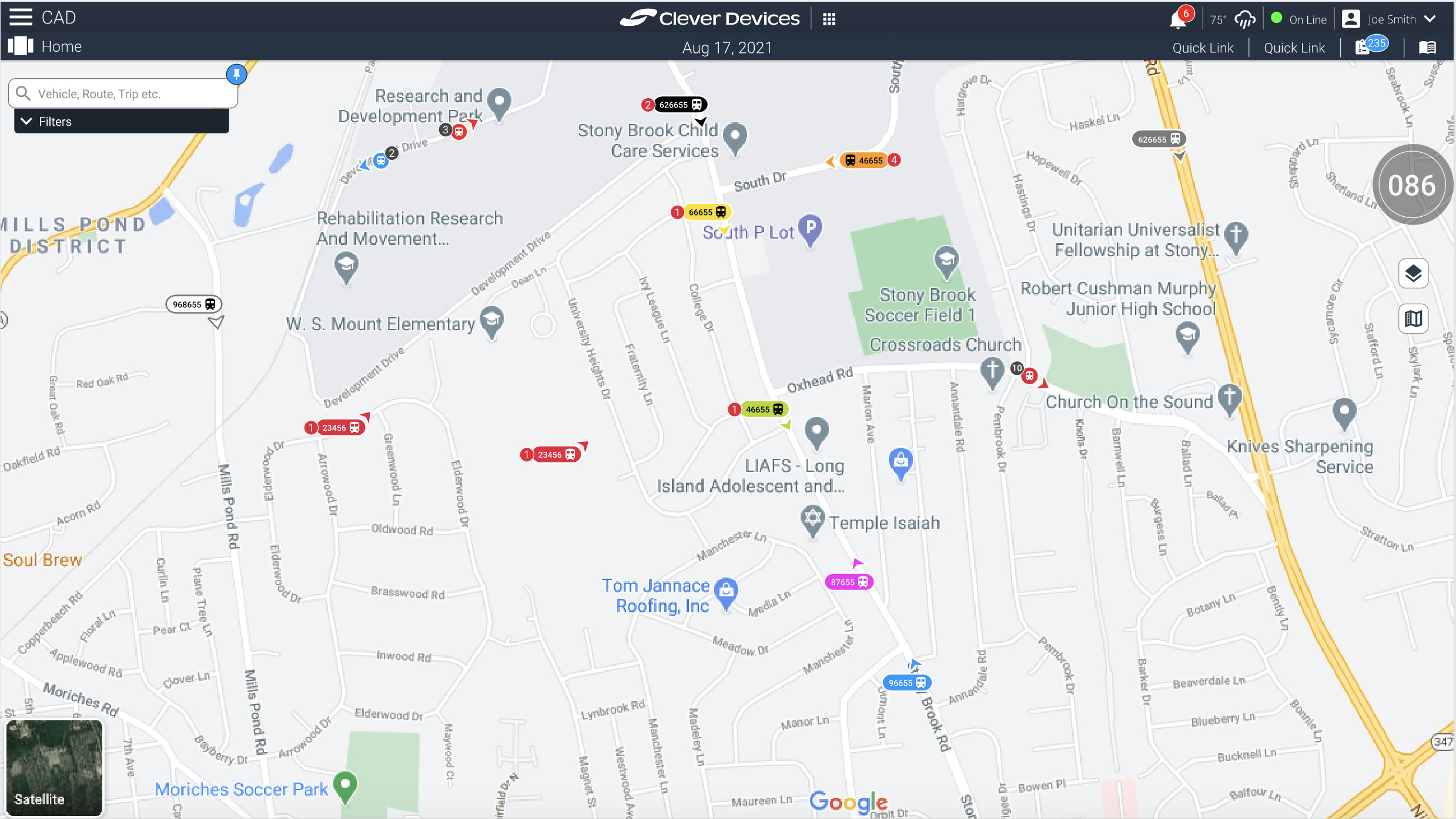
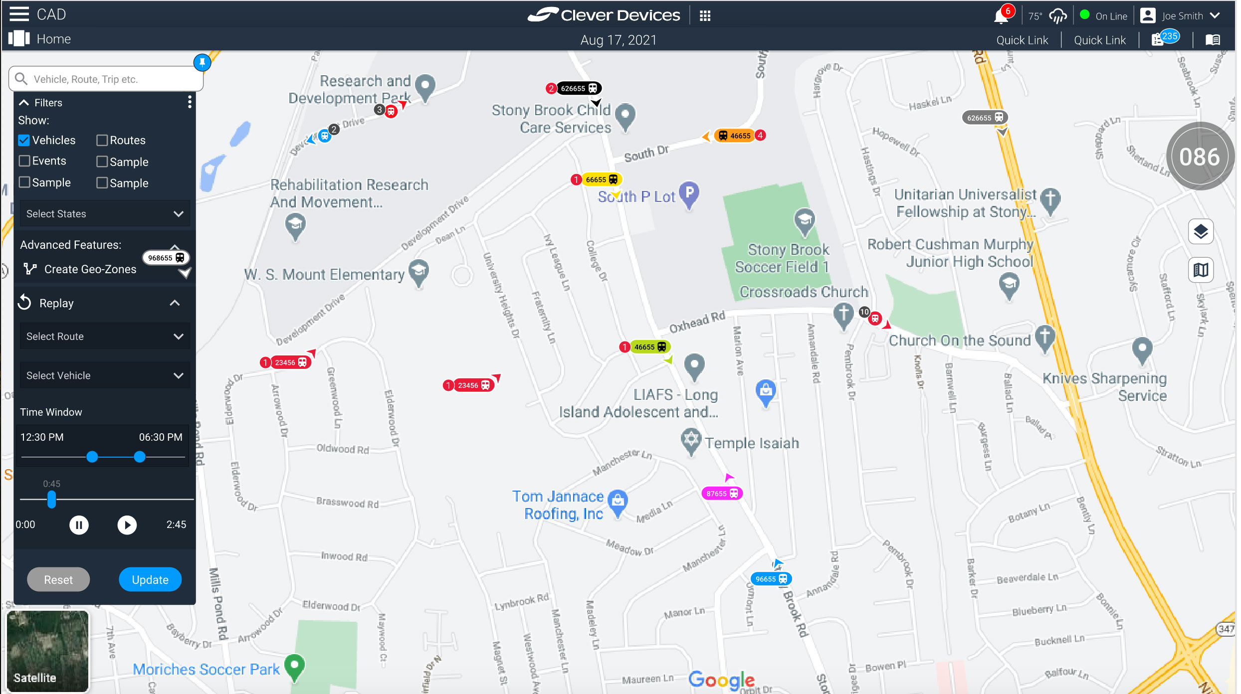
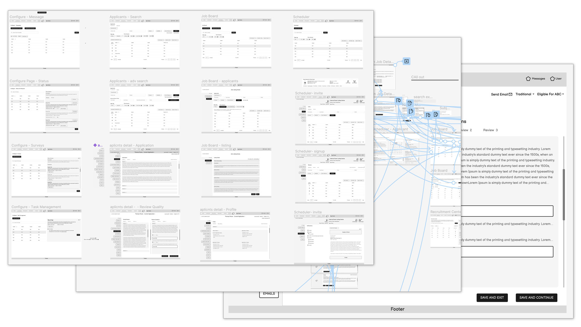
The CAD application was a comprehensive tool enabling mass transit companies to perform a multitude of tasks for their fleets.
Its complexity and scale were significant; a complete redesign would have required over two years. To manage this, we divided the project into manageable sections, beginning with the map view.
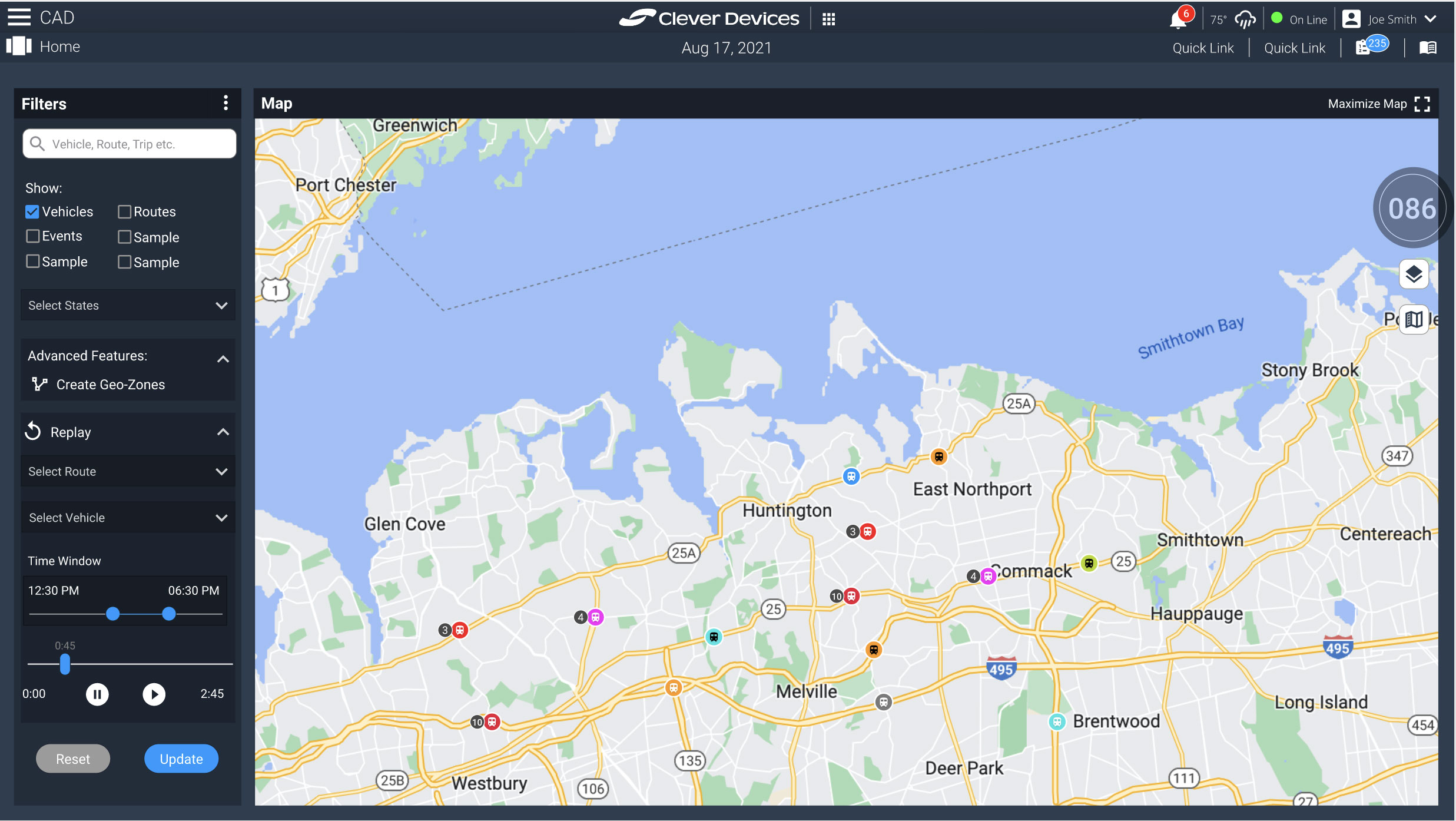
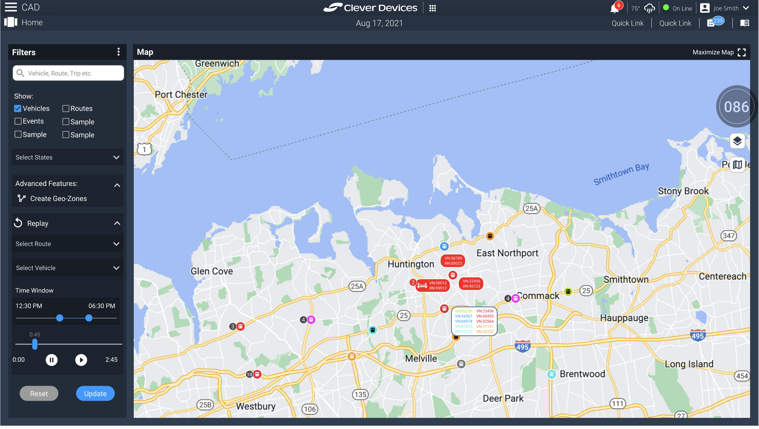
Initially, the maps in the application were outdated, user-unfriendly, and challenging to decipher. We commenced the project by addressing the smallest component: the vehicle icons.
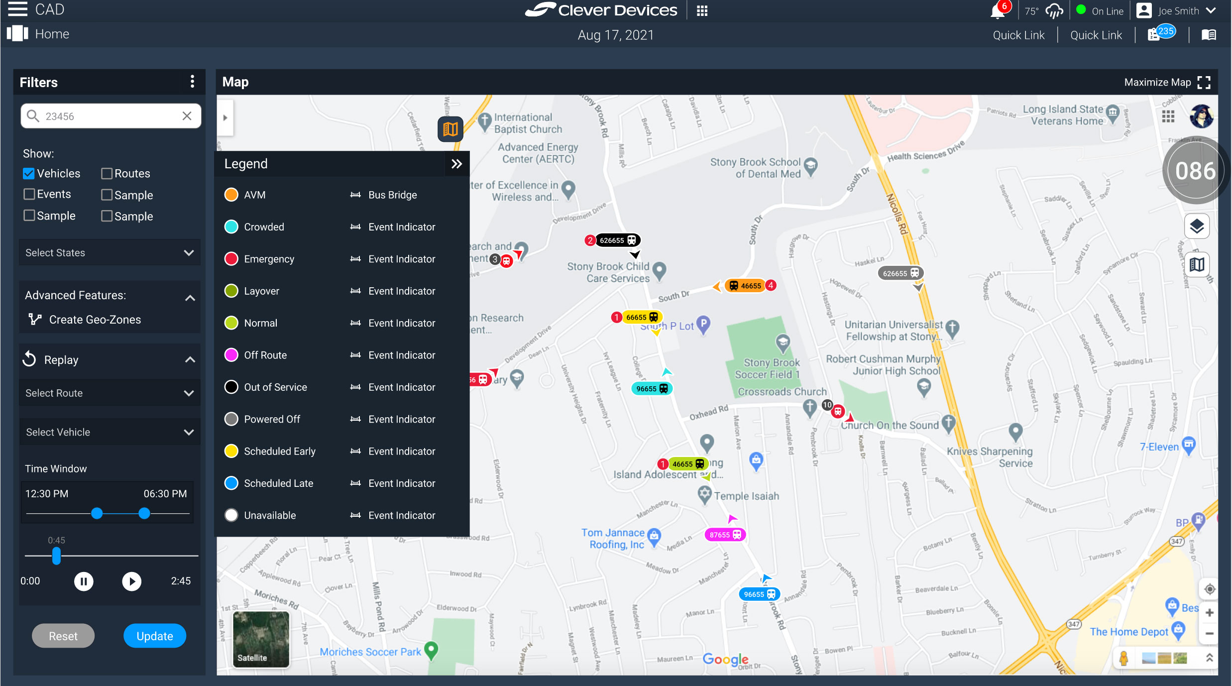
The primary challenge with these icons was to convey a wealth of information at a glance, while also accommodating potentially hundreds of vehicles on screen. This included displaying vehicle status (color-coded), vehicle type (e.g., bus icon), vehicle ID (up to nine digits), event type (icon representation), and crucially, the vehicle’s direction.
Another issue I identified and resolved was the problem of vehicle bunching, where icons would overlap depending on the map’s zoom level. I found the approach of suggesting continuous zooming to isolate specific vehicles impractical. Instead, I devised a solution to improve both the appearance and functionality of the icons when bunching occurred. Simplified icons would display the number of vehicles, and upon clicking, would expand to reveal all vehicles with their respective information, allowing users to drill down for further details and actions. If a vehicle had a Vehicle Identification Number (VIN), the number would display events associated with it. In the absence of a VIN, a trailing number would indicate the number of bunched vehicles.
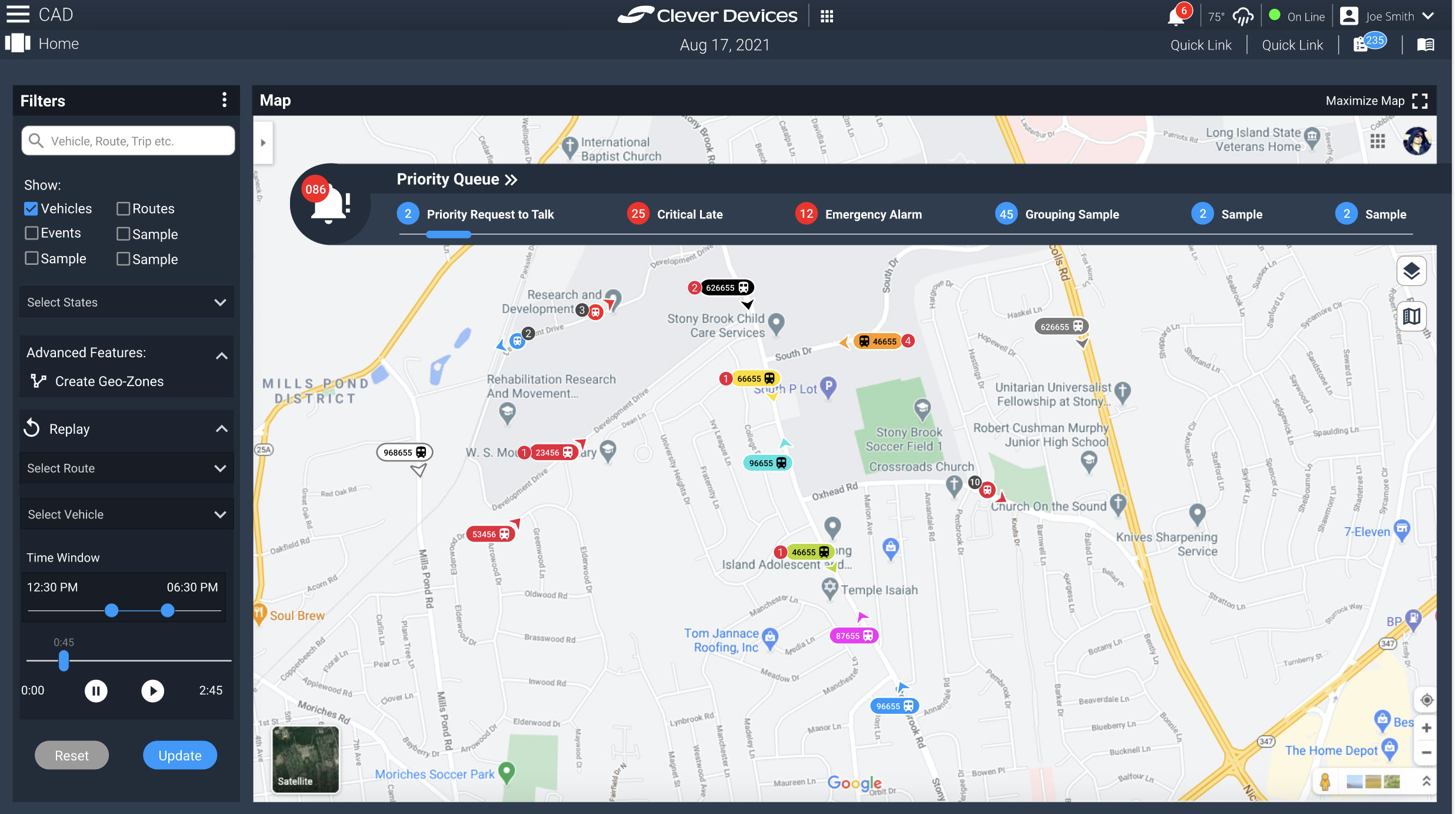
In addition to refining the vehicle icons, I also contributed to enhancing the user interface (UI) for the map itself and expanding its functionalities.
The following gallery showcases some of the ideas we presented to product managers to see if we had their buy in to continue on the current path.
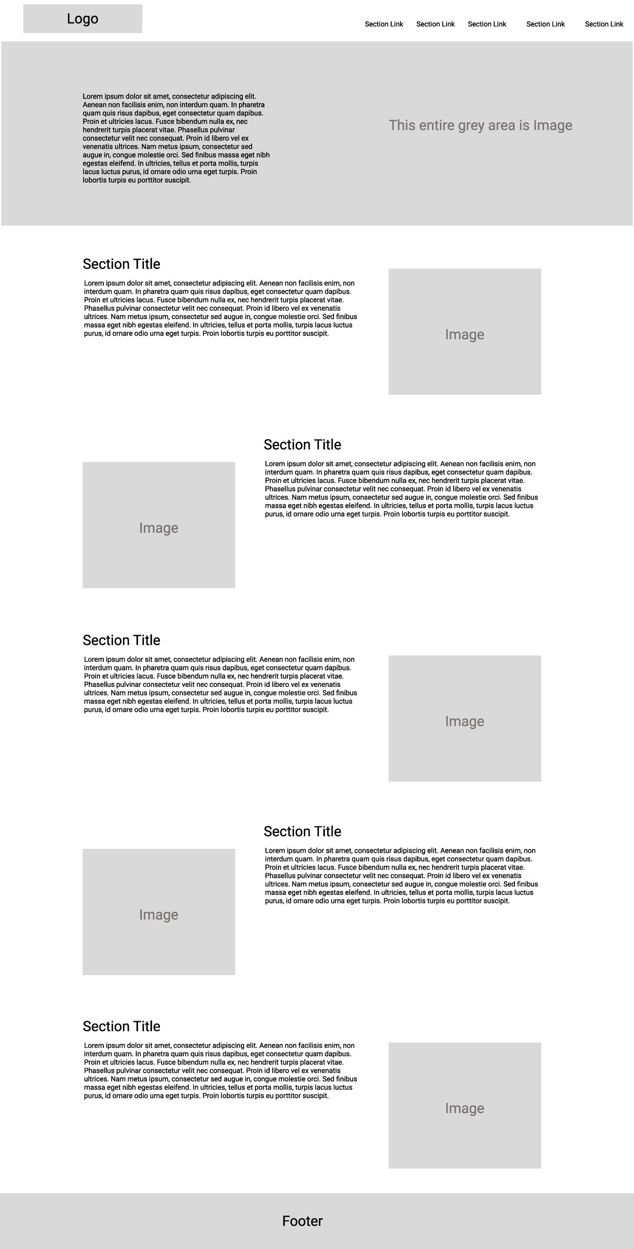
For this project, my role as a UX Designer involved crafting a comprehensive wireframe layout for an upcoming web application. Collaborating closely with the business analysts (BAs), I delved into understanding the application’s purpose and functionalities. Armed with requirements and video demonstrations of key user tasks, I meticulously researched and began constructing the wireframes. Throughout the process, I remained flexible, making adjustments based on feedback from the BAs and IT team during our review sessions.
Working alongside a skilled and talented group was truly enriching, and I found the project to be both challenging and enjoyable. However, my involvement was limited to a specific phase of the project, and unfortunately, I did not witness its completion.
The client is a DJ company. The request was to create a new logo for the company that encompassed the spirit of the company. They wanted a logo that was different, that didn’t use turntables or some thing to that effect. So I found some stock art of people dancing and used that energy in the logo design. After several iterations the final logo was a success!
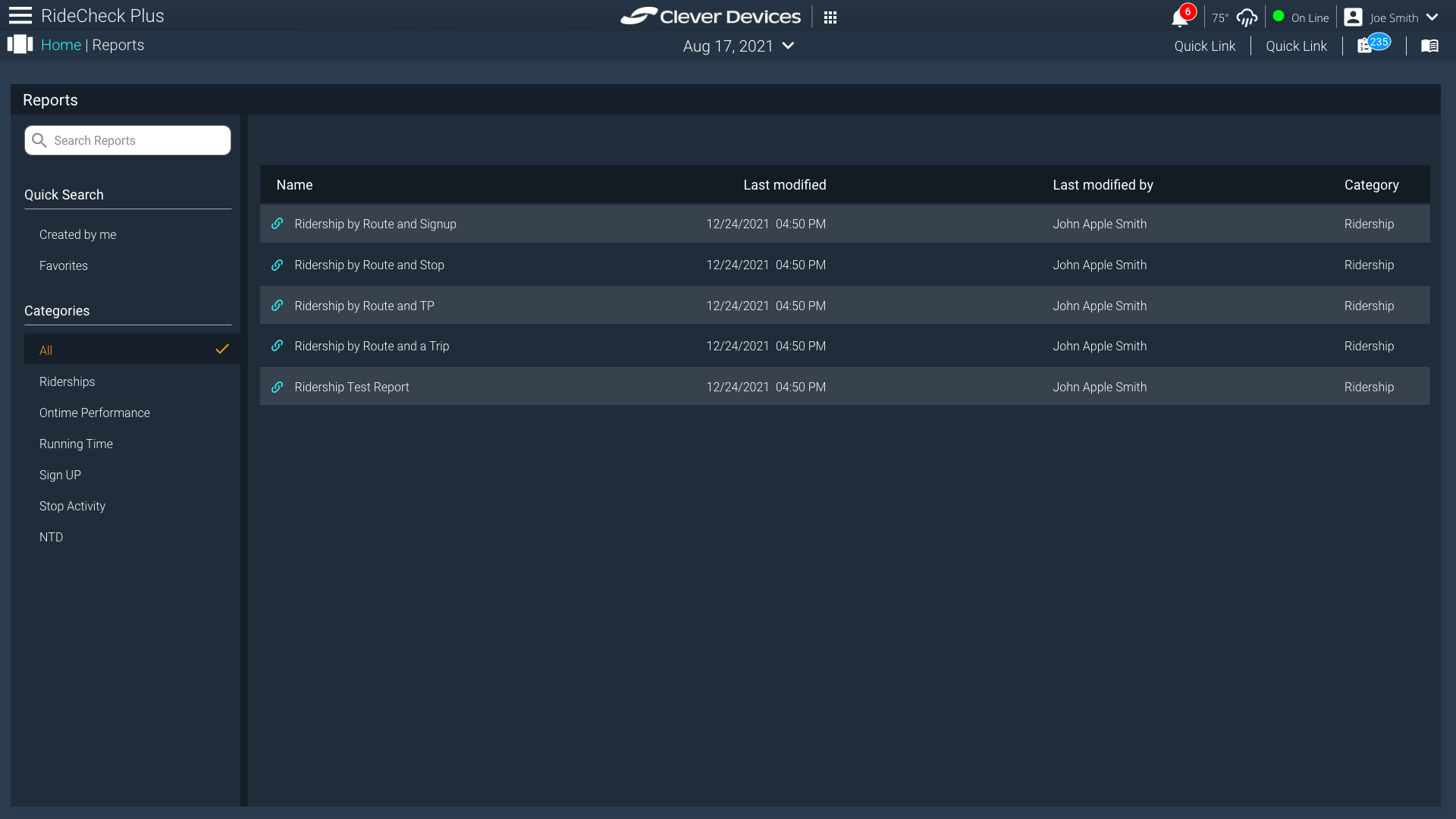
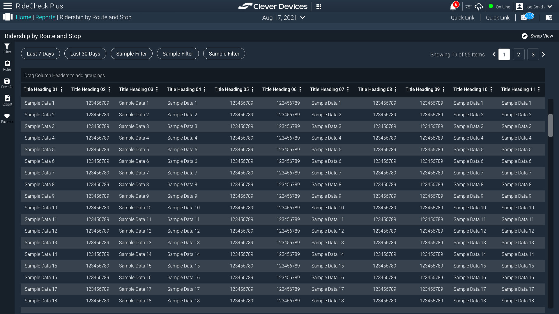
The ask for this project was to redesign and enhance our reporting application. The stakeholder had asked to design the main reports page along with a sub page that showed various reports and options to refine, filter and show other menu options for the reports. I had proposed two options for the sub pages. One would utilize the header top to include menu options for the reports, the other would incorporate a side bar with the menu options. The stakeholder loved it all and was to move forward using my designs to move to the next phase.
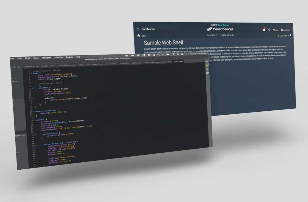
The ask from the stake holders, was to develop a web shell that the developers would utilize to create future applications. Since I had developed a design system that all our applications would follow, it would make the developers job easier if they all had the same starting point to work from. I created my own toggle for dark and light mode. Coded the CSS so that the swap would be easy. I wanted more control than having a frame work handle the swap. Our dark mode was based on shade of our corporate colors and used that as my baseline. There was still some work to do on the mobile portion of the site, but since this application was not meant to be utilized on a phone, the responsiveness was not necessary at the point of delivering the code to the developers. I used bootstrap 5, sass, and some minor javascript for this.
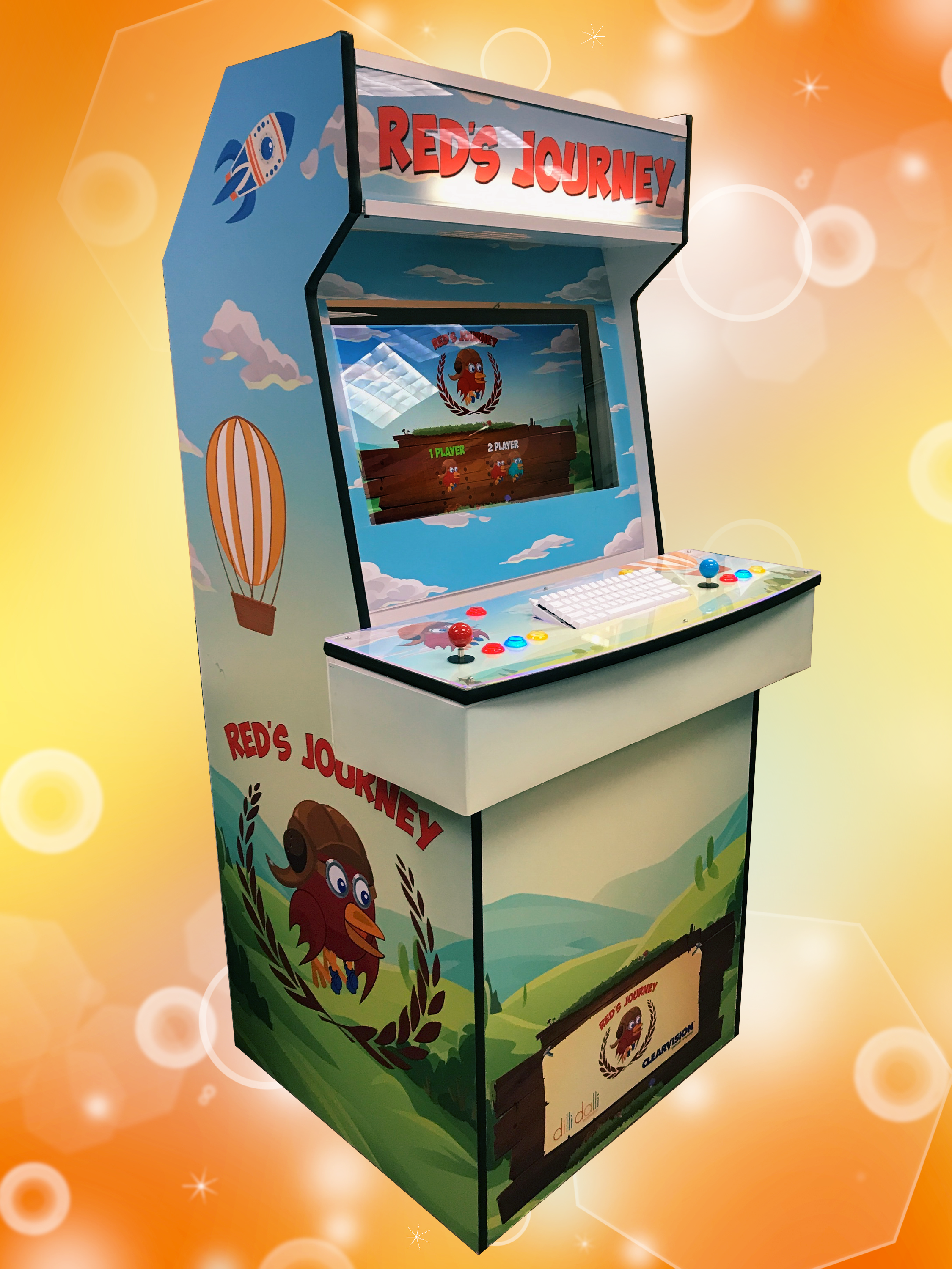
So not only did we create an android/iphone version, but we got a custom arcade cabinet made (thanks to Andres Gaete) arcade-pi.com. We developed a version of the game to be two player version of the game which adds some strategy and additional fun!
The arcade version brings back some nostalgia as well as adding that tactile feedback we all love. If your in Las Vegas for Vison Expo come check out ClearVision at Vision Expo West 2017 Booth #16087 to play on our arcade version.
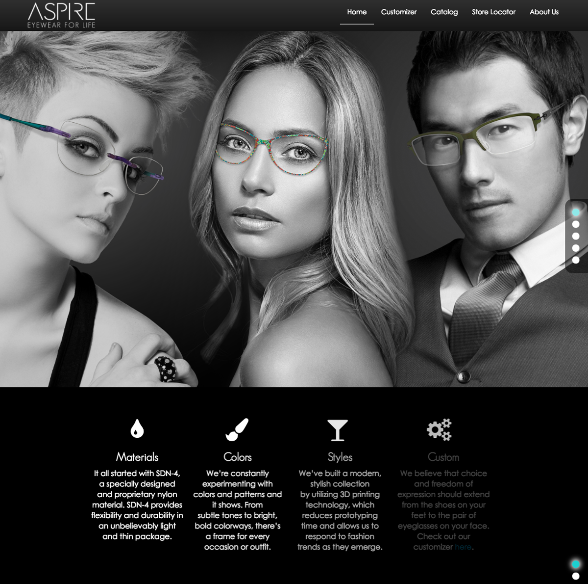
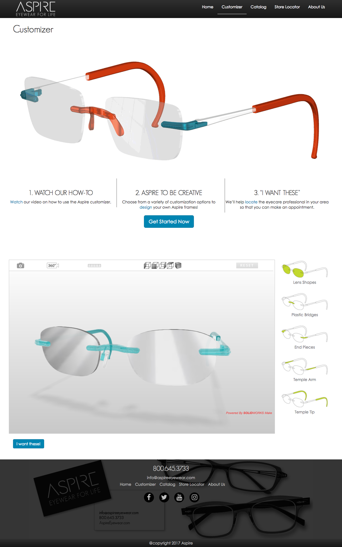
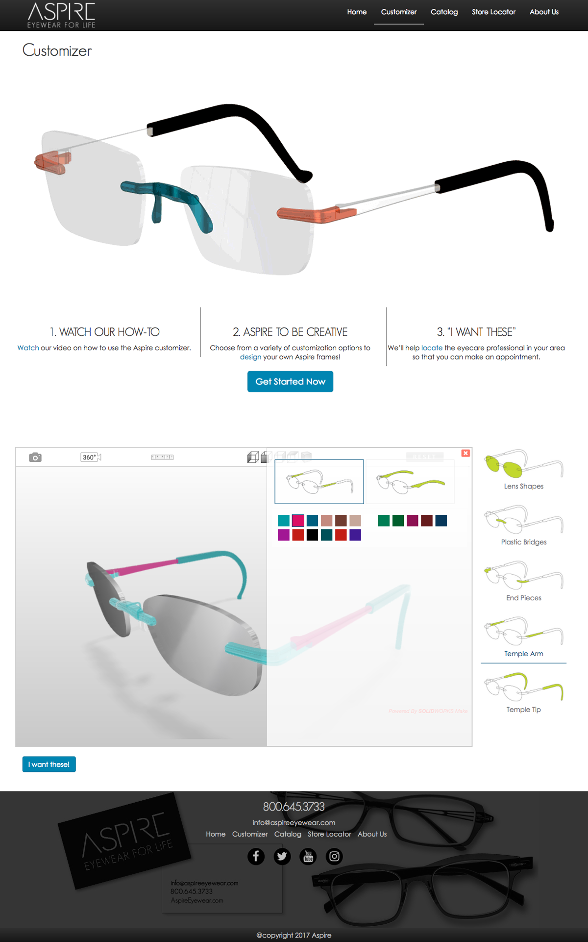
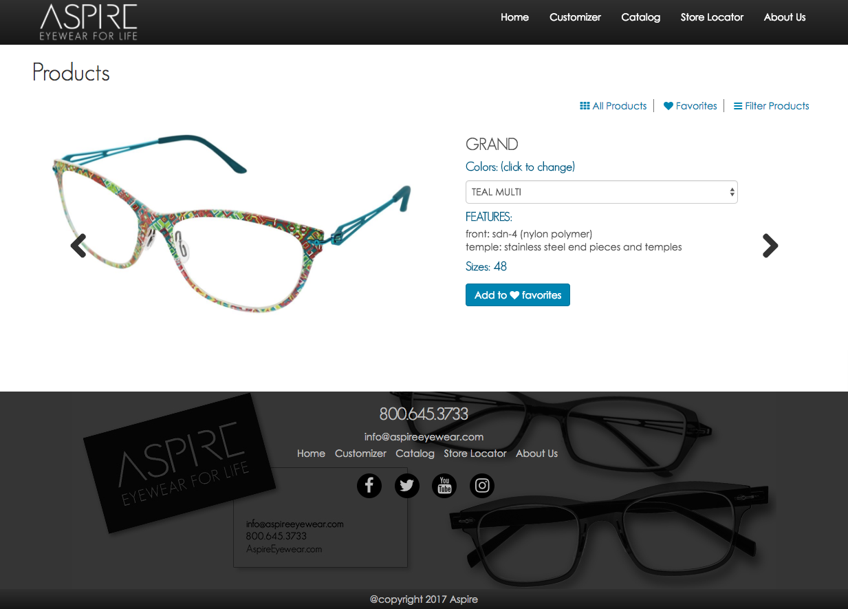
After designing and developing a new template for the Aspire brand it has finally gone live. I did wish I had more control over the images and copy for the site, but at least it was fun learning and implementing 75% of how I envisioned the site to look like.
The customizer was a fun project, got to rework the interface and make the user experience a more enjoyable encounter. There was a ton of back and forth between us and the vendor, but the overall exchange between us has created a great working relationship.
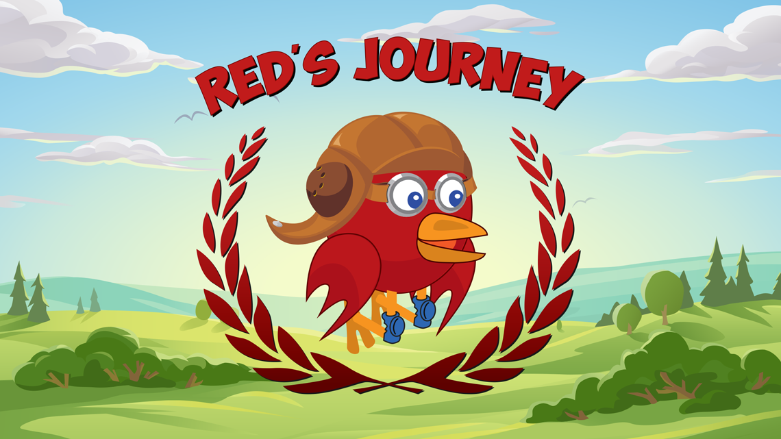
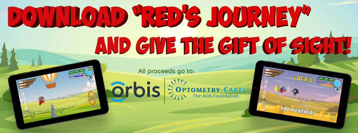
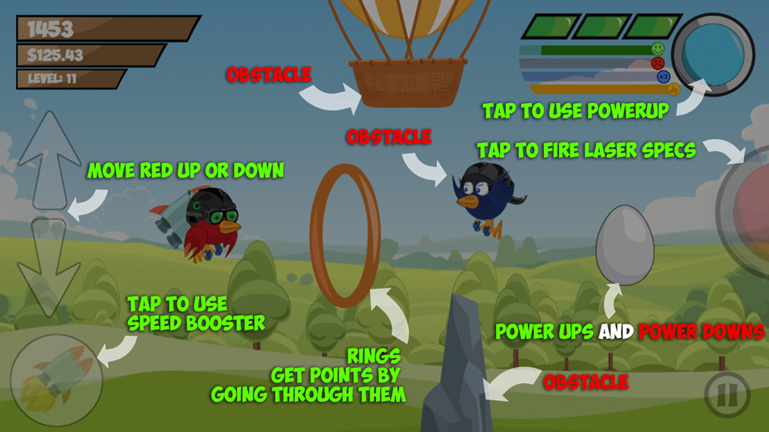
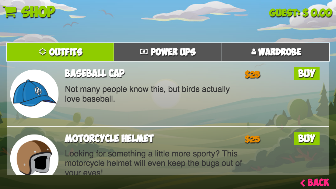
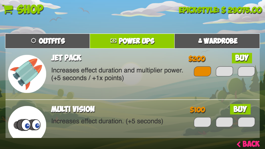
So after month’s of work, after many iterations, and after some user testing, we are launching the game on Sept. 14th. For more info check out this page. Reds Journey
I wore many hats during this project. From wire-framing, to character development, to UI/UX, front end development, and some strategy. So in short I learned alot! I also failed alot, but that’s all part of the learning process.
So in short please download our game, and please feel free to give back any feedback, and keep in mind all proceeds go to charity.
Thanks!!!
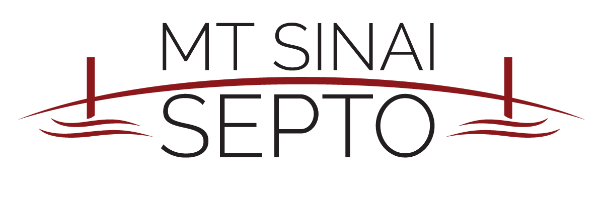
The Mount Sinai Special Education Parent Teacher Organization (SEPTO) had reached out that they were looking to create a logo for their organization. The direction was that they wanted something that conveyed bridging a gap, so they wanted a bridge in the logo. The end result was something that they loved and was starting to tie all their information together. This was done as PRO-BONO as a way to give back to the community.
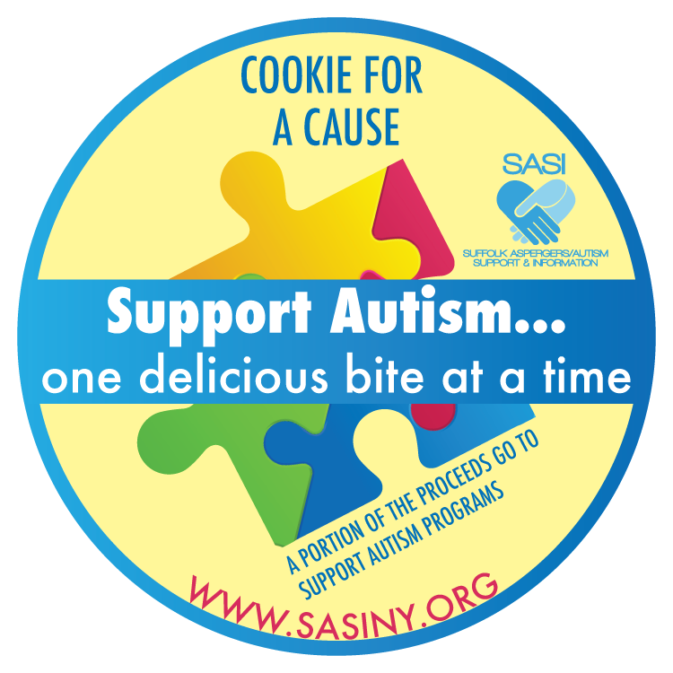
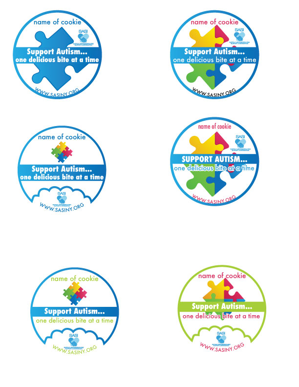
Was contacted to design a cookie label so that they can sell cookies to fundraise for their charity. They had requested to use a puzzle piece in their label, and wanted various options, with some having a bite out of the label. The end result was chosen without the bite mark, and the the yellow background was requested after seeing several iterations. The work was done PRO-BONO in order to help the charity as much as possible.
The project called for creating a new portal that was responsive. My approach was to build out a template that would house all our collective apps using the same principal foundation. This would solve the lack of consistency, between all the apps and since the template is built on on Bootstrap it would be responsive.
So far I’ve created 3 out of the 13 apps, I’m currently on hold until our backend team starts to pull content into the apps I have coded.
Problem: We need an app!! That is all I hear from higher ups at our company. The what they don’t realize is the lack of organization and direction is their main hurdle.
I stressed the importance of brainstorming, planning, and developing a strategy in order to get some solid requirements. With previous projects I have seen the waterfall effect of no proper direction and the project time exponentially grows due to improper management. With that said, I followed up with describing the proposed prototype.
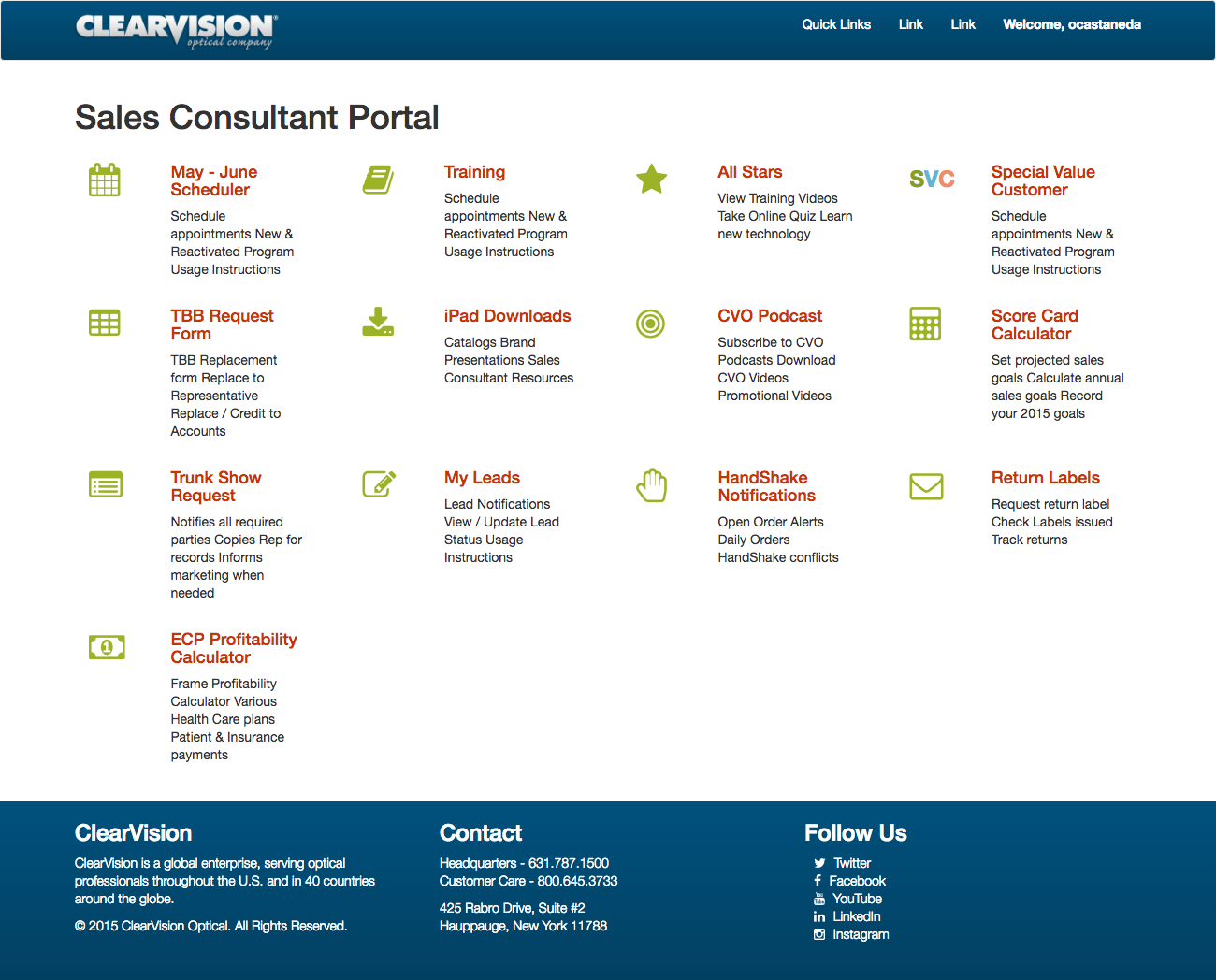
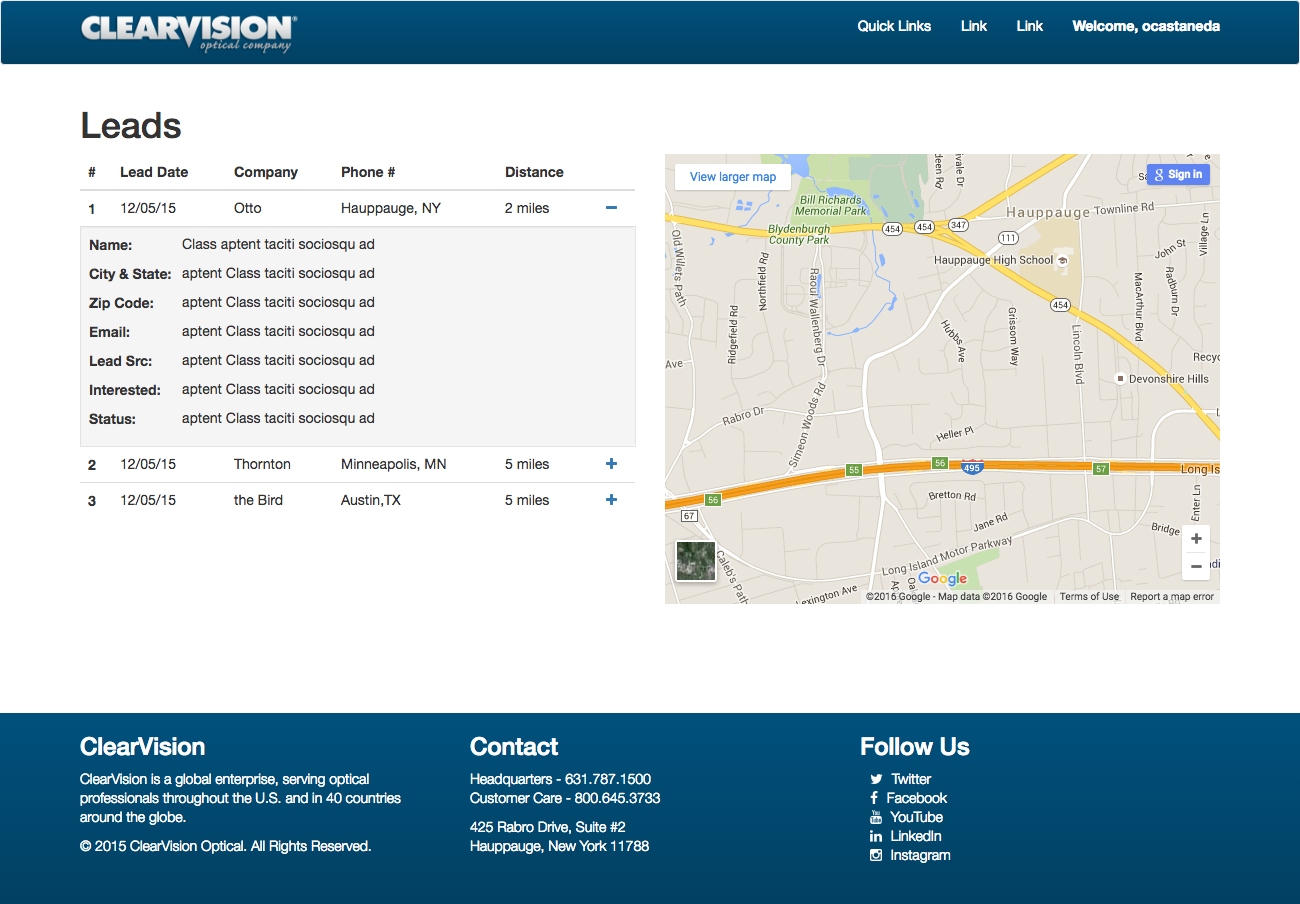
… Company: Clear Vision Optical
The problem with the project, I was asked to update content on an outdated site, with no cms. My solution was to redesign the the site as a responsive site built on WordPress for easy content management. I used our main site as a reference tool to capture elements that would keep you feeling like you were still part of the digital real estate of ClearVision Optical. The challenge for me was that this was my first real front end and backend build in WordPress.
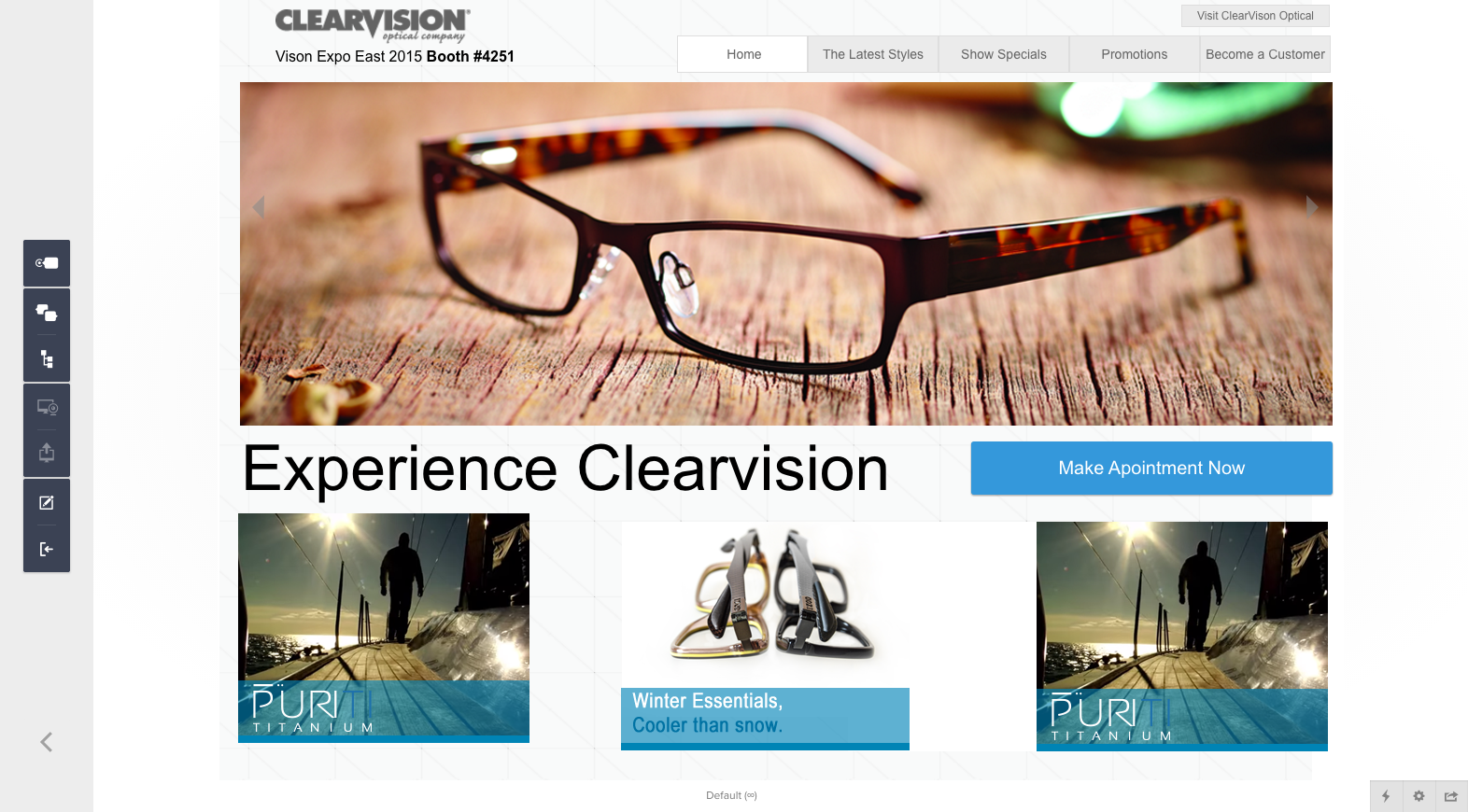
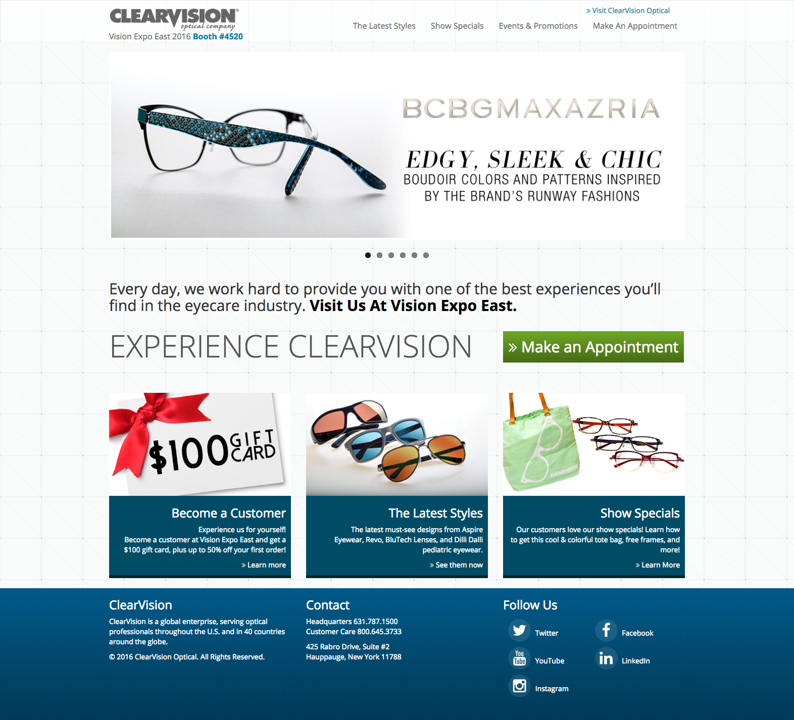
I worked closely with the Digital Strategist and project manager to create a design for a site that we did not have much idea what was needed. We had very little copy to work with. I created various wireframes and different prototypes to showcase the main message of the project. I had created a parallax version which was not approved and went with something more traditional and just made it look clean, modern, and made it responsive.
I was asked to create a simple design that would showcase what the company does, what projects they have done, and a way for customers to contact them. The design was clean, modern and fully responsive. This project is still in the works, I am awaiting copy and photo approvals.


This client approached me to create a very clean logo that would show in part some science behind her company. The final and approved logo was done to match her existing site, and the client loved it.
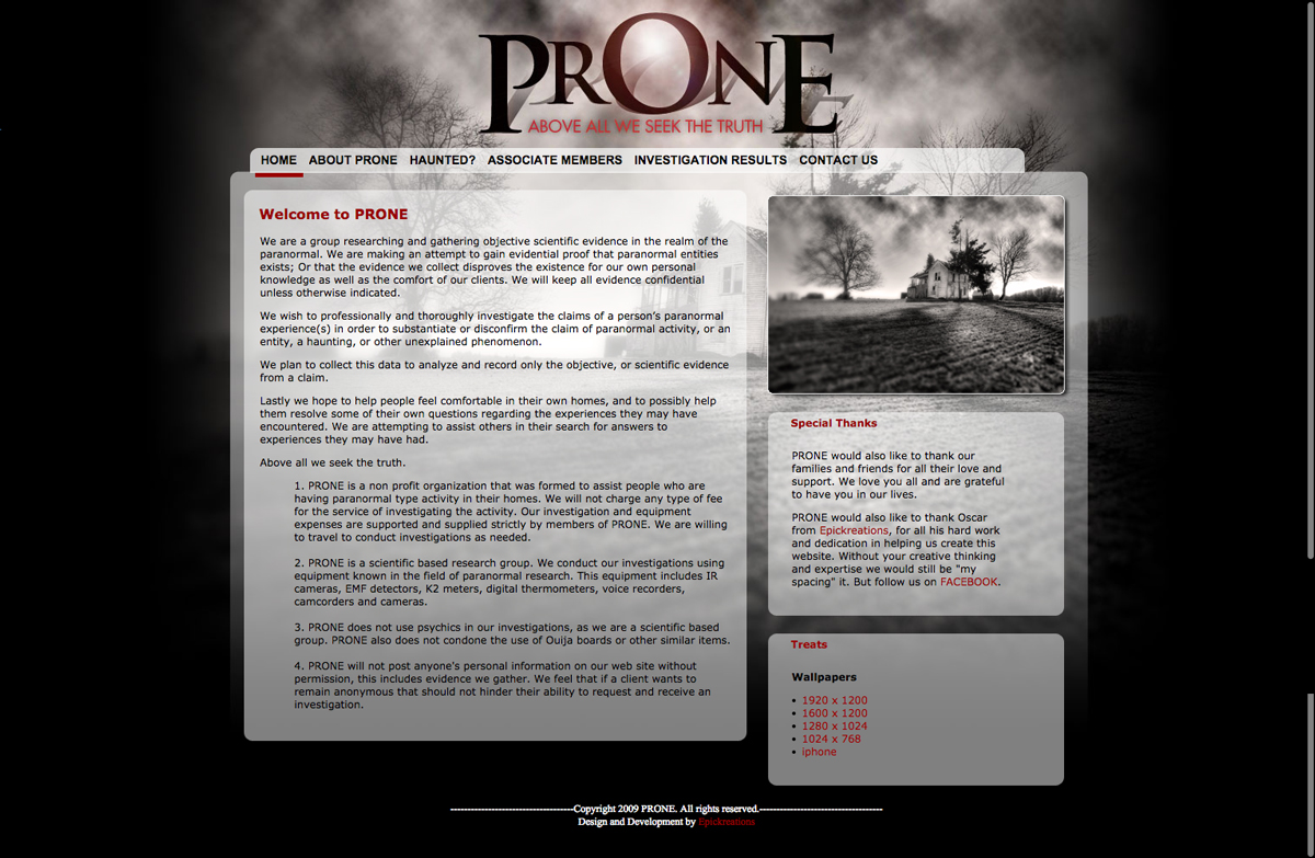
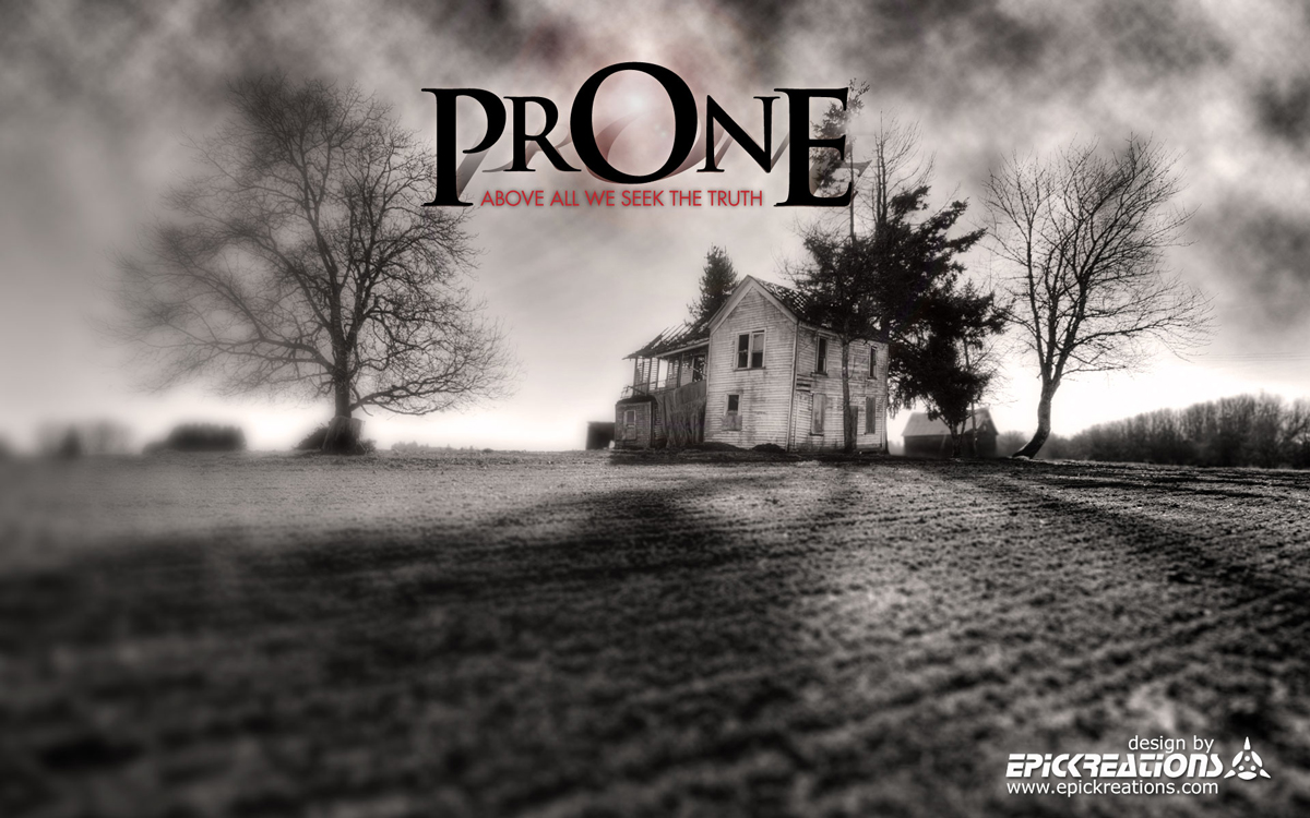
This paranormal research group approached me to create their Corporate Identity for them. This would include the creation of a logo, business cards, and also a website. I was given full design freedom on this project. With that liberty I wanted the logo to show the eeriness of what this group did. With that same idea I designed the site to compliment the logo.
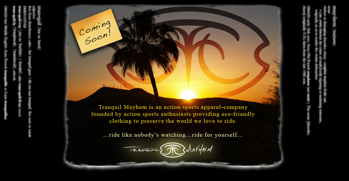
I was approached to create a unique logo. They wanted the logo to show a sense of tranquility and chaos as their name signifies.

I was approached by the organizer at the time and they wanted to update their logo. They wanted something that encapsulated the spirit of youth and a way to show that united we can make a difference, which is the use of the handprints. Once the logo was approved and finalized I designed a website for them. The design never got to development due to changes within the organization. This was done as pro bono.

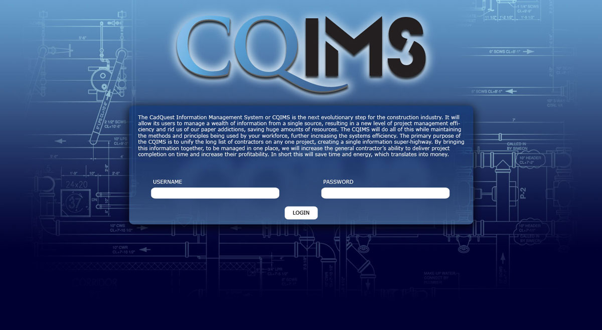
Cadquest requested a logo that would not isolate them to one area. They wanted to show that they will be a global entity as the company continues to grow its client base. The splash page was created as a temporary page until their website and application would be built. They did have some testing with some clients which was why they needed to have a login on the splash page.
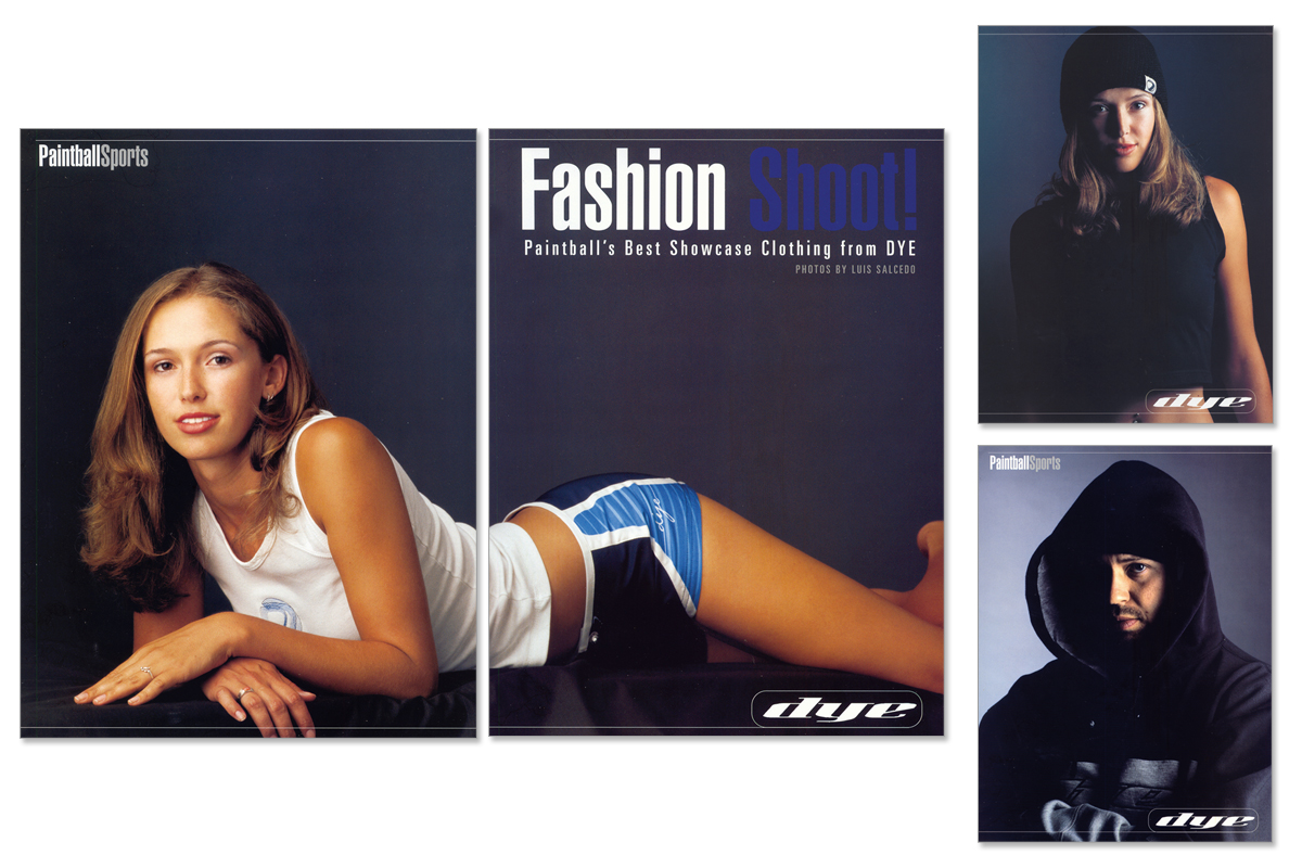
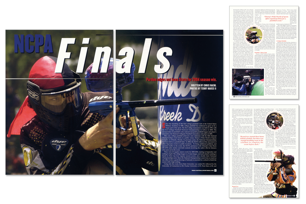
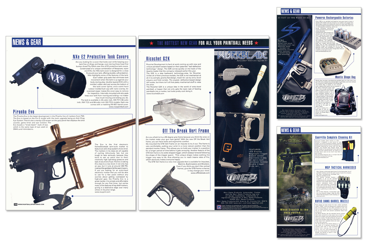
As one of the Assitant Art Directors I was in charge of creating several of the spreads for the magazine. As well as designing some of the sections like the news and gear and photo shoot with some of the products we advertised.
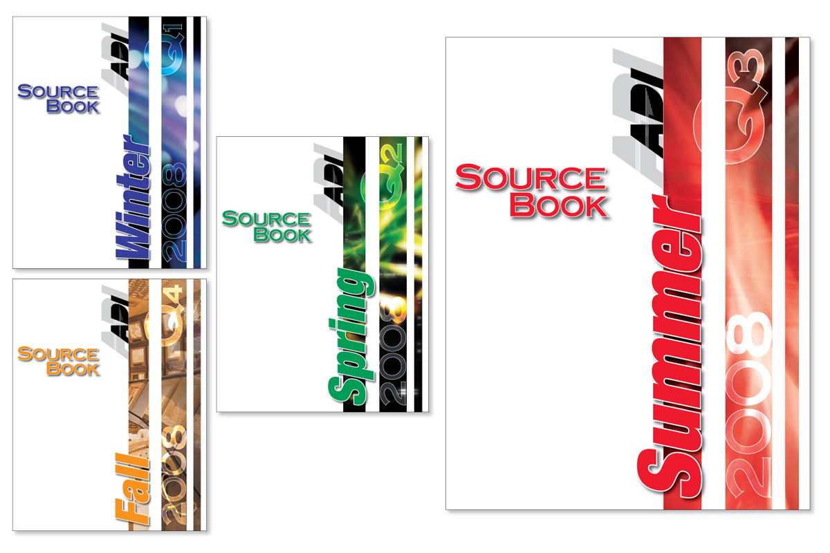
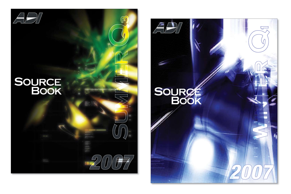
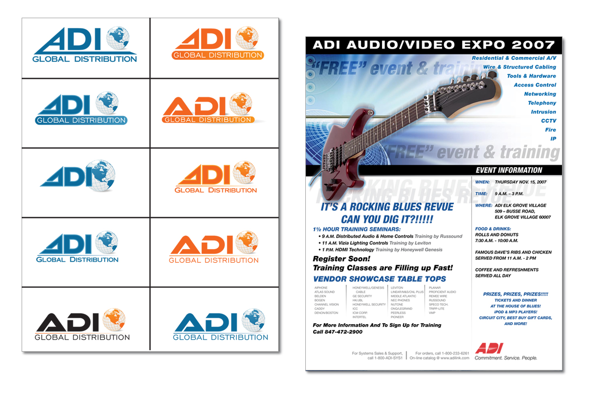
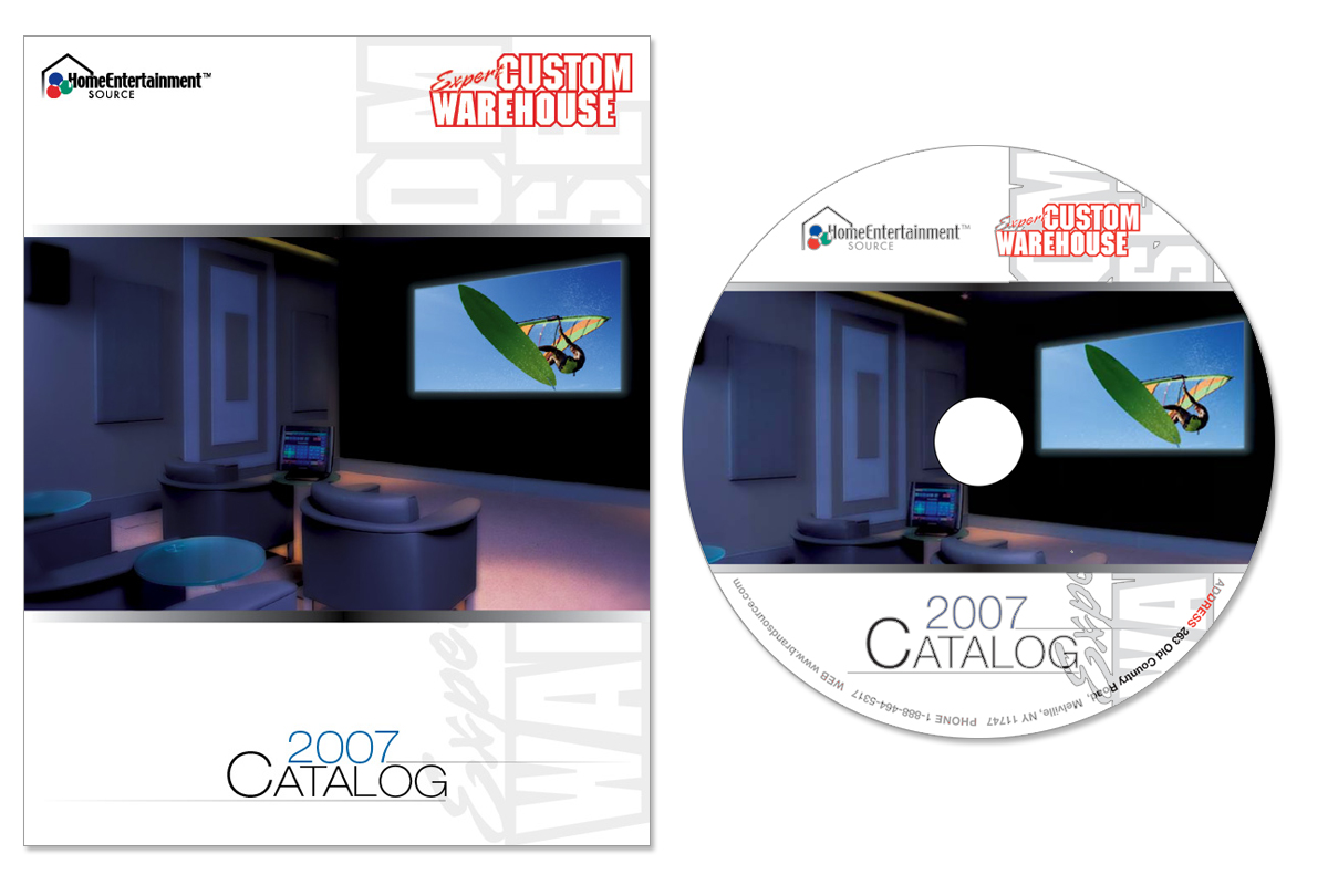
During my tenure at Honeywell I produced a number of pieces. Here are a few pieces that were created as mock ups which included catalog covers and logos for a rebranding project. The print ready pieces that were sent to production included a flyer and a catalog which included the cover and layout of the interior pages as well as a CD-Rom of the catalog.